How the Death Wish Coffee Website Redesign Prioritized Brand Innovation
by Kaden Laga • August 18, 2021
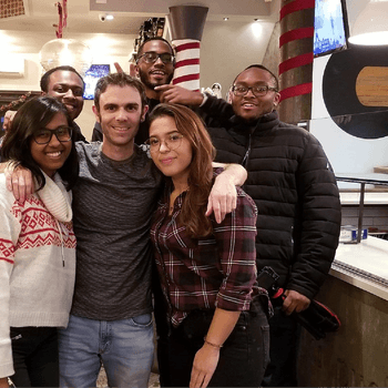
An Interview with Disruptive Client Will Critcher, Director of E-Commerce at Death Wish Coffee
By Kaden Laga
Marketing Consultant at Disruptive Advertising
If you’re considering a website redesign or spend any amount of time strategizing around website and brand innovation, read on. One of the best parts of my job as a Marketing Consultant at Disruptive is all the different brands I get to work with who are doing cool things. Disruptive started working with DeathWish Coffee in January of 2020, and since then we’ve been able to partner on several strategies that have helped more clearly define their brand tone and creatively test their content strategies.
I love working with DeathWish Coffee because they creatively push and inspire me as a marketer, and I can honestly say I am a better marketer for working with them. They know what it means to be a product and brand company first, and everything they do points to this philosophy. They think of their customers as friends and they’ve brought this tone to life in an authentic and compelling way, which is so much fun to advertise and collaborate with.
If you’ve maybe been living under a rock and didn’t see their punchy Viking Super Bowl ad in 2016, or hear about how they partnered with NASA to create a blend that fuels astronauts, in less than a decade DeathWish Coffee garnered much success roasting and brewing the World’s Strongest Coffee that’s developed a loyal following. They’ve done a great job executing on their mission “to fuel you wherever you go” in a bold and passionate way. And with premium products to boot!
In 2020, their team realized it was time to bring a totally different design logic to the table and launch a new website that more accurately reflected the strength and innovation of their products and bold brand vision.
I sat down with Will Critcher, Director of E-Commerce at DeathWish Coffee, to get an idea of how the process for their new website came about.
Q: What is Death Wish Coffee and what is it as a brand?
A: I think the answer is less about what Death Wish Coffee is and more about who we are. At Death Wish Coffee, who we are is rebels with causes. We’re a bunch of authentic, sarcastic, salty, smart-ass human beings who care very deeply about everyone who is a part of our team. But, we have high expectations of everybody on this team. I’m grateful to be a part of it.
We are a digitally native vertical brand. We started out on e-commerce as a whole, then after about five years, we got into the retail space in early 2019. We’re now in 12,000 to 13,000 retail locations. 98% of our coffee products are ethically sourced through fair trade, and all of them — that 98% of them — are USDA organic certified. Up until last year, we were the number-one selling ground coffee on Amazon. We believe in first-party data, leveraging that as much as possible to enhance familiarity with our customers.
Q:What were the indicators that it was time to update your website?
A: When I started at Death Wish, my first education was on the power of brand loyalty. I looked at our website as a barrier, as an obstacle, right away — the site on the back end is kind of duct-taped together. We modified and fixed it, but even from the front-end user experience, there’s so much opportunity to improve it.
I think we’ve kind of always known that the site needed a redesign, so that’s where we initially started off. The pandemic converted a lot of retail shoppers and forced everyone to get into an e-commerce space, which really made a glaring opportunity to redesign our website — the company constantly reinvests back into itself. The conversation really happened right before the pandemic in January.
This redesign is a way for us to fully unify our brand. When people are in a retail space, and they’re grabbing a bag of coffee, they may be checking out the QR code on the packaging to visit our website. We have to connect the brand with the product that they are interested in buying, so beyond e-commerce, we have to step up our game and better tell our story.
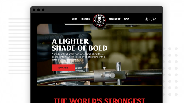
Q: How did you get started on the Death Wish Coffee website redesign?
A: I put together a form and gave it out to a handful of people. One of the questions on there asked for someone — a friend or family member who has never heard of the brand — to visit our website. We wanted them to give their opinion on who they think we are, what we sell, and what our messaging is.
On one of the pieces of feedback that stood out, the only feedback was “seems like a quirky brand.” I realized that we wanted to be seen as the world’s strongest coffee — a bold company, but not quirky. That shouldn’t be how a person identifies us.
We wanted to deliver a premium user experience to suit our premium products, and we want to make sure we are fully unifying our brand to tell our story and position ourselves the way this coffee deserves to be positioned.
Q: What are some of your top brand innovations on the site?
A: One goal was to increase our add-to-cart percentage rate. So we’ve implemented a quick-shop feature on our collection pages, which I think will drastically support that goal.
Even if you just load the collection page, the product listings will start moving with video elements that are very low-weight, so we won’t have page-speed issues or anything like that. Our new partner, Wistia, is helping us make use of video throughout the website.
On our content collection page, we’ll have a blank space that will say “Your Collection.” The user can title their collection there. Then they can start adding blogs and products, enabling us to lean on the editorial content side of the company, pairing it with products. If they grab a barbecue recipe that uses our instant coffee, they can buy the instant coffee, come back to the website, and have the recipe saved. It’s beyond trying to sell a product — we’re trying to create an environment where coffee has its fingers in a lot of things.
We’ve also looked at the content side of things, and for the listing page in the hero, we’re going to show our number-one-rated blog post — a post on coffee jitters. Having top-ranked content up there can help us support good SERP rankings internally. Hundreds of people come to our website and don’t think to look at that content, but if we say it’s number-one-rated and put it at the top, we’ll continue to push its high performance organically.
Q: What are you hoping to accomplish with these changes and brand innovation strategy?
A: My driving goal is that I want our customers to know who we are. I also want to know who they are, and I want them to go deeper. We want two-way familiarity and also something additional, like buying again or reading another blog.
We produce editorial content that is high-performing in organic SERP, so we also are creating an autoplay feature. If someone were to navigate to a blog page and get to the bottom of it, after a certain amount of time, it lets them know that in five seconds, something new and related to their interests is going to auto-load. It fulfills the point of having the blog, diminishing bounce rate and keeping people’s time-on-site up.
Q: What part of the change was the hardest part of the Death Wish Coffee Website Redesign?
A: The hardest part is that you just get going on a road and realize it’s maybe not the right one. But, you keep continuing down that path because of time and deadlines. It’s incredibly important that I personally learned to justify stopping when I recognize the way we’re going is not the way to go, even if it may put a deliverable two or three weeks behind. I might be emotionally connected to a decision, but when we realize it isn’t the right decision, we have to rethink the whole thing.
A big part of the plan is that we’re going to experience a conversion lift that translates to dollars. The longer it is delayed, the more it has an impact on performance. Still, what’s worse is delivering something that doesn’t meet the expectations we have.
We also thought we’d start with the home page and then cascade from there, but then we realized that we actually had to start with the product detail page. When the product detail page was completely designed and we were good with it, that set the tone for the user experience, content, and everything else.
We had to be realistic, too — what looks cool in one place might make no sense anywhere else on the website. Those things were fancy but irrelevant. There were still other elements that we could make work since they helped us toward our goals of helping customers and enhancing user experience.
Q: Is there any advice you’d give to a business seeking brand innovation or considering updating or redesigning its website?
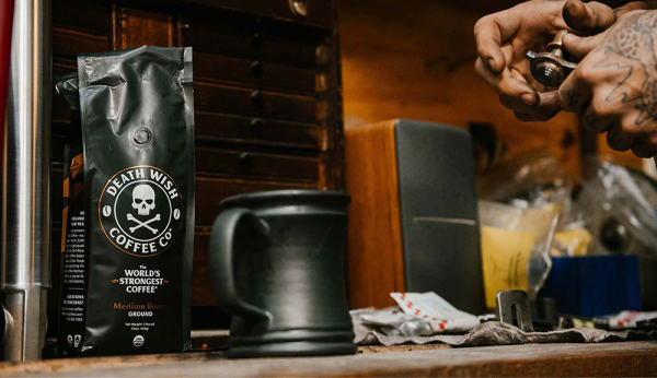
A: You have to identify what you can do and be sure about that. Then you have to be completely OK with knowing you can’t do certain elements. We felt confident about our abilities with user experience, but we needed to hire the right partners to help with design.
For a full redesign of your website, take your time vetting who you want to use for your development and design needs. Yes, their portfolio is really cool, but when you talk to them, do they understand what you’re trying to accomplish? Are they helping you through the process? And are they going to be transparent and realistic? You want them to hold you accountable and give you great, useable feedback.
Also, set realistic goals, expectations, and deadlines. When this project was originally handed to me, I thought we were going to knock it out in six or seven months. Realistically, I should have said a year. Be realistic with your superiors — and with yourself if you’re the decision-maker. Things don’t always go perfectly smooth from beginning to end.
Q: Key Takeaways from the Death Wish Coffee Website Redesign
A: Death Wish Coffee brought their whole company philosophy to the website redesign process. As a result, they have an interesting, dynamic website that they are excited to share with their customers. However, it wasn’t all easy and automatic — key decision-makers had to be there to do the hard work of making this dream a reality.
So what can other e-commerce companies learn from what Death Wish Coffee has brought to the table? Here are a few things to consider:
- Start your goals and planning by thinking about who your company is, not just what you sell or make. The conclusions you come to could yield fruitful ways to make your website stand out while fitting holistically with your brand.
- Take the time to run your current website by some new faces for feedback. Even if it’s not easy to hear people’s thoughts about a dated website that’s not as aligned as you’d like it to be, doing so gives you valuable information for the redesign.
- Take your time choosing a partner or partners for the redesign process. Just because you have in-house people who have the right skills doesn’t mean they need to drop what they’re doing to do the redesign. An outside team may be able to offer real value if they get your vision.
- Make sure you can decide when it’s best to push forward on a path and when you should stop to reconsider. Weighing the potential delays versus the potential impact to your overall goals is key to deciding what’s worth a few weeks of additional development and what can be worked around effectively to achieve goals in a timely manner.
- Don’t overpromise at the beginning. Instead, keep a wide time horizon in play for a website redesign. By tacking a few additional months onto the planned timeline, you give yourself the freedom to really do every feature the way you want to get it done
To see the revamped Death Wish Coffee website redesign, visit deathwishcoffee.com and check out their new and improved product detail pages, home page, and blog content collections. Get inspired by seeing all they’ve accomplished since the start of this project in January 2020.

