6 Things You Might be Forgetting on Your Landing Page
by Sarah Rodriguez • November 24, 2015
Landing pages are an important part of any pay-per-click marketing strategy, but—like their fully-functioning website counterparts—you can’t afford to miss an essential element.
With that in mind, here are 6 of the most important things to remember while putting together a landing page.
1. Page Title
A relevant page title makes your page look professional. In addition, it gives you a great way to show who your company is and give a potential organic searcher some information about what they’ll find if they click on the page.
For example, having something like this: “Disruptive Advertising | Most Awesome Company Ever” allows you to display your product or company name and a tagline or CTA right on the browser tab. And, if you follow my next piece of advice and add a favicon, you’ll also have a little logo by your name!

Touches like this can do wonders for the credibility of your landing page.
2. Favicon
Favicon is the name for the little icon that appears on your browser next to your URL or page title.
Putting a favicon on your page really helps your page look polished and professional. Many site builders, like WordPress, have areas for you to upload your favicon icon directly. If you are using Unbounce to build your landing page, a quick bit of code will add a favicon to your page.
You can see more detailed instructions on how to add a favicon to your Unbounce page here.
3. Privacy Policy
Although it’s best practice to keep your footer clear of “distracting” links or social icons, having a link to your company’s Privacy Policy—usually placed in the footer—is important.
If you’re collecting personal information through a lead gen form, you must link to a privacy policy. If you don’t do this, you run the risk of getting flagged by AdWords, which could potentially slow down or postpone your campaign. Save yourself the trouble by linking to a privacy policy on your lead generation landing pages. If you don’t have one, sites like iubenda make it easy to quickly generate a privacy policy for your business.
4. Confirmation Dialogue
Are you thinking about where you’re taking your customers after they fill out your lead form? After all the work you’ve put into getting them to hit “submit,” it’s easy to think “Yes! I’ve got a new lead!” and forget about your customer’s post-submitting experience. But, you’ll want to make sure you are optimizing your viewers experience even after they’ve given you their information.
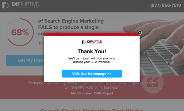
A good way to keep their interest and create a good experience is through confirmation dialog customization. Most landing page design platforms like Unbounce come with a default confirmation message, something like “Thank you. Your form has been submitted” but it’s worth it to take things a step further.
Instead of telling them their form has been submitted (well, duh!), tell them what is going to happen next. Something like, “We will contact you within the next 24 hours” or “You will receive your information packet in your inbox shortly.”

This kind of messaging helps to keep your lead interested and anticipating a next step. You can also add a phone number or link to your homepage in case someone decides they want to talk to someone now or learn more about your company.
5. Mobile Optimization
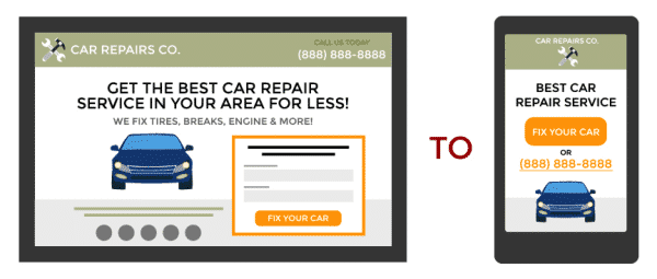
It can be really easy to focus on making a beautiful desktop landing page and just quickly throw together (or entirely skip) the mobile page. Believe me, I know from experience. However, with mobile traffic growing every year, it is more important than ever to spend some time optimizing mobile versions of your landing page. Not only do mobile optimized pages help you get more leads from different traffic sources, they also create a better experience for your viewers.

Think about how your audience will interact with the page. It is often a good idea to replace some (or all) of your form CTAs with call CTAs. Click-to-call makes it really easy for your viewers to get ahold of someone from your business, and in turn makes it easier for you to get qualified leads and sales. You can read more about how to effectively mobile optimize your landing pages here.
6. Proofreading & Testing
When I finish a landing page, I set aside a big chunk of time to proofread copy, double-check all of the links and buttons and test that everything looks and is working properly on the published page.
I know that this step is often skipped entirely (again from my own experience), but it is important to prioritize this step. A landing page with typos and broken links really takes away from the brand and the professional feel of any given page. It’s all about creating a positive experience for your viewers and if they can’t click the button they want, or fill out the form, or read copy that is full of typos, they are not having a positive experience.
This is also a good time to go back and make sure all of the previous points mentioned on this post have been completed. It’s also a good idea—and something that we do here at Disruptive—to have another person (or two) also check and test your final page.
Conclusion
The better your landing page, the better your online marketing campaigns will perform. But, if you want a great landing page, you need to make sure your page is set up with the all the necessary ingredients.
This list covered 6 frequently-neglected landing page elements. What other less-obvious landing page elements would you add to this list?


