How to Build a Great B2B Website: 12 of the Best B2B Websites to Learn From
by Ana Gotter • July 20, 2018
When you interact with a business for the first time, where do you do it? In many cases, the first true touch point or interaction will be on the business’s website. You’ll poke around, look at their products and About Me page and start to get a feel for who they are. Their outreach efforts might get you to their site, but it’s their branding and how they portray themselves that may get you to convert.
This is particularly true for B2B sites, too, especially since the buying process is so much longer, with an extended research phase. Having a strong site will make the first impression that you need and will help you land more clients.
Ready to create or edit your B2B website but stumped on what this should look like? We’re here to help. In this post, we’ll take a look at what your B2B website should accomplish and 12 different examples of businesses already doing it well.
Designing a Great B2B Website
B2B websites should quickly tell viewers the following:
- What you offer
- What makes you different (this is at least partially tied to branding)
- How you work
Your copy and images should all work well together to create a distinct brand and give users the information that they need all at once. This includes information about you, so that they feel good about potentially buying from you. It may also include testimonials and product or service descriptions.
No matter what, customers should have a basic idea of what they can expect when doing business with you just from the site. If you’re a marketing agency, for example, do you work closely with the business owners and want their input, or do you hope they let you run on autopilot? Advertise this in a way that it sounds appealing, because there will be customers out there looking for each of those solutions.
There should also be a clear contact form that users can find and submit quickly, whether or not they can purchase products or services directly from your site. If live chat is an option, that’s excellent, but you should still have a traditional “Contact Us” form on its own designated page.
Should I List My Prices Online?
One thing that many people debate about is whether or not you should have pricing readily apparent online. For some B2B businesses with set pricing, the answer is yes, you should offer that information under a “pricing & plans” tab.
But for other businesses whose pricing varies based on the exact customer, listing ranges of costs online can end up hurting you. Customers always want to be on the low end of those price ranges, even if there’s no way they could be.
For example, my business doesn’t list prices online, because each project is so individualized that it would be almost impossible to give accurate starting prices online. One eBook might cost $800 while another might cost over $8,000, and listing that $800 online is only going to make people angry if they’re paying a penny over it. It can make it difficult to negotiate and that’s the last thing businesses need.
If you have a set list of services or products that come with specific parameters, however, and pricing is definitive, listing it online can be an asset. Potential customers do want that information, and it can help you weed out irrelevant leads who could never afford your prices in the first place.
12 of the Best B2B Websites
Want to see what a great B2B website looks like? Let’s take a peek at 12 of the best B2B websites out there and discuss what they’re doing well.
1. Nutshell
Nutshell sells CRM software designed specifically for small businesses. Their homepage is beautifully executed.
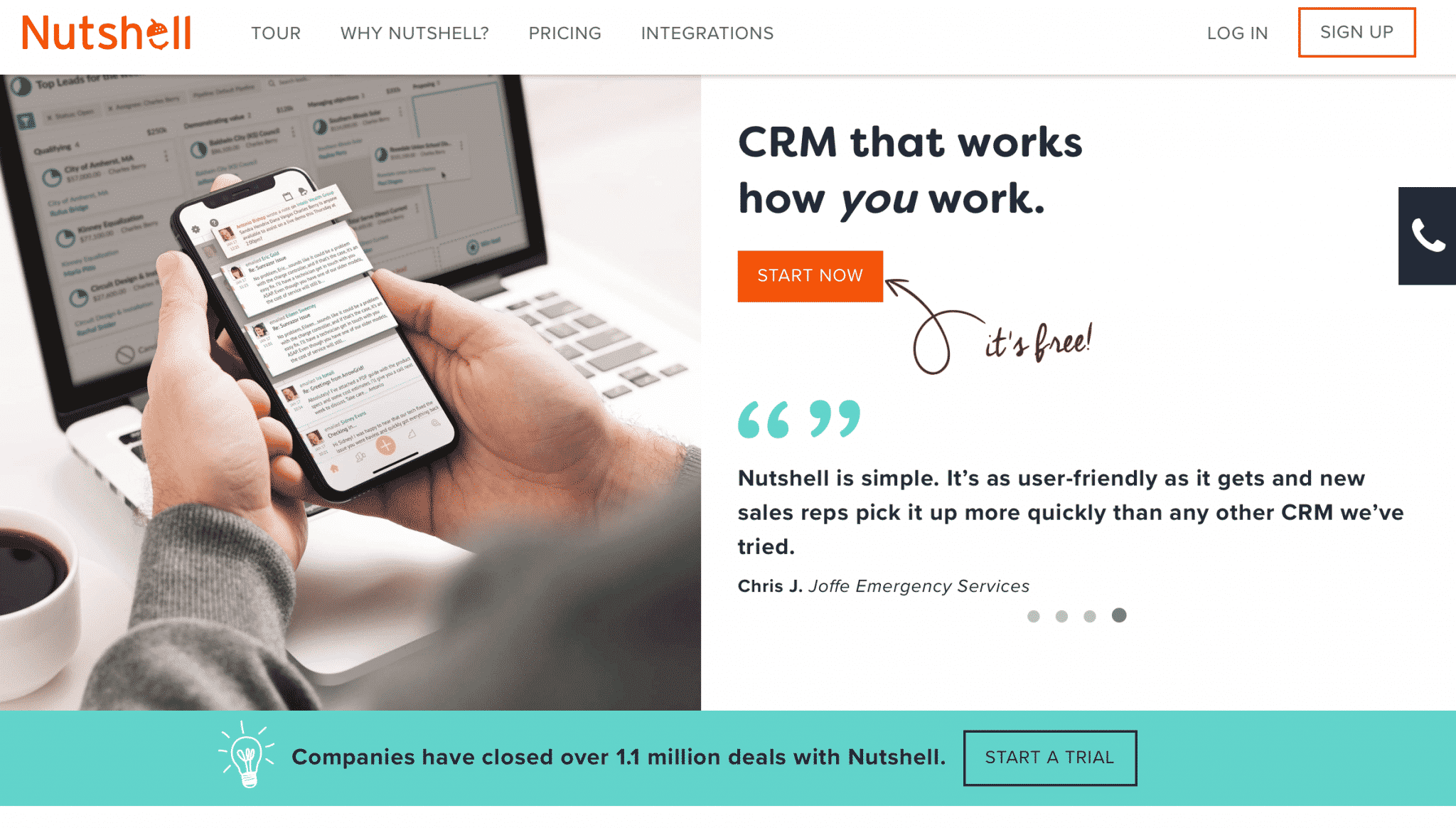
Here’s what they’re doing well:
- The site design is simple, and uses elements like constructing colors and borders in order to draw users’ attention to the CTA buttons.
- The copy emphasizes flexibility, which is a big selling point and differentiator.
- They’re showing proof of demand by highlighting that companies have closed over 1.1 million deals with the tool, demonstrating value and credibility.
- There are several testimonials on the homepage, building trust from the get go.
2. KraftCPAs
KraftCPAs has multiple locations and a wide span of services. They’ve been in practice for more than 50 years and highlighting that on their main page builds trust.
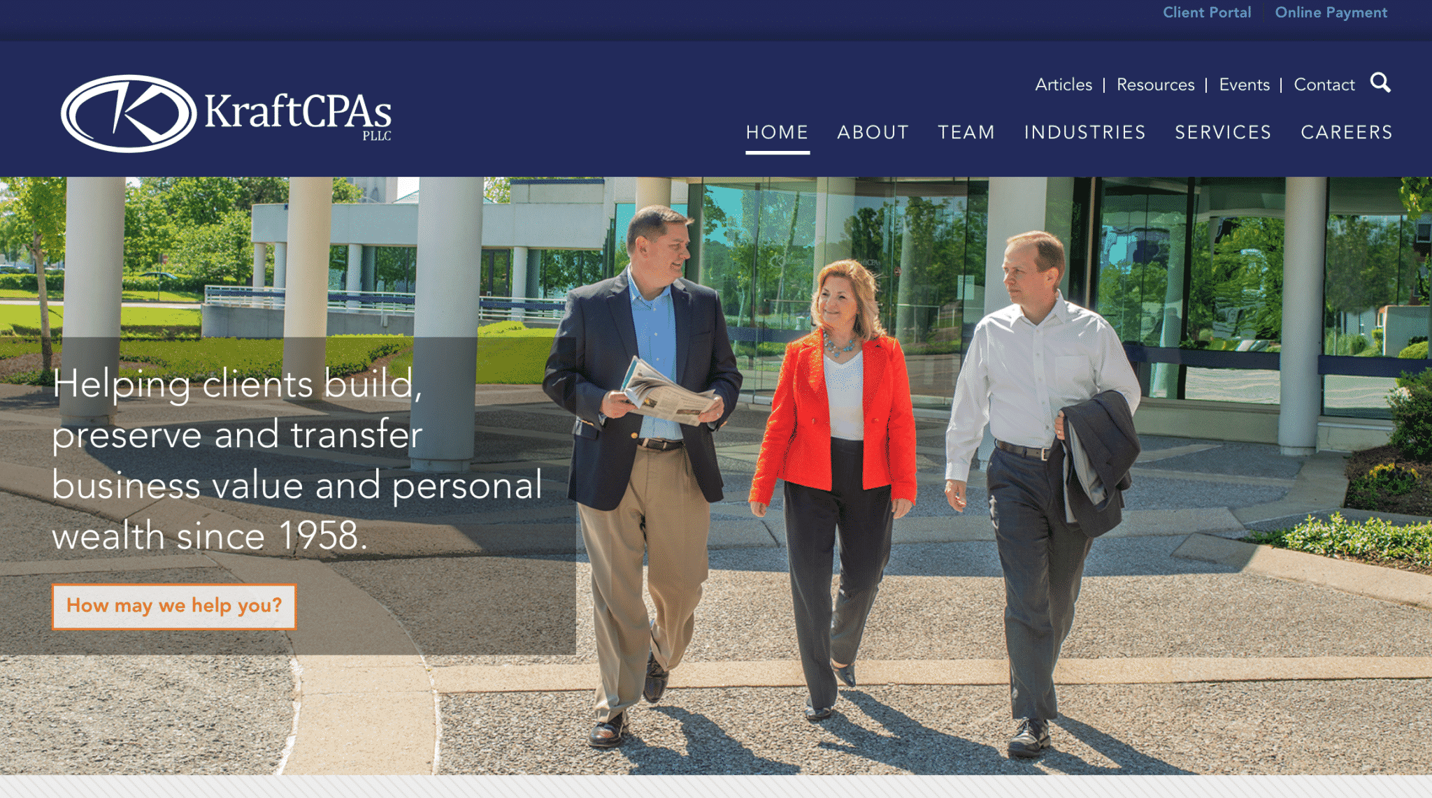
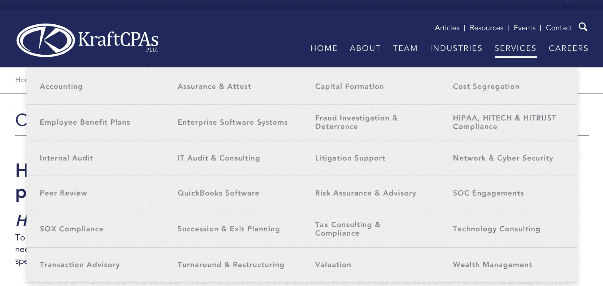
There’s a lot of information on their site, and it’s all easy to find. Each type of service that they offer can be found under its own category. Potential clients will be able to quickly scan this list and see if the firm can help them or not.
They also do a great job demonstrating their experience and credibility under their About tab. There, you can find testimonials, past awards, affiliates (which are sometimes seen as additional testimonials) and the history of the firm. All of this establishes trust early on.

3. Sage
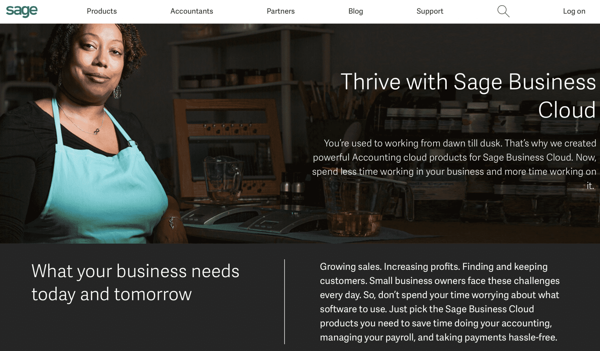
Sage offers small business management and accounting software and the first paragraph of copy you see really drives home the point of why you need the software. It’s exploiting a pain point of their target audience in a masterful way.
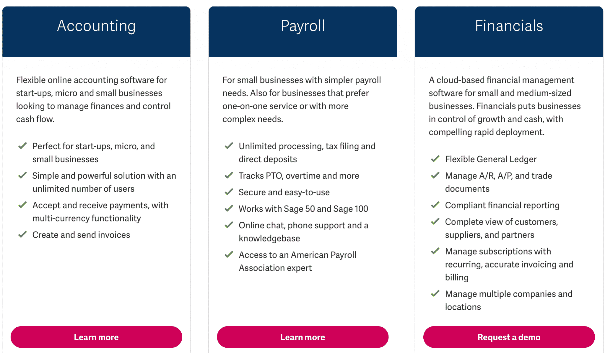
Then, they take you onto the practical: what their tools are and how they work.
After this, if you’re still not convinced, they have a series of high-quality video testimonials from different business owners explaining how the software helped them and their businesses. It’s a powerful first impression.

4. Keylay
This graphic design agency understands the importance of the visual and their site reflects that. Keylay‘s left side navigation bar is informative and easy to use, helping potential clients move quickly through the site.
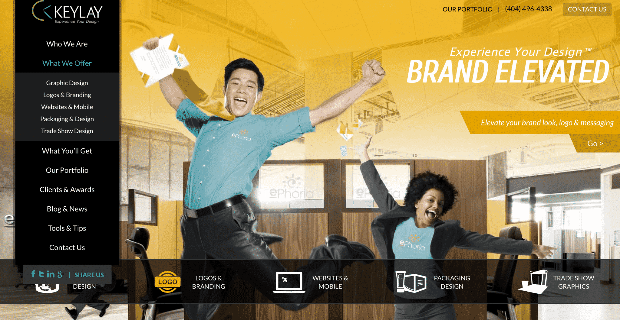
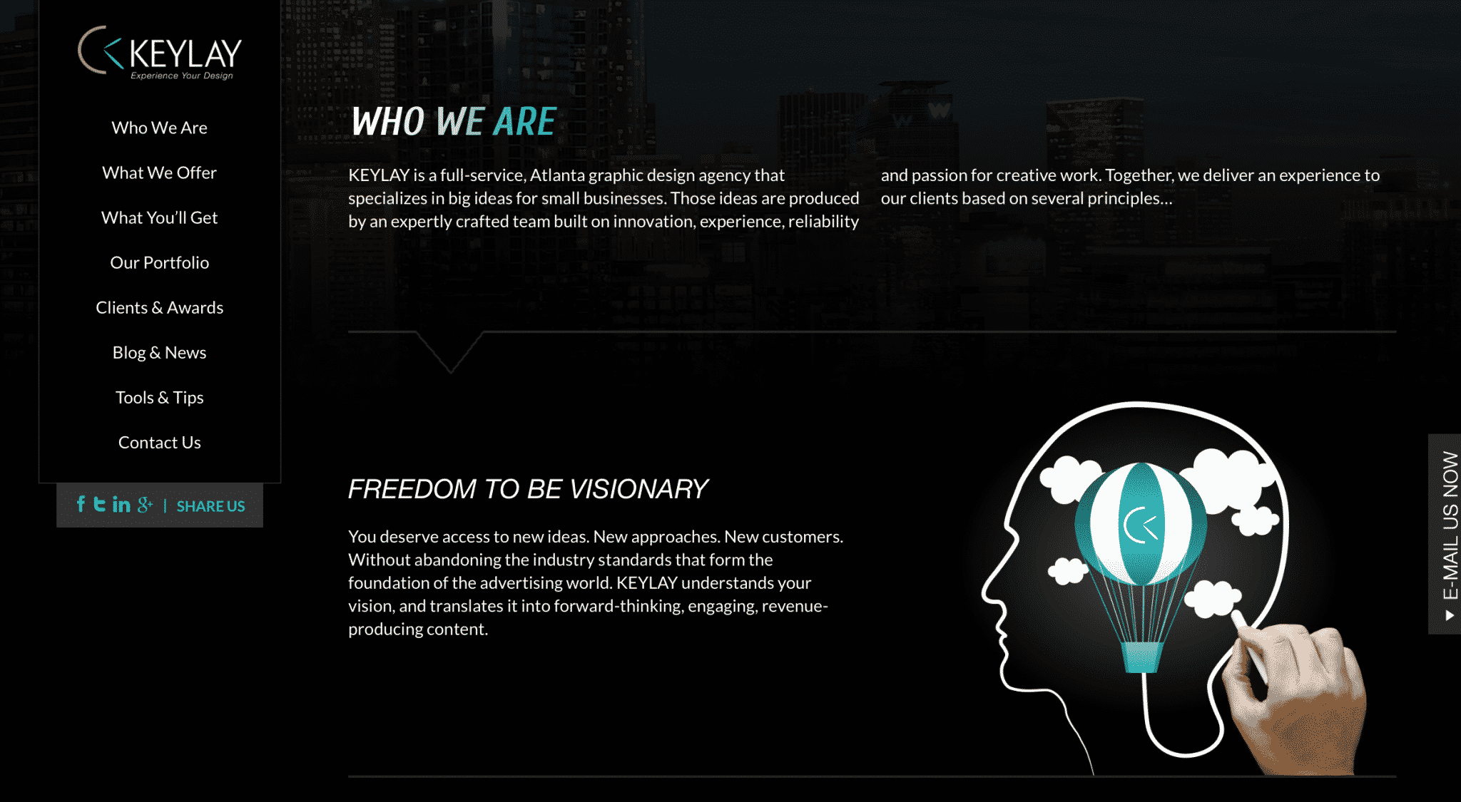
They organize a lot of information very well, making sure to still highlight both their services and the testimonials and awards. They also do an excellent job with branding. Everything about their site feels exciting and ambitious in a good way that makes sense with the promise to deliver “big ideas for small businesses.” This is an agency that is passionate and excited about the work they do, and that’s a good feeling for potential clients.
5. SmallWerks
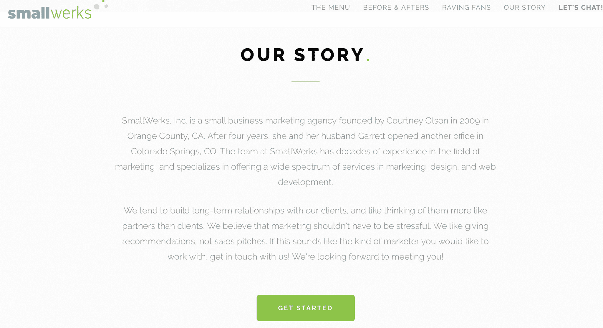
This digital marketing agency works on site design and development, and they set themselves apart with their story on their homepage. SmallWerks presents themselves as partners instead of a detached agency and make it seem like a tight, family business.
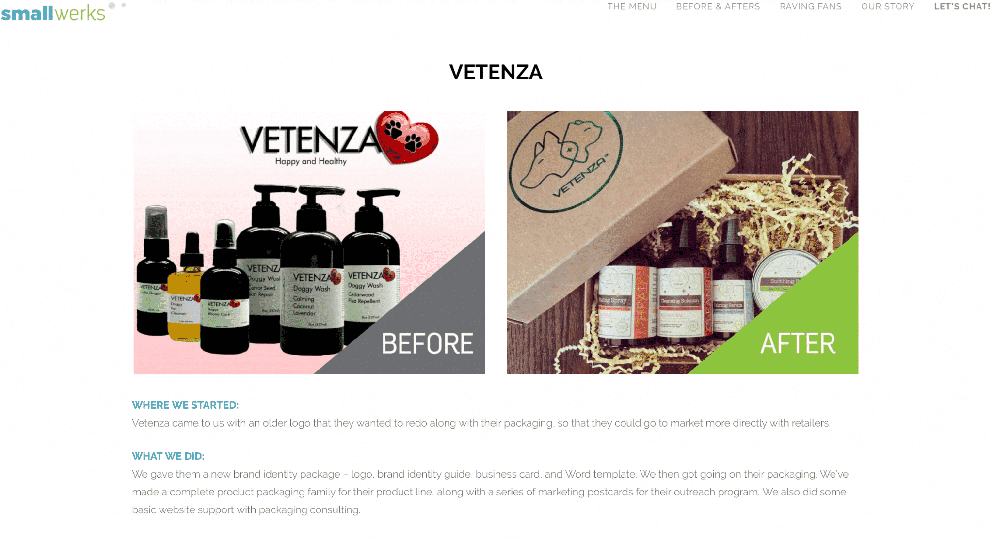
SmallWerks does an excellent job of showing viewers that they can back up their claims on an aptly-titled “Before & Afters” page. Here, they show what websites looked like before and after coming to the agency, with a description of why certain changes were made and what was done. The results are undeniably impressive.
6. OpenTable
OpenTable is seating software for restaurants and their homepage’s copy is why it’s made this list. They go hard with the stats, showing restaurants the immediate monetary value of signing up with them.
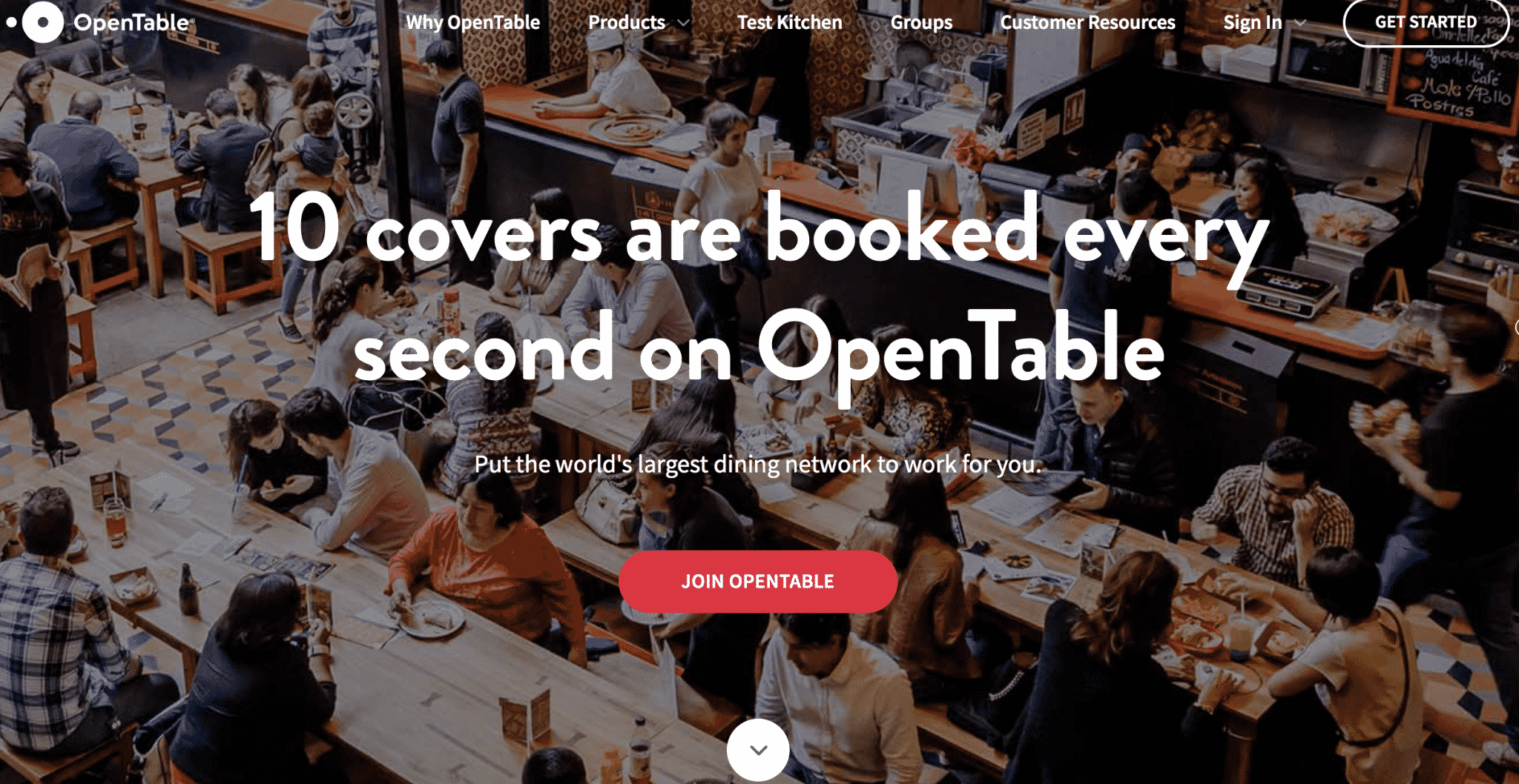
All they need to say is said: 10 covers are booked every second on OpenTable. They’re showing proof of demand, and starting to demonstrate value.
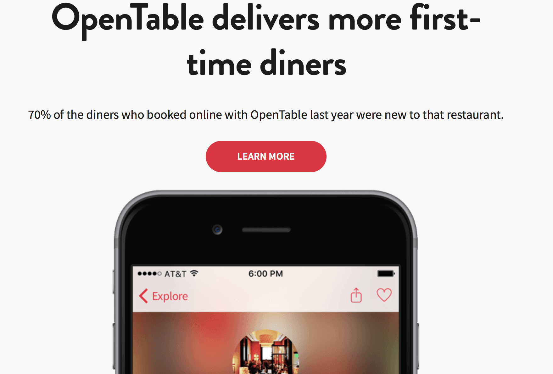
When you scroll down, they present you with more value. They deliver more first-time diners, with up to 70% of diners who booked being new to a restaurant. They’re not only providing restaurants with a reservation booking system, but also positioning themselves as a way for restaurants to connect with new guests. This is a great strategy, and it works.
7. Hixcox Business Insurance
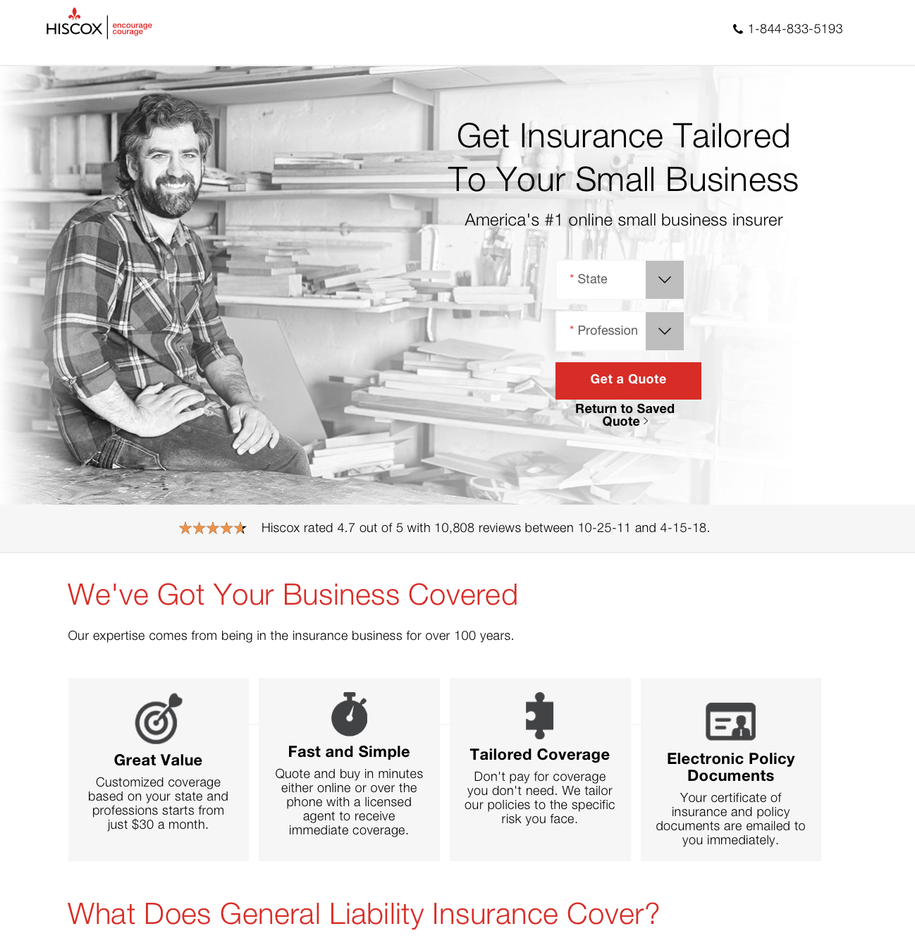
This small business insurance company makes it easy for users to find information they want quickly: a fast but semi-accurate quote. Hixcox Busines Insurance has their phone number visible in case potential clients would rather call, and place a note about their reviews right under the main image. Underneath this is a list of benefits to working with this company, making it hard to resist at least getting a quote.
They also address a question they’re likely asked a great deal on the homepage: what does liability insurance cover? This is informative and could decrease the number of potential clients calling in with this exact question.
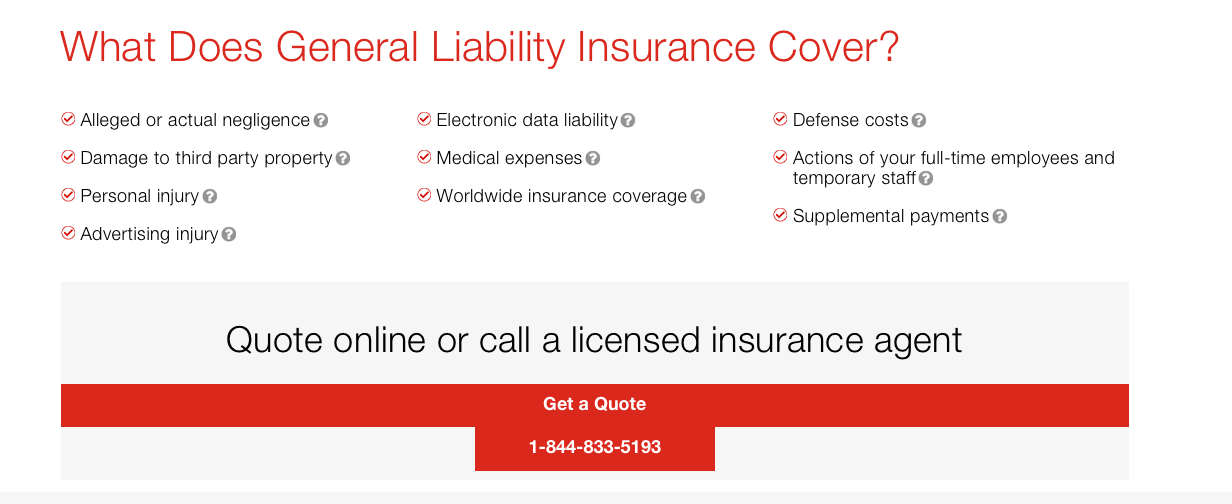
If you’re looking for a good one-page site design, check this one out. They execute it well.
8. Bedrock Protection Agency
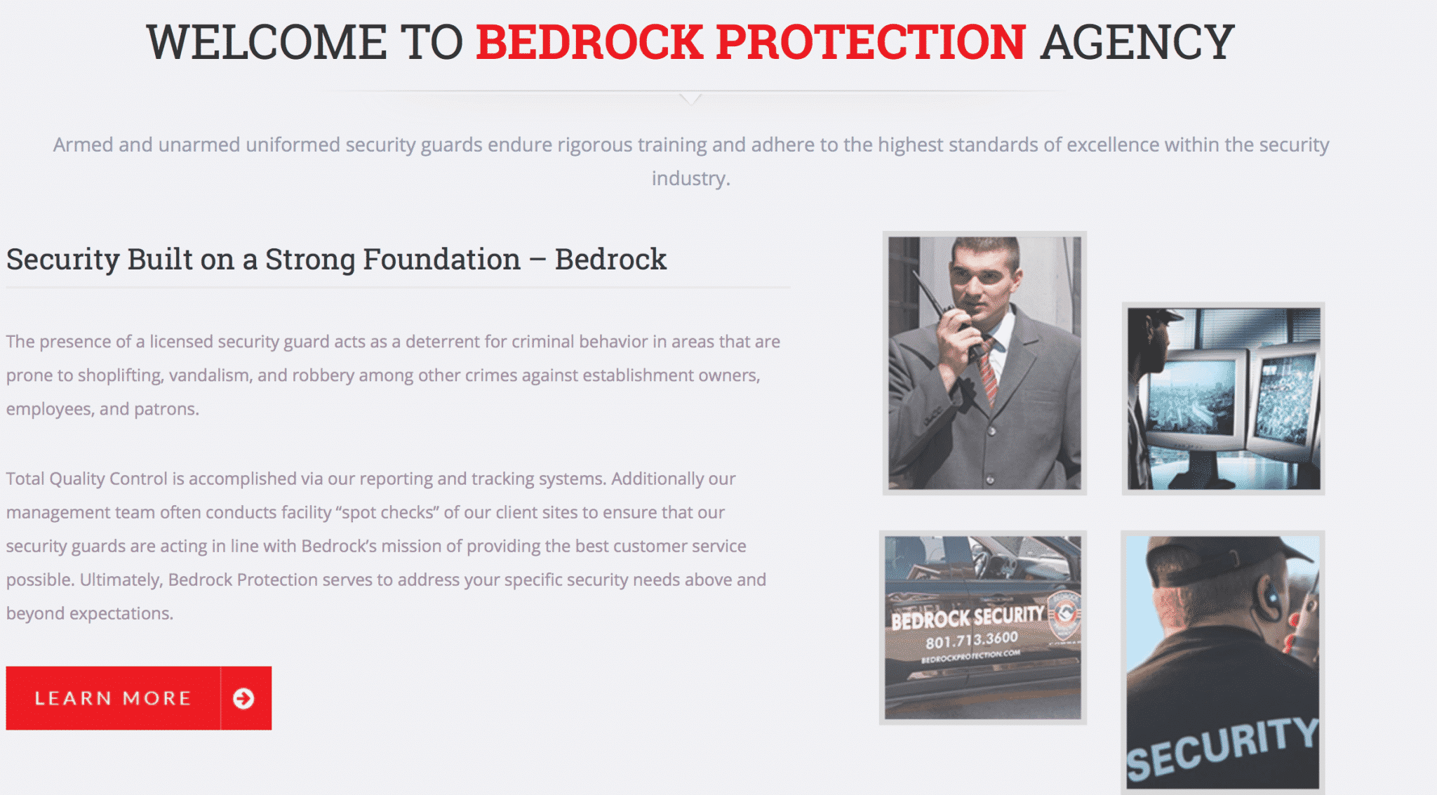
The Bedrock Protection Agency‘s site launches right into why security is needed for some businesses. They remind readers that the presence of a security guard can actually act as a deterrent of crime and can help to resolve any issues that do arise. They then position themselves as the ideal solution.
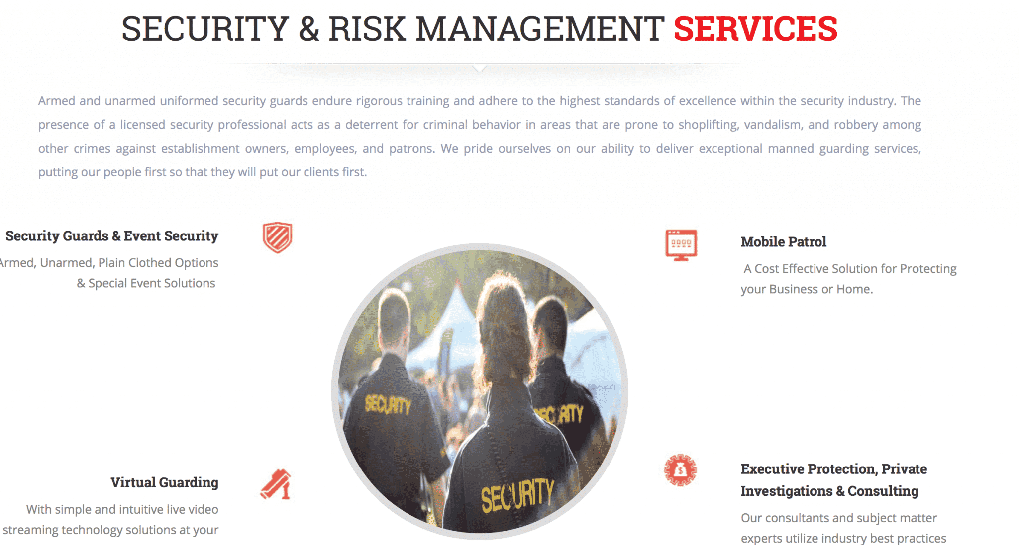
In the section next to it, they showcase different types of services with a brief snippet of information about the benefits of each. They provide in-depth information about these services under their own tabs, but this is enough to get potential clients interested.
9. Romano Law
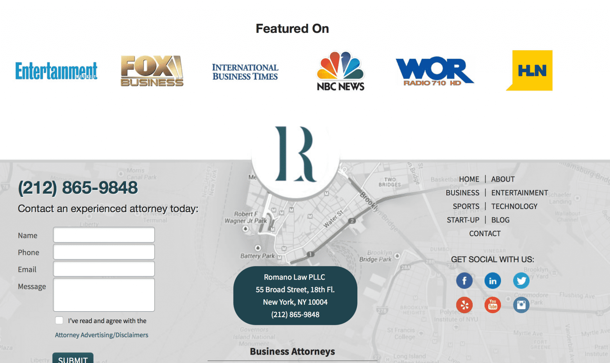
One of the biggest challenges that law firms have to overcome is that some clients don’t trust lawyers right off the bat. The Romano Law Firm uses a picture of smiling team members placed front and center in order to combat that, building rapport as quickly as possible.

They also have their contact information highly visible and showcase an “as featured on” section on their homepage that showcases big name publications they’ve been interviewed on. This establishes credibility and prestige.
10. CountonThat
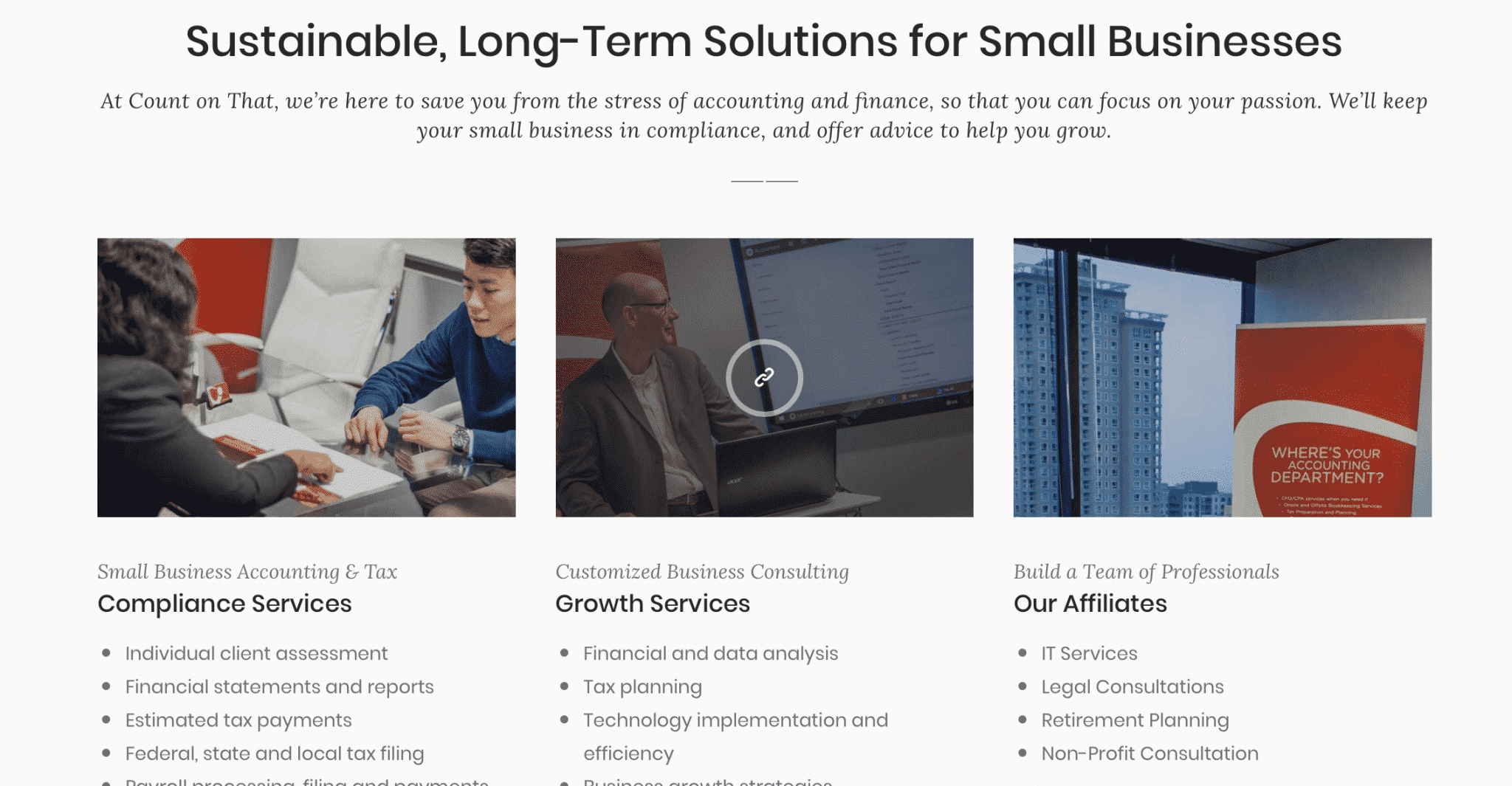
This CPA’s firm understands that not every business can afford a CFO, and they’re letting site visitors (and their target audience) know that a CFO isn’t necessary; they can help your business just as much.
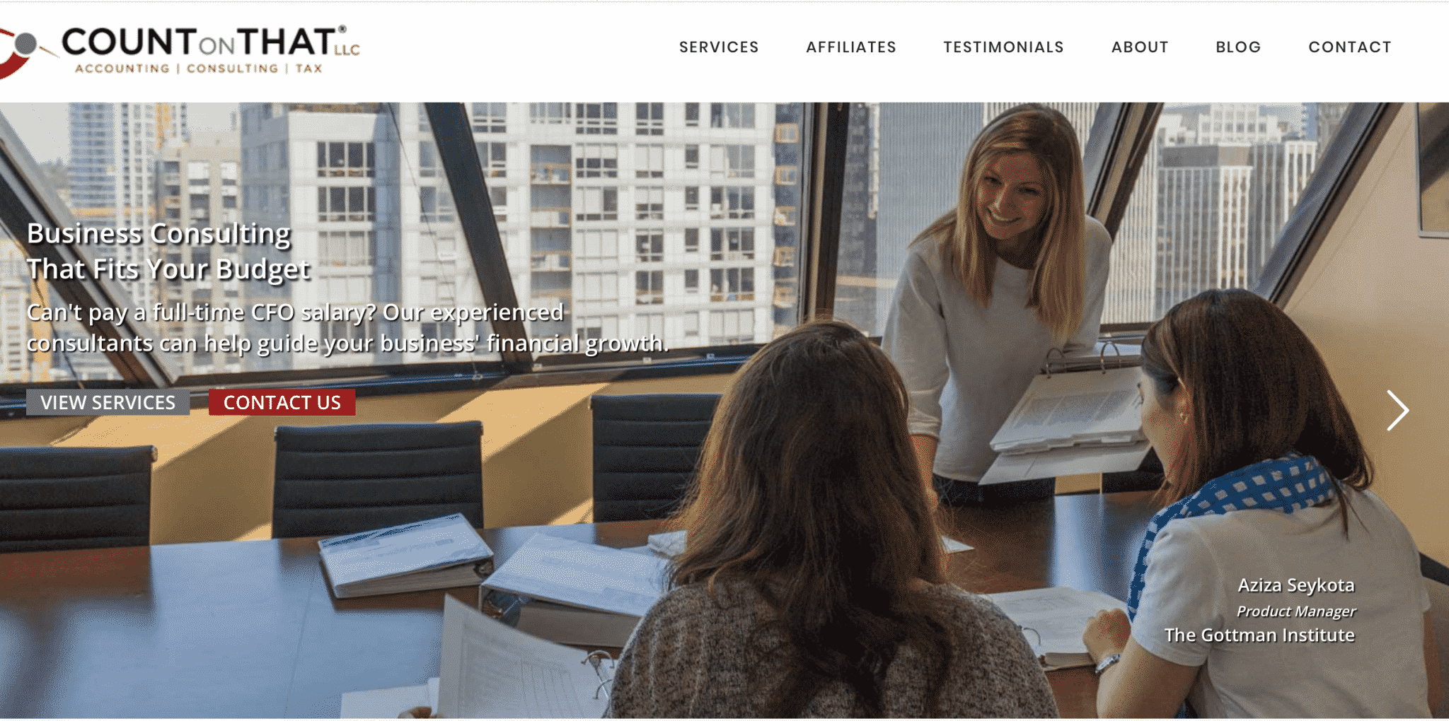
Count on That also uses language that focuses on long-term relationship building, automatically encouraging a rapport and a trusting mindset from potential clients. They place this above offerings like customized consulting and information about building a team to serve your business through their affiliates. The site is clean and easy to navigate.
11. Quorum
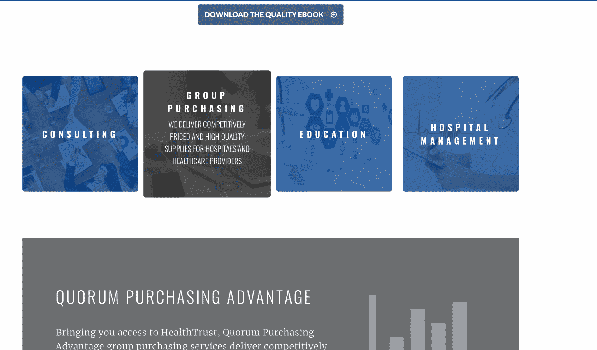
Quorum sells services and goods to healthcare providers and hospitals and they quickly break down their different services into different tabs to make their site easier to navigate.
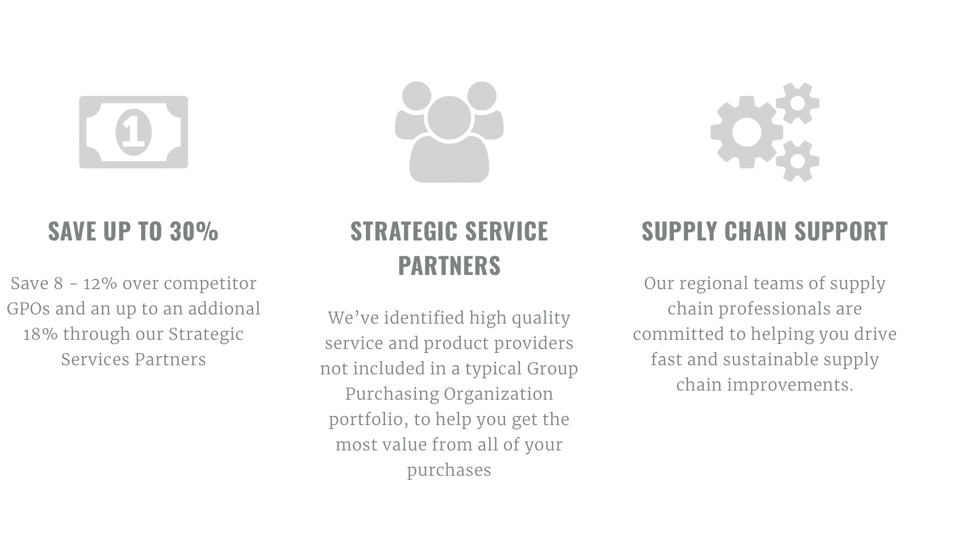
They do one thing well that we haven’t really seen yet on this list: they highlight the financial bottom line quickly. Their site explains that customers can save up to 30% with them, which is a significant sum of money…and a very persuasive argument.
12. Supercat Design
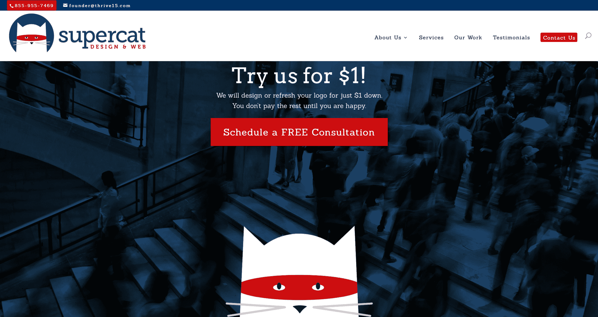
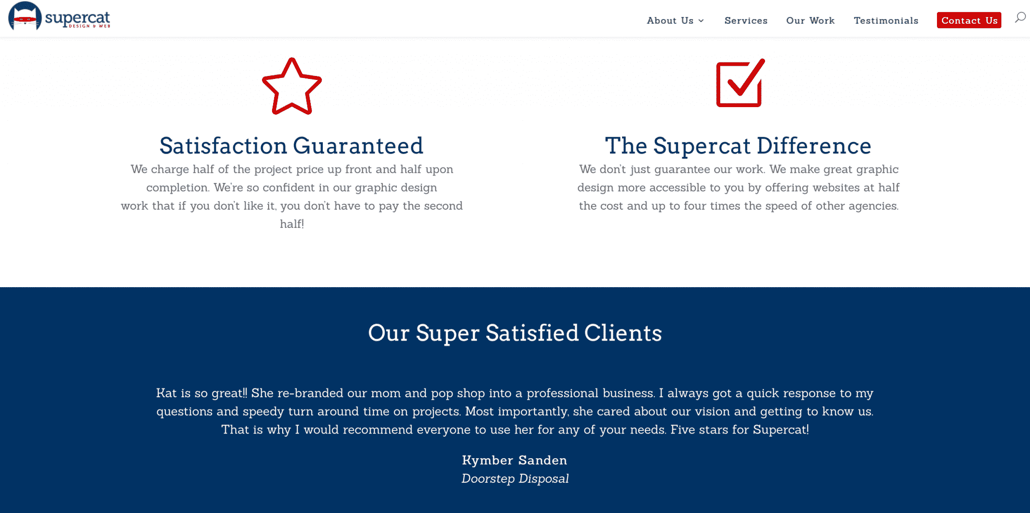
Supercat Design does a lot of great things just with their homepage. They immediately grab your attention with an offer of a free consultation and the promise to design or refresh the logo for $1 down. That’s an enticing offer, especially when many other agencies require much larger deposits up front.
Underneath this, they really drive home the point of the offer, letting potential clients know that customer satisfaction really is the most important thing to their business. They explain how their pricing works and how it’s designed to be low risk for the clients. Their satisfaction guarantee is strengthened by the testimonials placed immediately under it.
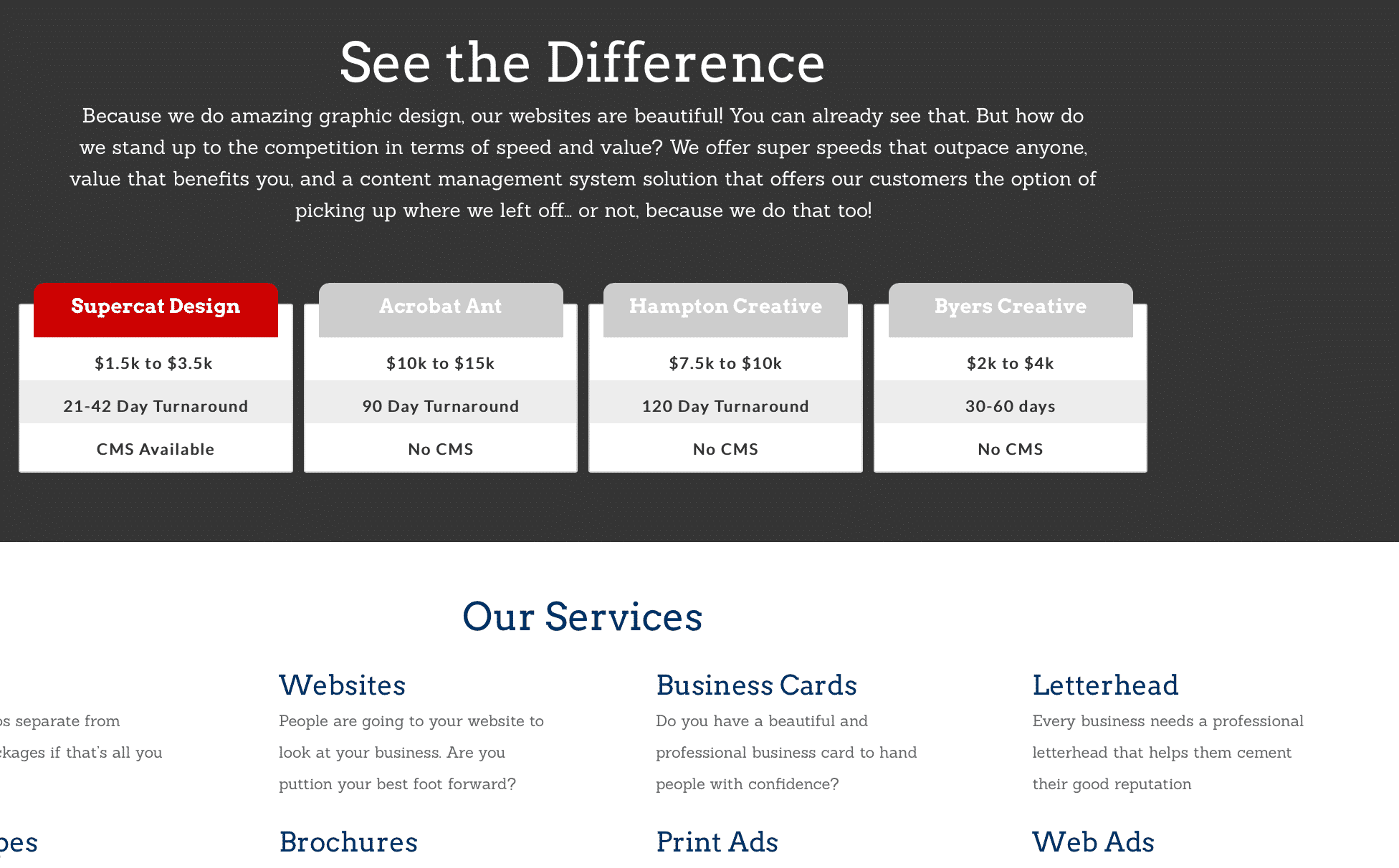
Towards the bottom of the homepage, they immediately finish answering the “why you” question clients like to ask to an agency. They show you that they can offer additional features, complete your designs faster and for less money than the competition.
Conclusion
These 12 different B2B websites are all great examples that demonstrate how you can create a gorgeous, interesting B2B website that stands out without breaking out of professionalism. They all have strong copy and intuitive designs and utilize branding to set themselves apart. You can take these strategies and adapt them to your own B2B website and what your audience is looking for.
What do you think? What qualities do you think all B2B websites need? Which B2B website was your favorite? Share your thoughts and questions in the comments below!

