How to Design a B2B Landing Page that Converts
by Jacob Baadsgaard


A good B2B landing page is the key to any effective B2B marketing campaign. Unfortunately, most B2B companies struggle to put together a decent B2B landing page.
If you think about it, though, this makes a lot of sense. In B2C, marketing is all about getting people to buy. As a result, B2C marketers put a lot of work into crafting landing pages that appeal to the specific needs and pain points of their potential customers.
Things are a bit different for B2B companies. In B2B, you aren’t selling to people—you’re selling to businesses, right?
Well, while it might be technically true that your target customer is a business, not a person, the fact of the matter is that you are still selling to people. A person, not a business, clicks on your ad and a person decides whether or not to convert.
So, if you want to run a successful B2B marketing campaign, you need to create a B2B landing page that is designed to get people to convert. Here’s how:
1. Keep Your Messaging Consistent
No matter what industry you are in, the key to an effective landing page is messaging consistency. In other words, the messaging of your ad should match the messaging of your B2B landing page.
In fact, messaging consistency is the primary reason why landing pages exist. A home page has to meet dozens (if not hundred or thousands) of different needs. A good marketing campaign delivers traffic with one specific need.
If that traffic lands on a home page with a hundred different options and messages, what are the odds that they’ll actually find what they’re looking for and convert?
B2B marketing campaigns perform best when they deliver a consistent experience. If your ad appeals to a certain type of person, your landing page should appeal to that person as well. That way, when they arrive on your page, they think, “This is exactly what I was looking for!” not “Wait, where am I and what am I doing here?”
2. Focus on Them, Not You
B2B or not, all businesses struggle with egocentrism. After all, you spend all day, every day thinking about and improving your product or offer. It’s natural to want to talk about all the special things that make your business unique!
The only problem is, the people on your site don’t care.
See, most people struggle with egocentrism, too. They don’t care how many countless hours you’ve invested into that nifty feature. They may not even care about the feature at all. Most visitors to your site are asking themselves one simple question:
Will this make my life easier?
Depending on what you’re selling and who you’re marketing to, you might answer that question in a number of different ways. For example, if customer service is a big deal to your potential customers, you may want to focus your page on how great your customer service is.
You might want to include testimonials about your customer service, awards your customer service department has won, statistics about response times…you get the idea.
The important thing is to keep the focus on how your customer service will make their life easier—not how awesome your business, product or offer is.
Ideally, your page should address what brought them to your page to your page in the first place. If they clicked on your ad, it’s probably because your ad addressed a problem or need. If your page is focused on how your business solves that problem or need, there’s a good chance they’ll convert. If all your landing page does is tell them that your business is great, they’ll lose interest and leave.
Do you see why messaging consistency is so important?
3. Create a Compelling Call-to-Action
The goal of any B2B marketing campaign is to get people to take action. Depending on your campaign, you might want them to submit a lead form, sign up for a trial period, subscribe to your email list…but your goal is to get them to do something.
But, if you don’t tell people what you want them to do, what are the odds that they’ll actually do it?
A quality call-to-action (CTA) solves this problem. Essentially, your CTA tells your potential customers what they should be doing next. It’s the old, “Submit”, “Sign Up”, “Get My Free Proposal”, “Try Now” button we’ve all seen on countless pages.
However, telling someone to “Submit” and actually convincing them to do it are two very different things. If you want people to act on your CTA, you need to convince them that doing what you want them to do is in their best interest.
With that in mind, your CTA should be a natural extension of your landing page. Remember, they are on your B2B landing page because they’re hoping that your business can solve a problem for them. Your CTA should show them how converting will get them one step closer to solving their problem.
For example, each of these CTAs makes it clear that if a user converts, they will get something of value that will help them:
- “Download Now”
- “Get My Free Proposal”
- “Send Me My Access Code”
Of course, the right CTA for your landing page will depend entirely on the specific problem or need of your target audience, but if you’ve already created a landing page that is focused on that problem or need, creating your CTA should be easy. Just ask yourself, “If a potential customer read this page and resonated with my content, what would they naturally want to do next?” The answer is your CTA.
4. Keep Things Simple
Often, when you’re creating a B2B landing page, it can be easy to overcomplicate things. There’s a natural temptation to think, “What if my target audience wants to know about X? I better add it to my page.” or “What about Y? That might be a point of concern for my audience…I should probably throw that in, too.”
Before you know it, you have a landing page that looks like this (I split the page into 3 columns so you wouldn’t have to scroll all the way through their whole page):
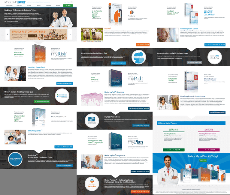
However, the fact of the matter is, most people don’t scroll very far down your landing page. And, those who do, don’t usually read most of your content.
Remember, your potential customers are on your page because they have a specific problem that they need solved. If your landing page makes it obvious that your business may be able to meet their needs, they’ll convert. If not, they’ll leave.
So, even if your landing page does address that one specific concern that a potential customer might have, but they have to hunt through your page to find the answer, most people won’t take the time to find that answer. The issue might be worth addressing a separate marketing campaign and landing page, but if you feel like you need to include tons of extra content to get people to convert, you probably don’t know your target audience’s needs and problems well enough.
This applies to forms as well. Longer forms tend to decrease conversion rates, so if you don’t need to know their gender, weight, height, weight, credit card number and billing address, don’t ask for it! Keep your forms focused on the information you truly need.
However, keeping things simple doesn’t always mean keeping things short. Sometimes, what you are asking people to do comes with a lot of risk. If you want them to convert, you need to really convince them that your business will solve their problem. That may take a lot of words.
But, before you turn your B2B landing page into an essay, ask yourself the following questions:
- Am I overcomplicating things? If you only need a phone number and your sales team can resolve any additional questions, focus on getting the phone number.
- Can another medium solve the problem? Sometimes, a video or image can be worth a thousand words of text. If an image can say it better, try an image.
- Does my ask make sense? If someone is making a purchase and you are asking for a credit card, you shouldn’t have to worry about convincing them to give you their credit card. However, if someone is signing up for a free trial and you’re asking for a credit card, that may need a little more explaining.
In general, the best B2B landing pages keep things simple. Their content is directly focused on the needs of their visitors and their forms only ask for relevant information. How much content or how long of a form you need will vary from business-to-business and page-to-page, but a simple, focused page will almost always outperform a more complicated one.
5. Use Social Proof
People put a lot more stock into what other people say about your business than what you say about your business. After all, you get paid to say good things about your business.
So, if you really want to convince your potential customers that you can solve their problem, it’s often best to let your current customers do the talking.
Testimonials and customer reviews are one of the most compelling elements of a landing page. They give people an opportunity to really get a sense for what it’s like to buy what you’re selling.
Here are a few ways to get the most out of social proof:
- Get testimonials from well-known sources. An endorsement from Oprah means a lot more than an endorsement from Orpah. If Oprah endorses the wrong product, that can have big repercussions for her good name. If Orpah endorses the wrong product, well, who is Orpah anyways?
- Add more details. Liars avoid the details. Therefore, the more details (location, company name, statistics, case studies, etc) you have, the more believable your testimonial will be.
- Include images. A quote is good. A quote with a picture is better. A video testimonial is awesome.
Social proof is what makes your marketing message meaningful. Without it, your landing page just feels like bragging.
Conclusion
A well-designed, focused B2B landing page can be the difference between a mediocre B2B marketing campaign and a gold mine. Fortunately, by applying the principles in this article to your landing pages, you can create an incredibly compelling landing page for your B2B business.
Incidentally, if you’d like some help putting together some high quality B2B landing pages or would just like some feedback on your existing landing pages, let me know here or in the comments. I’d love to help.
How do you approach B2B landing pages? Are there any tricks you use to improve conversion rates on your pages? Let me know in the comments.