9 of the Best Ecommerce Sites You Need to See
by Ana Gotter • February 21, 2018
The first time I went to build my own site, I thought that the technical side of things would be the hardest part. I genuinely believed that picking out a domain and a web host and trying to choose a content management solution (CMS) was going to be the end of me. It turns out that this was the easy part, taking me not more than two hours.
While it might seem simple, designing an effective ecommerce site is hard. You need to choose a design that has strong, intuitive navigation, will easily be mobile responsive and that just plain looks good. You can comb through thousands of themes to create your site, or hire a designer to create a custom theme for you.
But, before you get started with any of that, it’s a good idea to take a look at what is already working for other business. With that in mind, let’s take a look at nine of the best ecommerce sites out there. We’ve got examples from a number of diverse industries all included. They’ll give you all the ideas and inspiration you need when creating your own, in terms of both aesthetic and navigation.
1. MOO
For anyone who needs new business cards, I highly recommend MOO. Unsurprisingly, it was their high quality site that sucked me in the first time (though the high quality cards are what kept me around).
MOO’s navigation bar isn’t quite like other brands. Instead of having multiple drop-down menus for different products, all their products fall under one option. Other drop-down menus included in the main navigation bar are inspiration, FAQ’s and an option for “10+ employees?” This isn’t how most ecommerce sites are set up, but it allows them to list main selling points quickly.
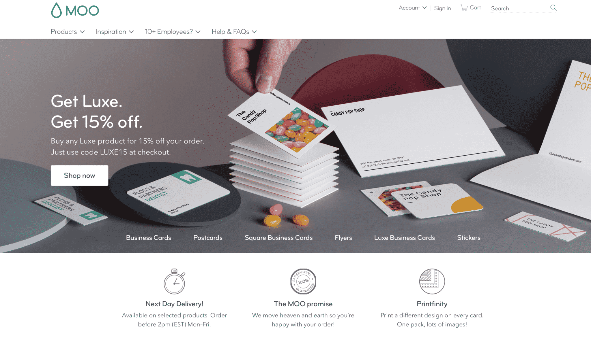
Oh, and want to see something really awesome? They still have a gorgeous home page even if you already have an account—they just customize the message on the header image with an offer addressed to you.
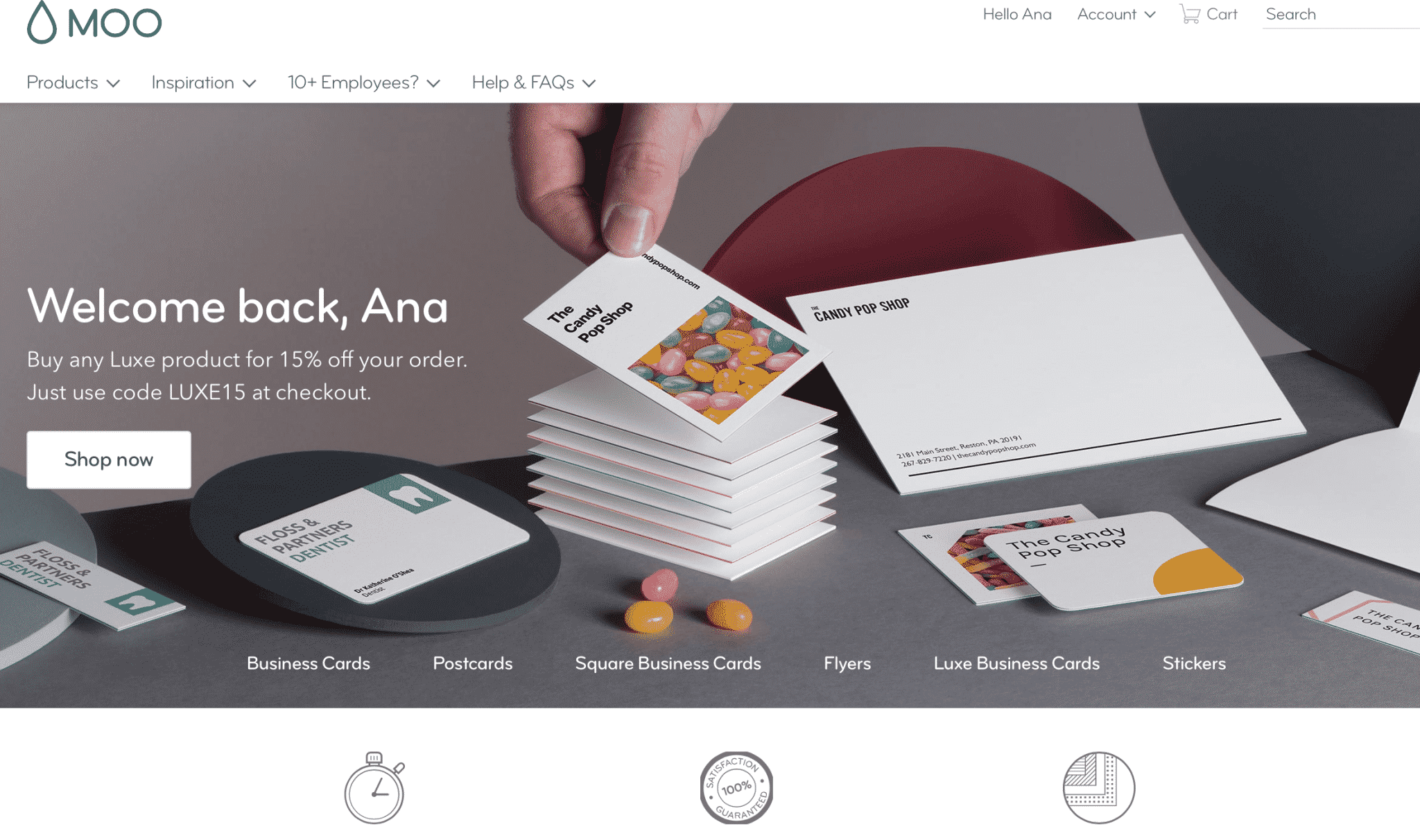
It doesn’t matter if that offer isn’t just for you, the fact that it feels like it is can be enough and it’s special touches like this that make MOO one of the best ecommerce sites around.
2. The Cultured Cup
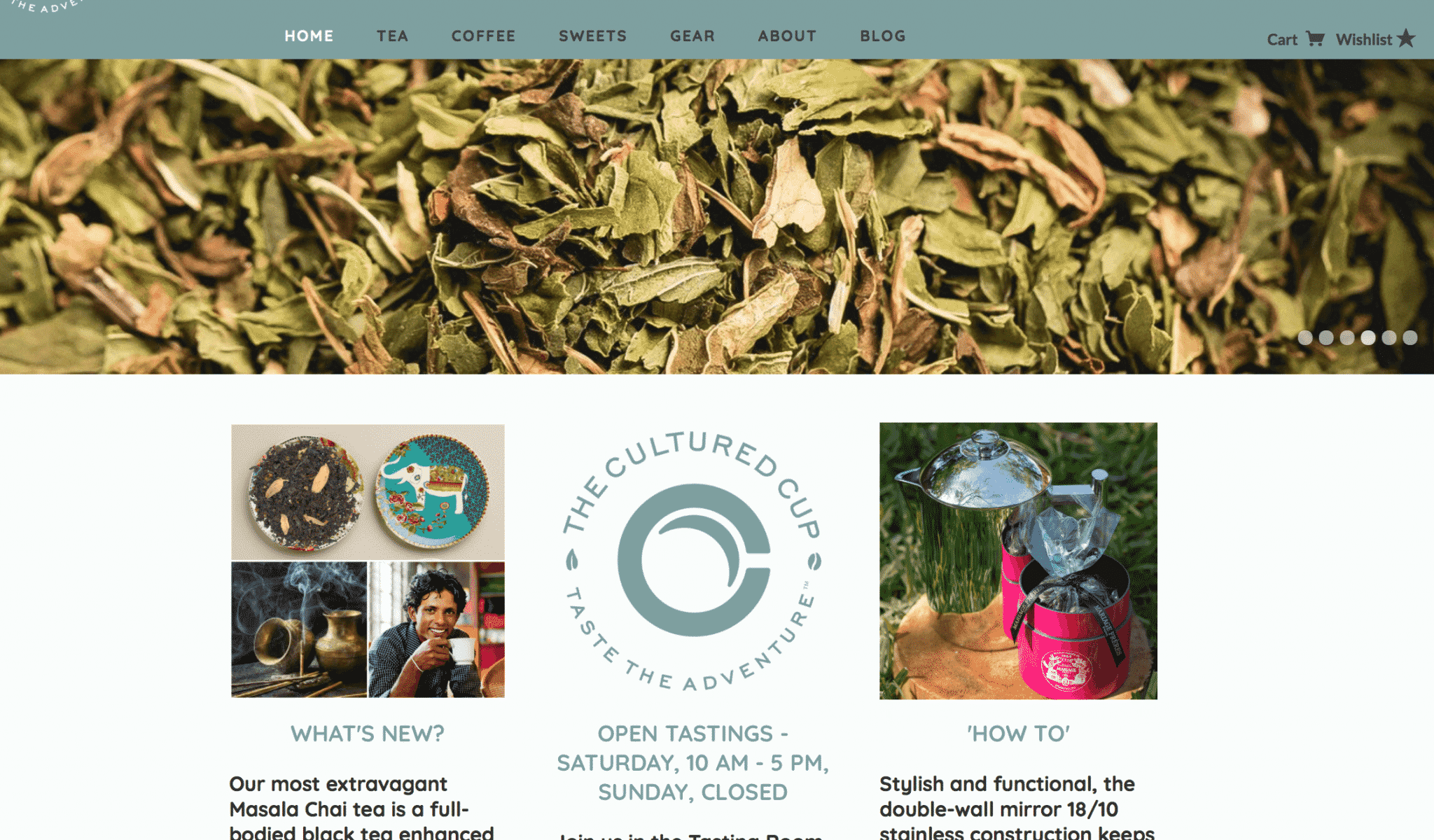
The Cultured Cup sells just about everything related to tea and coffee and their site is one of the best ecommerce sites in the food and beverage industry.
The home page is stunning, with a slider bar that shows beautiful header images and some announcements. There’s a clean navigation bar that takes users to different types of products quickly and underneath the header you can find information promoting their services, events, and tutorials for how to use their products.
One more thing that caught my attention immediately when I visited the site? They have a small pop up that is displayed immediately after a user visits the site, asking if they want to see the tea or coffee products.
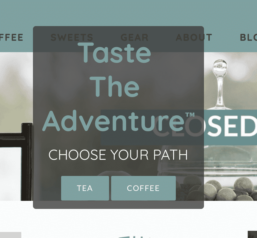
The messaging of “choose your path” works well with their “Taste the Adventure” branding, and it also helps to keep users moving through the site quickly before they get bored.
3. DocuSign
A lot of businesses will be familiar with DocuSign, which allows users to sign documents electronically, or send them to others and request signatures. For those who aren’t, however, DocuSign has one of the best ecommerce sites out there and it does an excellent job of explaining the service quickly thanks to a mix of smart copywriting and an excellent layout.
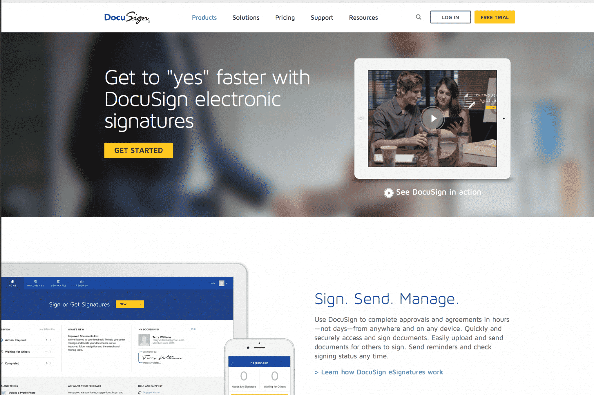
Their header image has succinct copy that explains exactly what the product is, with a CTA that immediately encourages users to “Get Started.” In case they are confused, there’s a prompt next to this text that lets users know they can view a video that will explain the service.
Immediately under this, DocuSign explains their value by reminding users how simple they can make the process. The quick copy and simple design together work to push users through the funnel, having a CTA every step of the way so they’ll convert as soon as they’re ready.
4. Legend-Tees
Legend-Tees is a fashion ecommerce site with a beautiful home page. There’s a clean navigation bar at the top, and they use more abstract outdoor photos to advertise Sport Tees, Custom Tees, and Casual Tees. They’ve designed their site for the aesthetic and the branding instead of just promoting items outright.
In short, they’re going for the feeling.
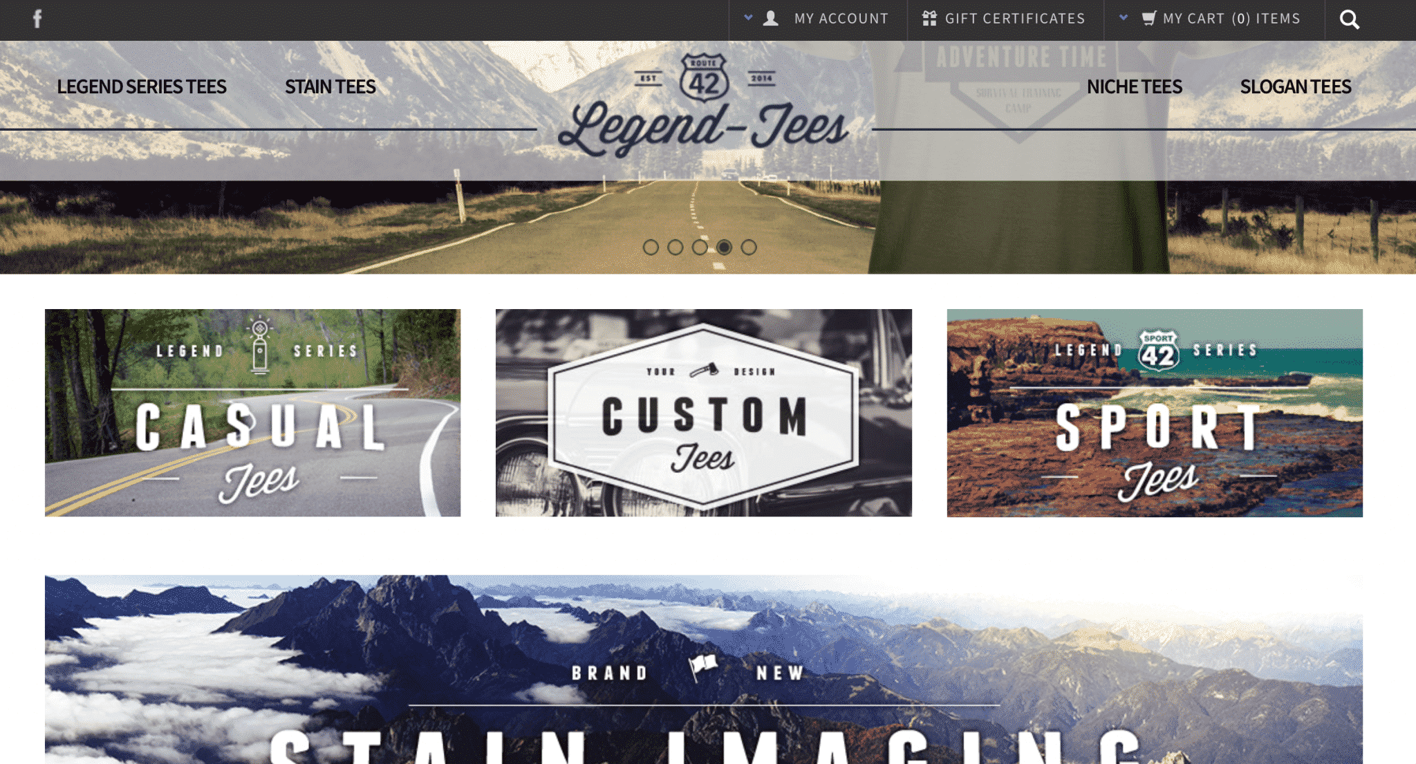
Their site design also features some of their biggest selling items—including their custom tees—above the fold with a clickable image that will take users right to what they’re looking for.
The site layout is intuitive, and it’s exceptionally easy to find exactly what you’re looking for. And, underneath the fold, they promote their Tee of the month club.
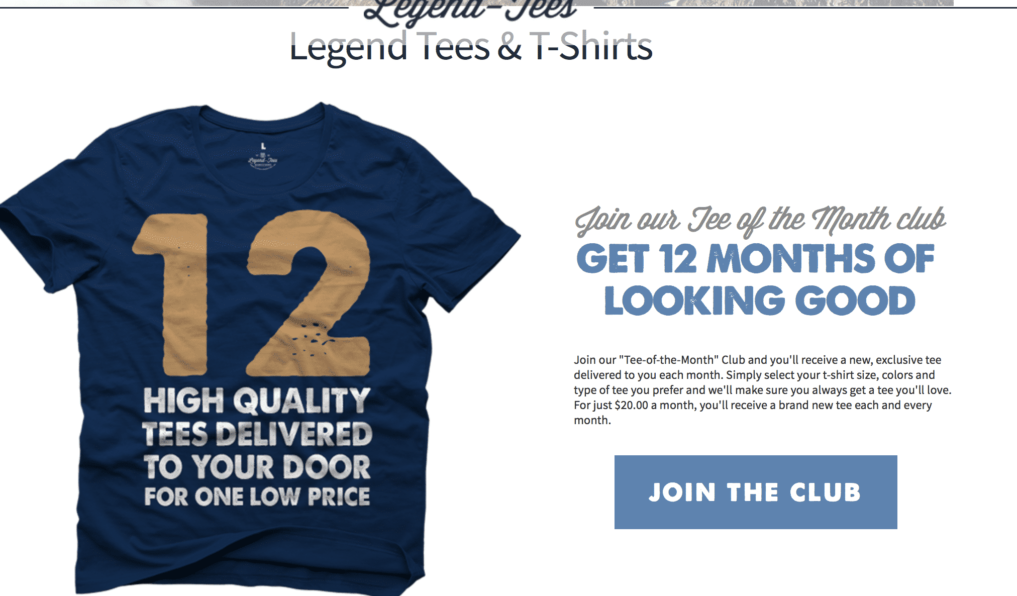
This is still on their home page, so it will still get a lot of attention but they showcase other products first so users know they aren’t just a subscription service.
5. Dollar Shave Club
Dollar Shave Club has built their business successfully by creating an exceptional web presence, so it should come as no surprise that they have one of the best ecommerce sites.
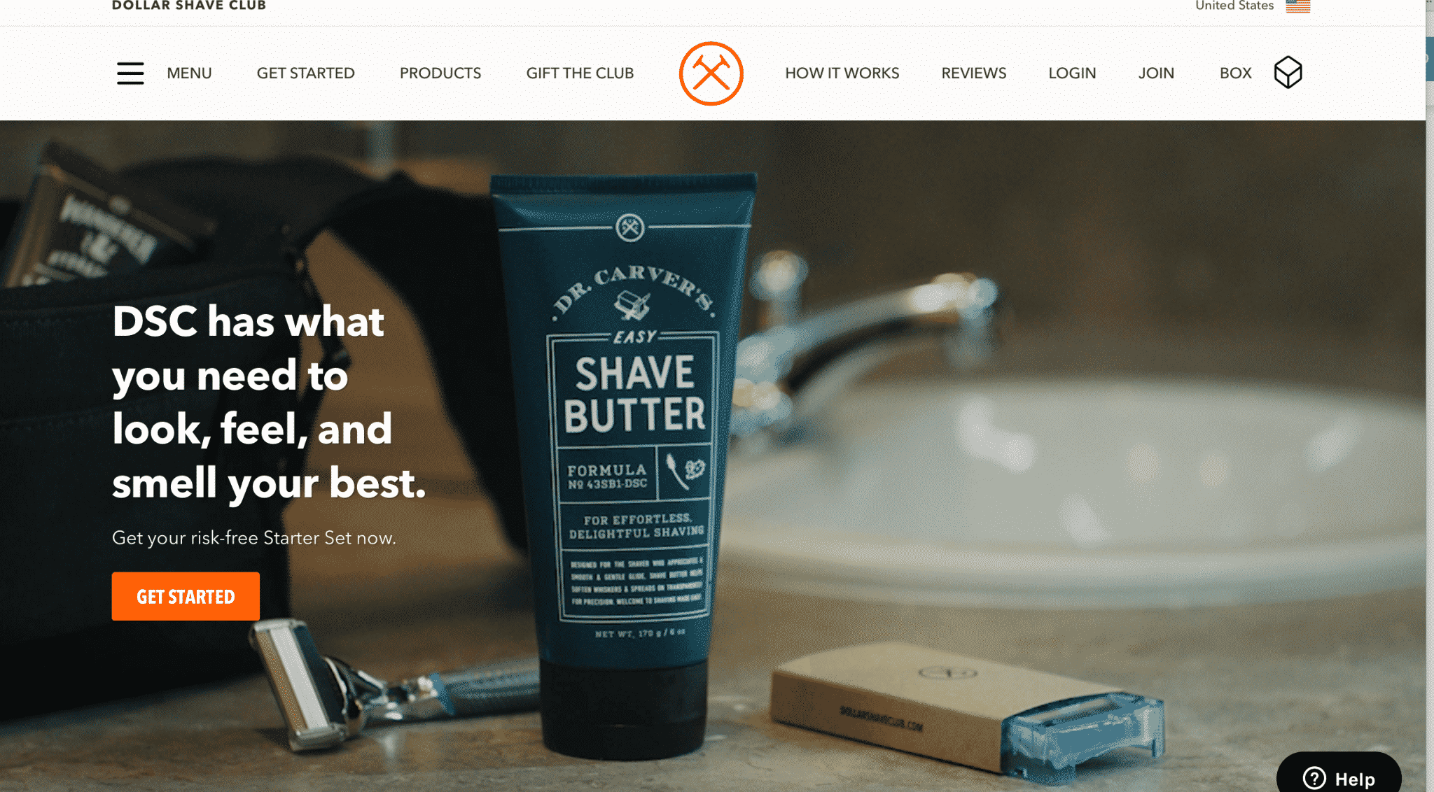
Dollar Shave Club uses an entertaining video instead of a header image, which cycles through a starting point where all the products in their starter shave kit are featured. They emphasize that this starter kit is risk-free, making winning over customer’s trust just a little easier.
That being said, they know that this site design absolutely won’t work for mobile. Mobile users, after all, aren’t big fans of auto-loading, playing-on-a-loop videos, which can take too long to loud and eat up their data.
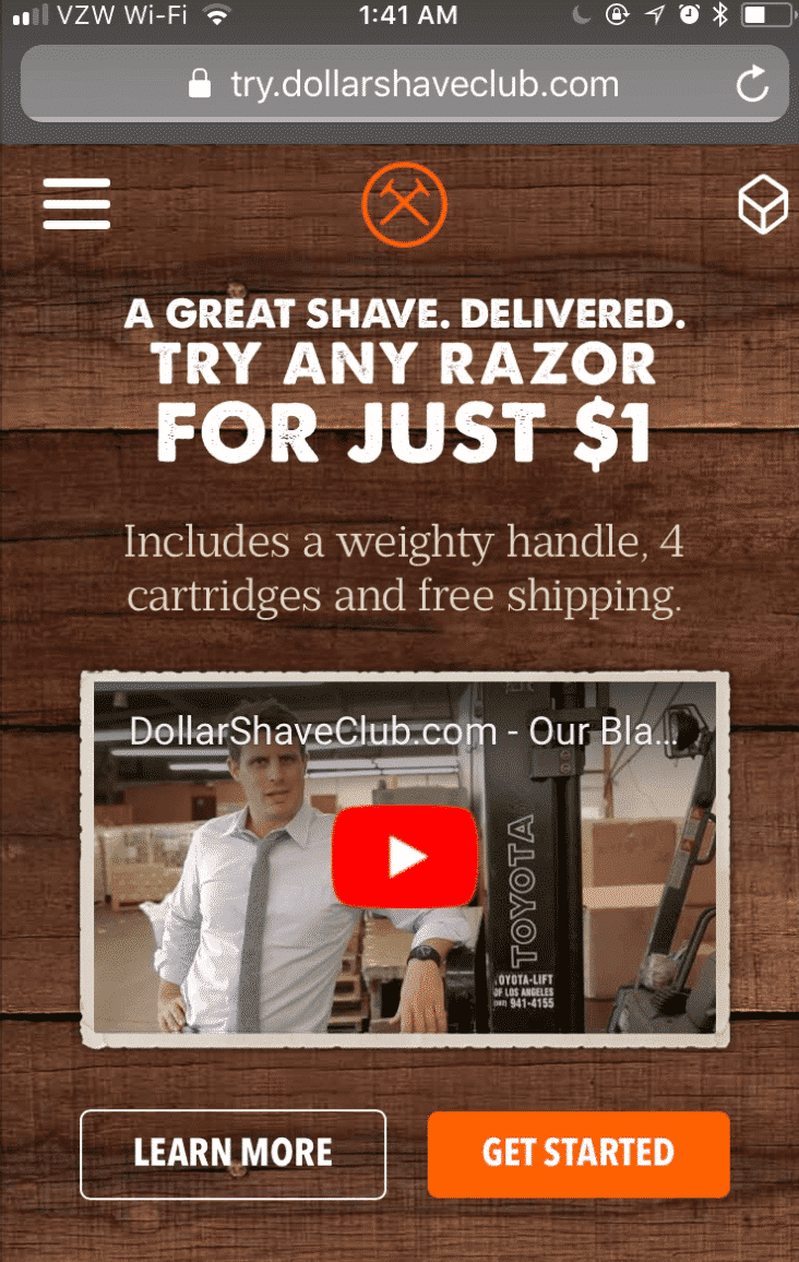
Instead, the mobile site quickly explains the product and then gives users the option to load a YouTube video underneath. This shows the importance—and effectiveness—of designing your ecommerce site specifically for mobile traffic instead of hoping your mobile-responsive site will meet their needs.
6. Tamara Knight Photography
This local Orlando photographer takes everything from family portraits to professional head shots, but her business model is more creative than other photographers I’ve seen. She offers packages, including hair, make-up and wardrobe selection, along with physical products like prints and photo albums for extra costs and her site is set up to promote these features.
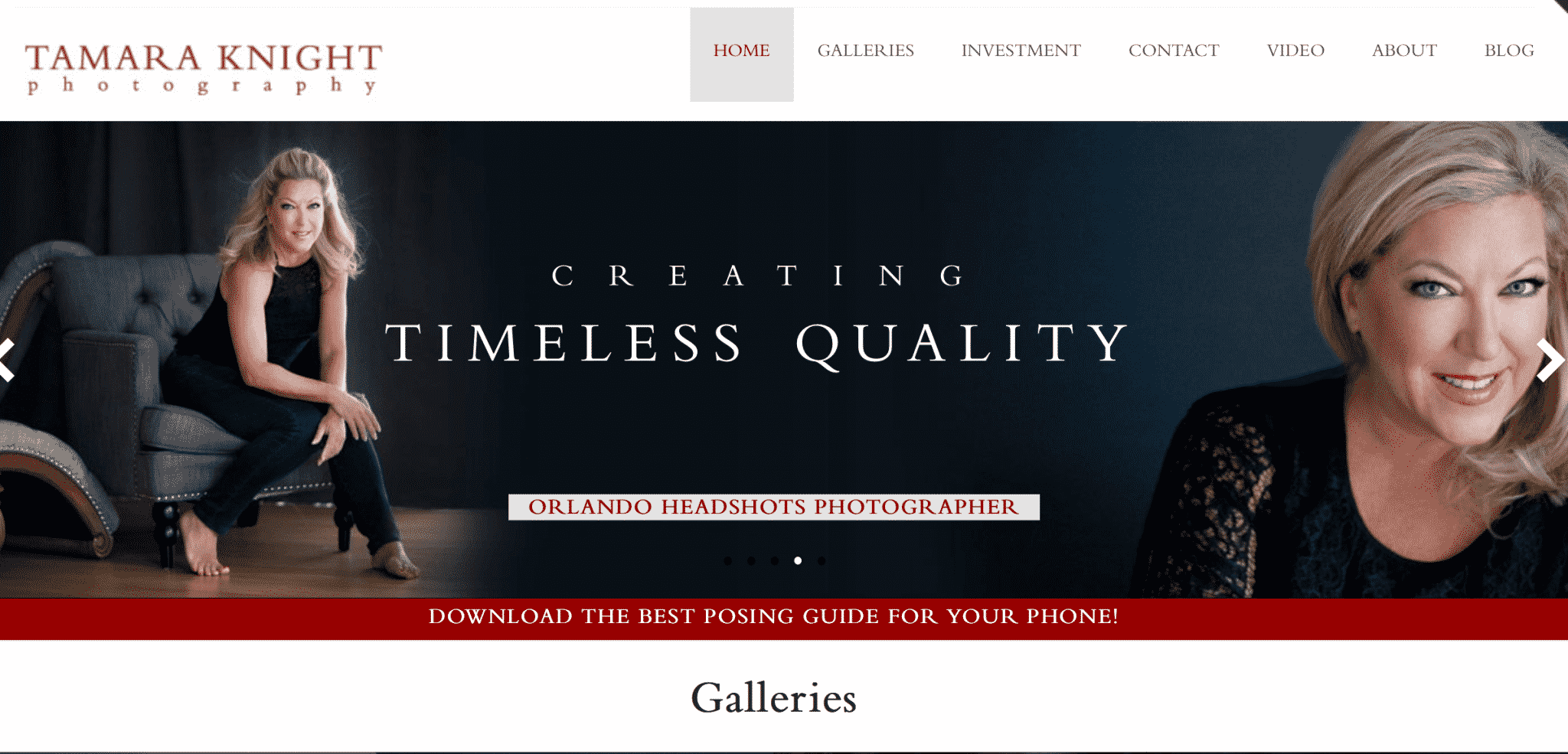
Unsurprisingly, gorgeous photos are center-stage on this site, but she uses white space against the photos to highlight a natural path users can take throughout the site.
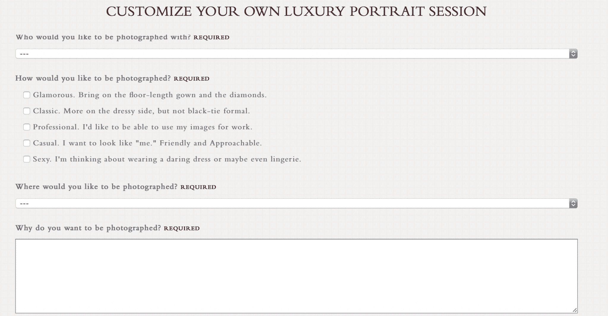
As you can see, this path leads users to a posing guide she created, with an immediate contact form towards the bottom of the first page to draw leads in quickly.
7. Soul Socks
Soul Socks is a subscription socks company with one of the best ecommerce sites in the apparel industry. Above the fold, they have a gorgeous image with socks (their product) that pop against the otherwise drab image—it’s perfect.
Soul Socks explains what their product is succinctly and then offer you two options: Join the Club, or Give a Membership.
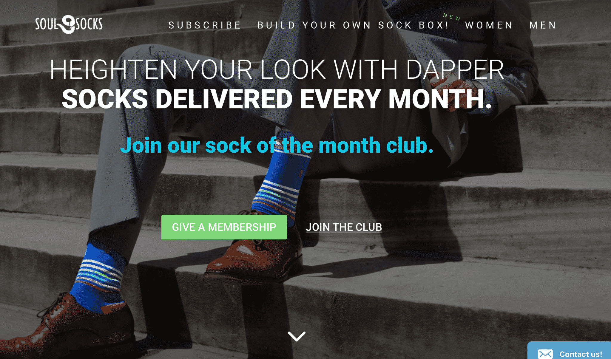
There’s a good chance that they realized early on that more people were gifting their service to others instead of buying it outright for themselves. This isn’t uncommon with certain luxury, novelty goods. By highlighting the option to gift the membership and making it easy for users to do so, they give themselves a major competitive edge.
8. Good Start Packaging
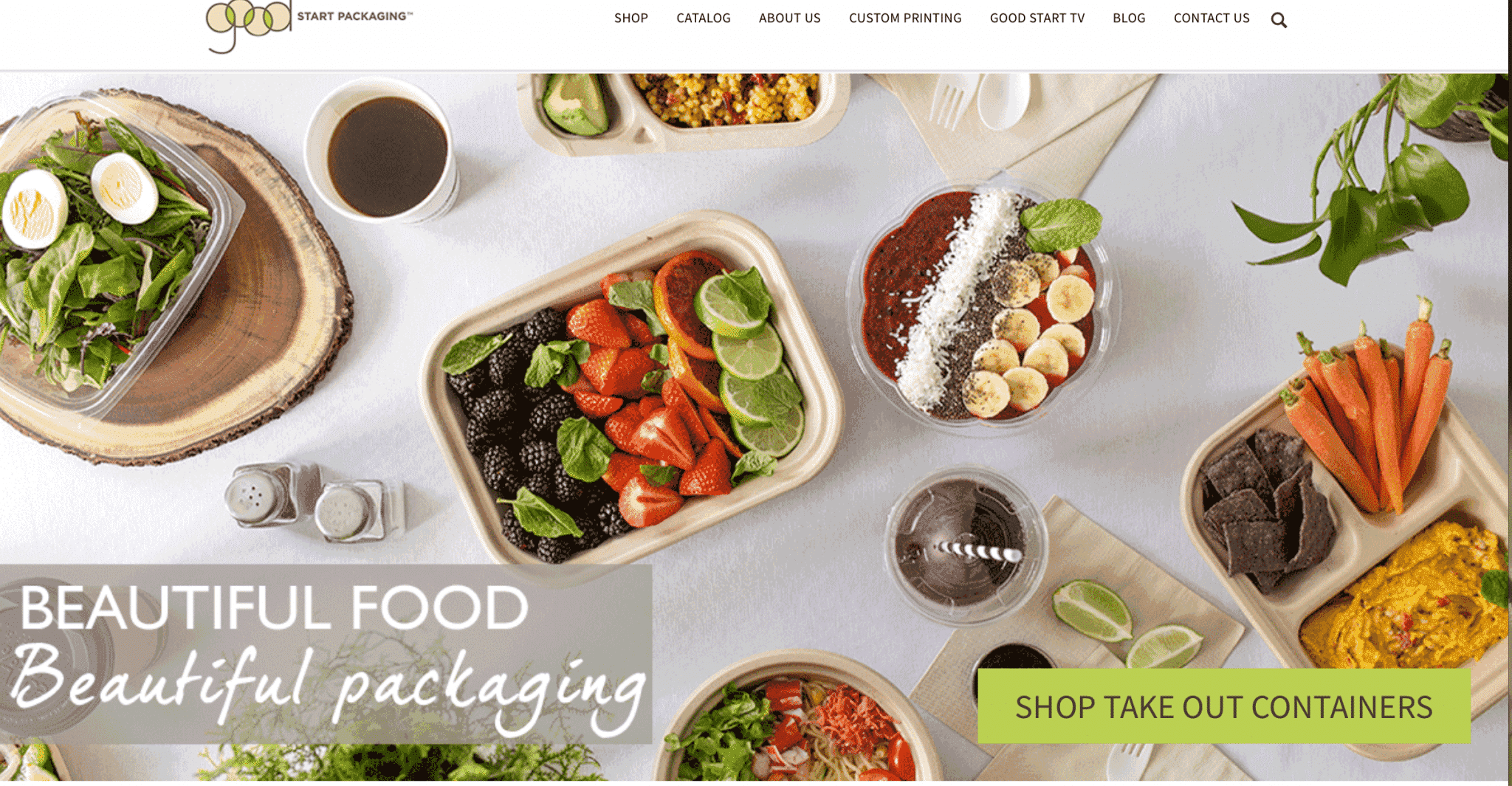
Good Start Packaging sells compostable take out containers for restaurants, and their site—like many others on this list—is beautiful and has outstanding navigational designs.
The home page’s layout is designed to introduce buyers to the product while simultaneously overcoming objections all at once. When you first visit, you’ll see a number of their different products with a highlighted CTA to “Shop Take Out Containers.”
If that doesn’t work just yet and users need a little more incentive, they’ll give you that immediately underneath the fold. They have small tabs that show different benefits of purchasing with them, including mentioning the green movement, promoting the brand’s story, and highlighting that their products are sustainable.
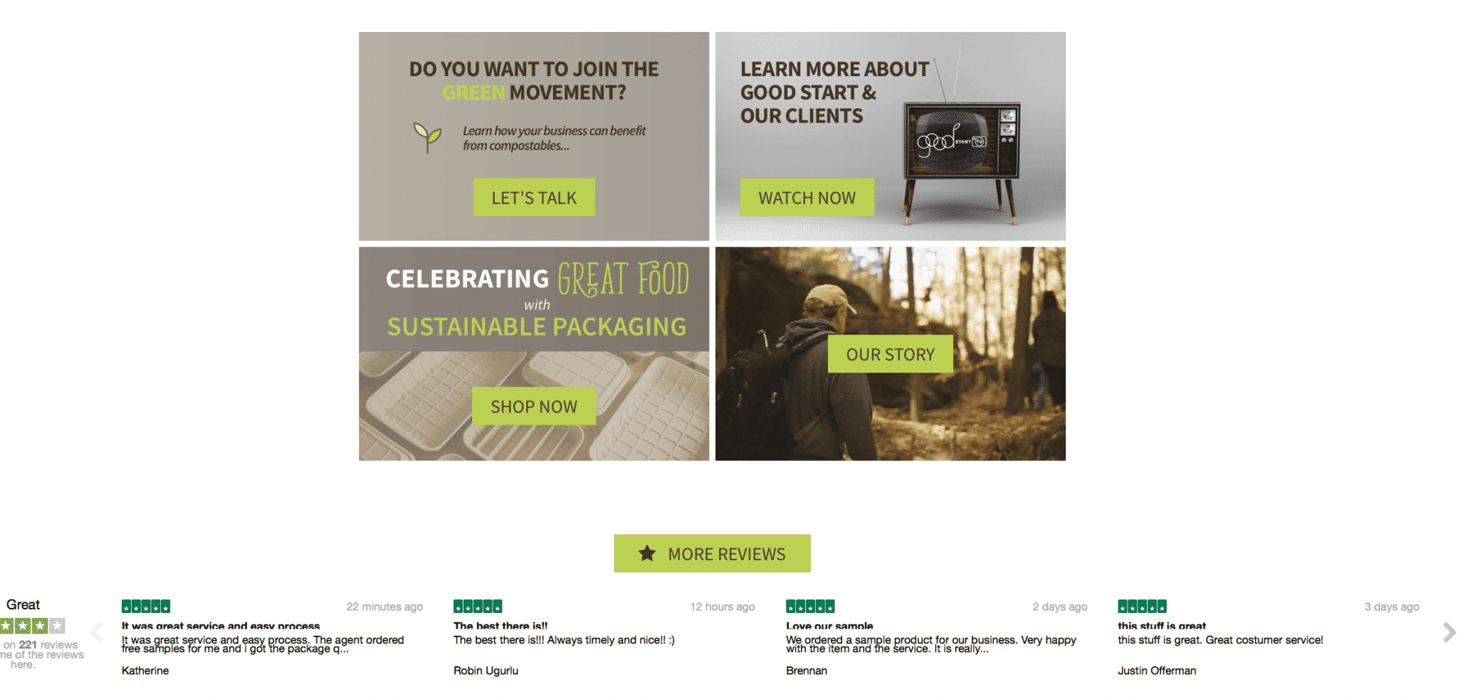
If site visitors still need to be won over, they cleverly have user reviews and testimonials listed at the bottom of the page.
9. The Joinery
The Joinery is a small business that makes handmade furniture. Their furniture is sorted neatly by purpose, making the site easy to navigate as you’d expect. What puts them on the list of best ecommerce sites, however, however is a feature that I’ve never seen elsewhere.
When you hover over an image, as shown in the example on the homepage below, a text description of the item’s details will pop up.
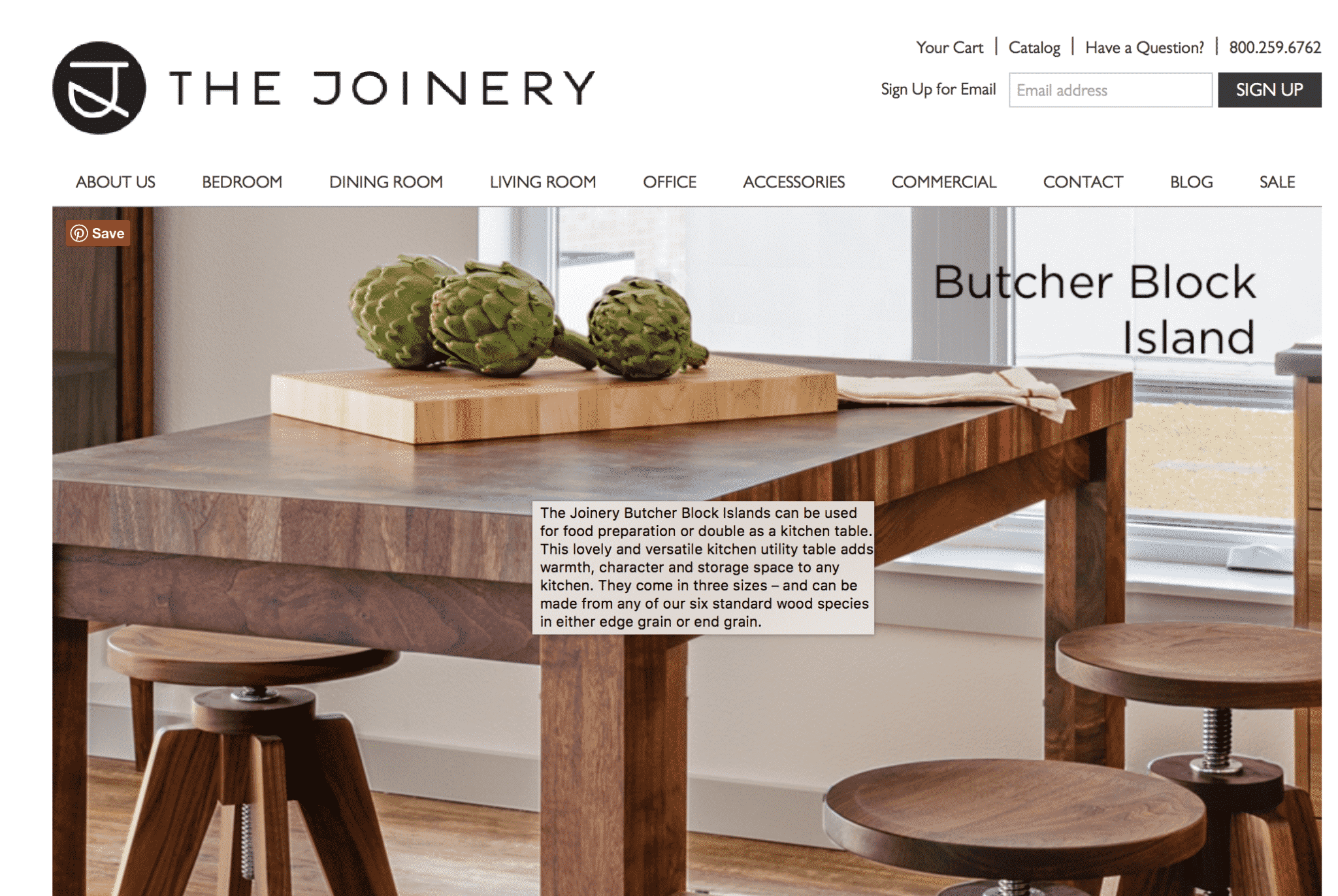
This description may include different options you can choose from, where to place it or how to use the furniture. This can help users picture the item in their own home and give them an incentive to click, even if they would have passed it over otherwise.
The Best Ecommerce Sites
Designing your own ecommerce site definitely isn’t an easy task, even if you’re using professional themes you’re purchasing online. That being said, many businesses will benefit from hiring a professional designer to create custom ecommerce design for their business that is optimized for their specific needs and offerings.
Before you hire someone, though take another close look at these examples and other examples in your industry to see look for ideas you want to adapt for your own site.
By the way, if you’d like help creating a beautiful and effective ecommerce site design, let me know here or in the comments. I’d love to help!
What do you think? Which of these ecommerce website designs did you love? What are some of the best ecommerce sites you’ve seen? Share your thoughts and questions in the comments below!

