How to Build an Effective Mobile Landing Page in 5 Steps
by Sarah Rodriguez • February 4, 2015
We love flip phones, but smartphones are probably here to stay, so…
Mobile users have increased dramatically over the last few years. More and more people are searching, browsing, and buying exclusively on mobile devices.
Despite this spike in mobile usage, many landing pages are still not being optimized for mobile use. Sometimes converting a desktop page to a mobile one can be tricky, and that’s why we have a few tips to help you for creating your mobile landing pages.
1. Think About Your Headline
Mobile landing pages are different than their desktop counterpart for many reasons. One big difference is the size and shape of the screen. You no longer have 1500+ pixels of space to tell your audience what you’re all about.
Although you want the mobile and desktop LPs to be cohesive with each other, you need to get creative and find ways to shorten your content on mobile. Small, lengthy headlines do not lead to good mobile conversion rates. Plus mobile visitors are usually browsing on the go, and are less likely to carefully read through the page.
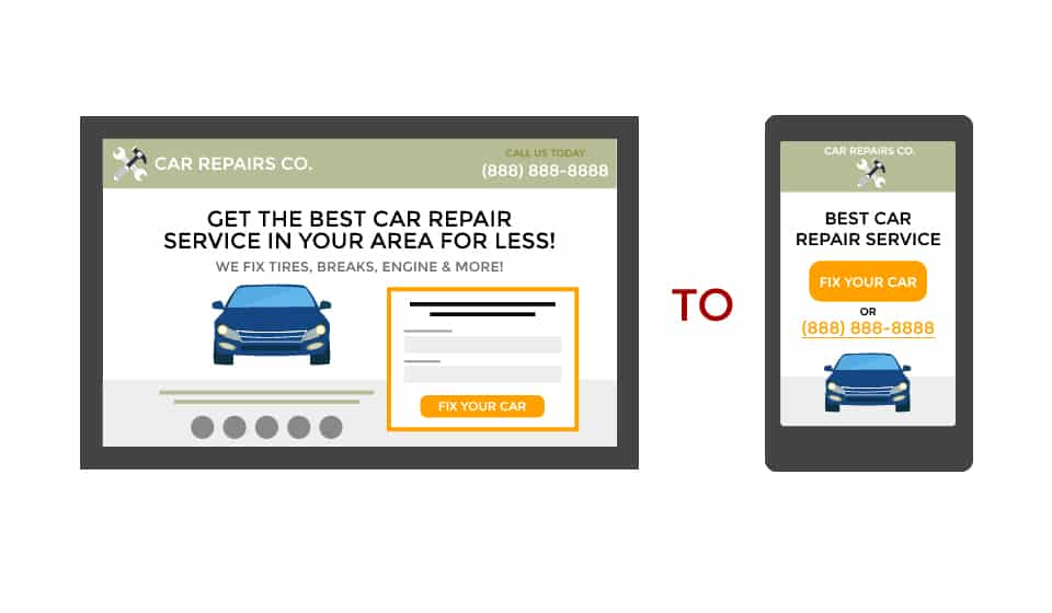
Try simplifying your headlines to a few words without loosing too much of the its original intent. Avoid frustration from to hard-to-read text or confusingly long headlines. For example, instead of saying “Get the Best Car Repair Service in Your Area for Less!” like you so carefully wrote for your desktop LP, try “Best Car Repair Service” or even “Fix Your Car!” for your mobile page.
It will save you space and increase your mobile optimization.
2. Put the Important Stuff at the Top
As far as landing page optimization goes, there are conflicting theories about what needs to go above the fold. From my experience, it can depend on your product, your visitors, your page layout, and many other things that can only be determined through testing.
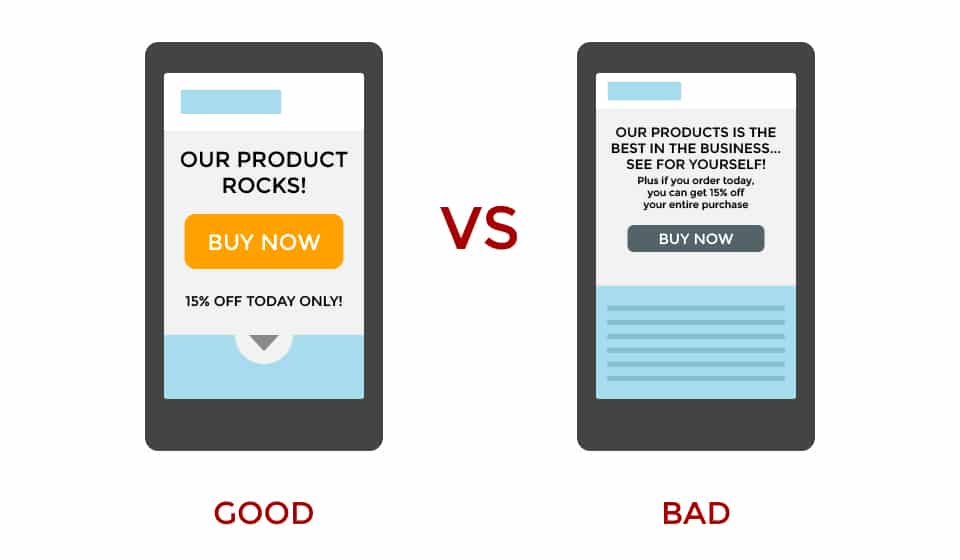
But when it comes to mobile, it is very important to try and get your important information (including the CTA) right up at the top of the page. Your visitors don’t want to spend several minutes pinching, tapping, and scrolling around your page in order to find what they’re looking for.
Figure out what you want your visitor to do on the page, whether it be click a button, call a phone number, or fill out a form, and put this information where it can be easily spotted.
[Tweet “Your visitors don’t want to spend several minutes pinching, tapping, and scrolling around your page in order to find what they’re looking for.”]
3. Choose Your CTAs Carefully
We all know having a good call-to-action is important for conversion rate optimization, but how can we tailor those CTAs to work with out mobile pages?
Put yourself in the visitor’s shoes and think what you would be willing to do as you’re browsing through a mobile page. Filling out a long form is probably not going to happen.
Quick and easy CTAs are the way to go with a mobile page. Big, bright colored buttons (big enough to easily click with your finger), tap-to-call phone numbers, and short, straightforward forms work best. Remember, visitors are on a (relatively) tiny screen without the luxury of 1 pixel cursor. Don’t sacrifice your conversions for small, cramped content that your visitors aren’t going to waste their time with.
4. Make Pages Easy to Scroll Through
Your desktop pages might be filled with great information about your product, but unfortunately those lengthy paragraphs and busy charts don’t always translate well on a mobile landing page.
Because of how mobile pages are laid out, information has to be presented in a vertical layout. For example, if you have three icons with info laid out across one section of your desktop page, you are most likely going to want to stack those icons going down, so each point is easier to see and read.
Consequently, this makes your sections longer which means more scrolling for your visitor. To optimize your page, you want to make your content, skim-friendly. Clearly label sections, condense your content to the most relevant information, and make sure your page is organized in an intuitive way. Provide smooth scroll links or “back to top” buttons so your visitor can jump to certain sections without endless scrolling.
[Tweet “To optimize your page, you want to make your content skim-friendly.”]
5. Test Your Mobile Pages
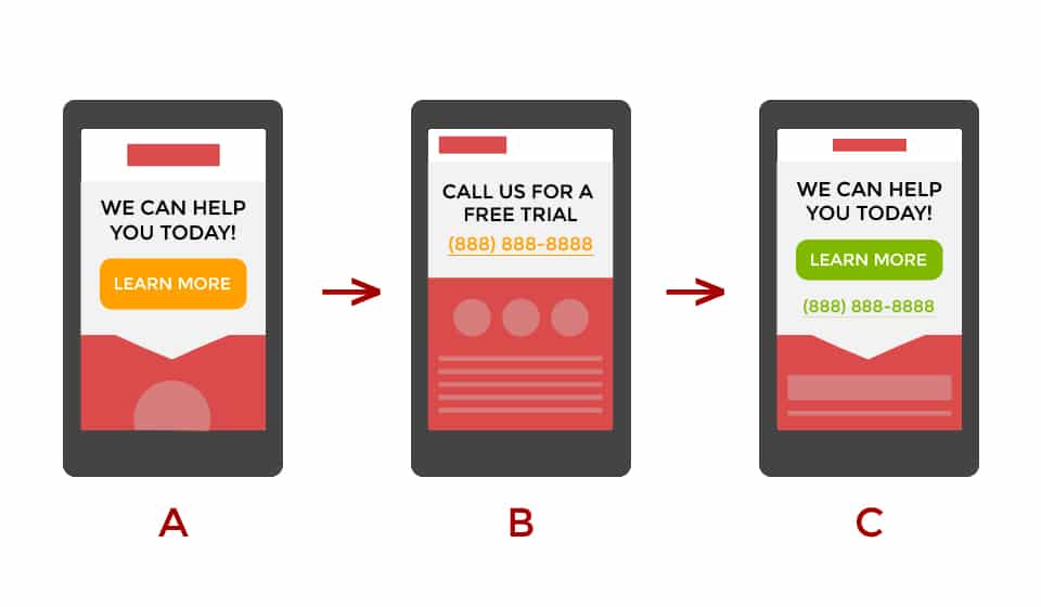
Just like with your desktop pages, the only surefire way to see what’s working and what’s not is to continue to test your page. Try switching out a click-through for a click-to-call phone number or making your pages longer. These kind of tests can usually give you a better idea of what your visitors are experiencing when visiting your mobile site and how you can optimize that experience for conversions.
Now although this all might still sound a little complicated, creating moblie pages are pretty easy to get the hang of. And hopefully with these guidelines, you have a good idea of what you need to do and how to get started. Check out more articles about conversion rate optimization with landing pages on our blog and let us know what works for you!


