What Makes a Great Hero Shot…Great?
by Sarah Rodriguez • March 9, 2016
A great hero shot can be one of the most important parts of your landing page.
Your hero shot is the leading visual representation of your brand’s product or service for a given campaign (if you’re not sure what a hero shot is, it’s typically that main image you see first) and it sets the tone for your entire landing page.

Nail it and your page is much more likely to succeed. Fail and your visitors will run screaming from your page.
Okay, so maybe they technically won’t toss their laptop out of the window in disgust, but according to a study by Stanford, up to 75% of sales are lost due to a poor landing page experience.
Your customer’s first experience with your page is with your hero shot, so it’s important to get it right.
Here are 4 things your hero shot needs to have:
1. Relevance and Context
It might seem obvious to choose a hero shot that is relevant to your brand, product, or service, but relevance is a quality that is often overlooked on landing pages.
Don’t cut corners by using generic stock photos or nixing your hero shot altogether.
People respond very strongly to visual cues, so take advantage of this and use a hero shot that is relevant to your brand and in the correct context of your campaign or landing page.
2. Value
Hero shots aren’t just there to make a landing page look pretty—use your hero shot to showcase the value of your product or service!
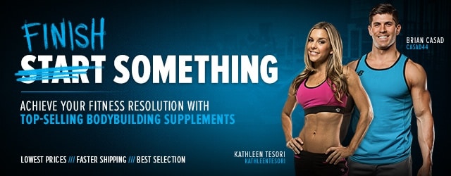
For example, if you sell supplements that give you energy, use a hero shot of someone exercising or looking happy and energized.

See how happy and healthy they are? Obviously, it must be the supplements!
You can also show real pictures of your product. If you are a software company, show screenshots of your dashboard.

Just look at all the info she’s got! She looks enthralled by her data, so it must be a good dashboard!
Pictures speak a thousand words, so use your hero shot to convey 1,000 words worth of value about your product or service.
3. Emotion
When it comes down to it, pictures—especially the right pictures—create an emotional experience for your audience. That’s why you don’t often see websites or landing pages with just long paragraphs of plain text.
Visitors to your landing page are looking for a positive experience and not a persuasive essay.
The easiest way to create an experience for your visitors is by picking a hero shot that sparks an emotional reaction. I often like to address pain points that my clients have seen their customers have and choose an image that addresses that point.
For example, if a visitor comes to your landing page because they can’t seem to find a reliable electrician, you could address that pain point by choosing an image of an electrician interacting with a happy and satisfied customer.

Clearly, hiring this electrician is like hanging out with your best friend!
And, if you happen to have a great hero shot that’s also a real life photo of a customer using your product and service, you’ll inspire a lot of trust, too. Double win!
4. Support & Persuasion
As a final qualification for your hero shot, you want to choose an image that supports your overall campaign message.
You might know that creating a consistent marketing experience for your audience is important, but this also applies to the hero shot.
Keywords, ad messaging and landing page CTA consistency work together to create the positive experience we talked about earlier. However, it’s important to remember that your hero shot is a critical component of how your landing page is perceived.
In other words, if your landing page doesn’t match your keywords and ads, you undermine the message match of your entire page!
The biggest mistake people make here is choosing overly generic images that don’t support their carefully chosen Headline, CTA, or copy. By choosing an image that supports your overall campaign, you will be more successful in persuading visitors that your product is exactly what they are looking for.
Use a Great Hero Shot
Your hero shot can make or break your landing page.
It’s not enough simply to find a stock image and throw it up onto your page, you have to think about exactly what you want your page to convey and then find a relevant image that establishes the value of product and evokes the desired emotion in your audience.
By the way, if you’d like me to review your hero shots and/or landing pages and give you some ideas, let me know here or in the comments below. I’d love to help!
Are there any great hero shot elements you’d add to this list?


