5 Best Practices for Landing Page Videos
by Fahad Muhammad • September 19, 2016
It’s not a secret anymore that great landing page videos can increase conversions by 80%. In fact, 76% of businesses who use video in their campaigns believe it provides good ROI.
Among other things, including videos on your landing pages increases the time visitors spend on your page. Plus, videos can:
- Explain product features
- Narrate your brand story
- Feature customer testimonials
- Display visual case studies
So, it’s safe to say that placing video on landing pages is the best way to get visitors to convert, right?
Well, yes and no.
You see, not all videos are created equal: some videos are optimized for viewer experience while others cause visitors to scratch their heads in confusion—or worse, be turned off by the service altogether.
So, what makes a landing page video effective? Here are 5 best practice tips for landing page videos that will get you well on your way to increasing conversions.
(Note, for the landing page videos featured in this article, you may need to click-through to each page to fully understand the points discussed.)
1. Landing Page Videos Should Educate Visitors
The focus of your landing page video should be to inform your visitor. Whether you’re educating your visitor about how your service will make their lives easier or showcasing a specific product feature, the focus should always be to teach them something about your business.
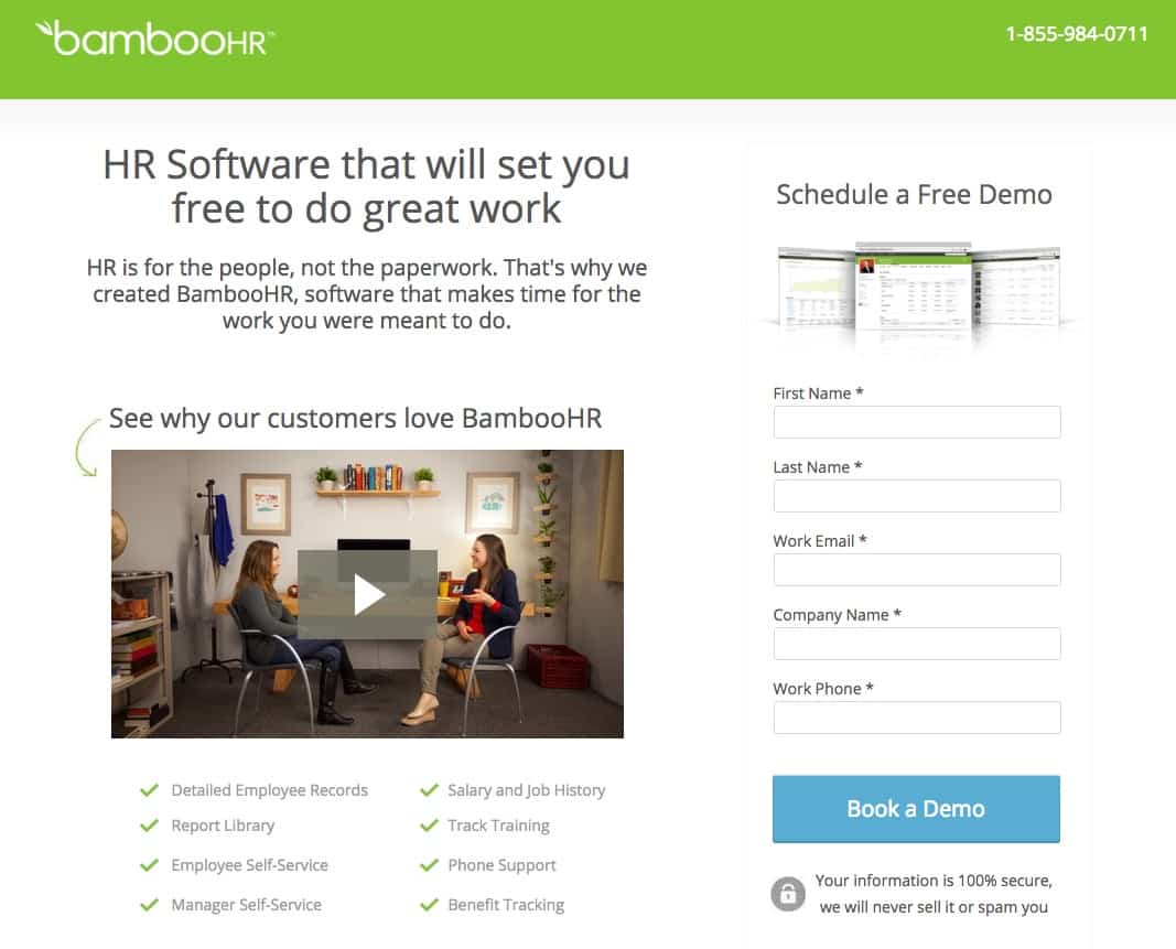
Bamboo HR’s video explains how using the product will help you save time, so that you’ll be able to focus on other important things at work:
Mozu uses their landing page video to reinforce the statistic in their headline and shows visitors just how Mozu-powered retail websites load quickly:

Workfront, on the other hand, shows a step by step demo of their product, allowing visitors to get comfortable with it before they click the call-to-action button:

The goal of your video shouldn’t be just to “get clicks.” It should be to give your visitors an engaging and informative experience. The click is what you’ll get in return.
Your landing page should be focused on the visitor and the video should reinforce that focus.
2. A Landing Page Video Should Have One Goal
Think of your landing page video as a landing page in its own right. In other words, a landing page video should have one goal—a specific action it wants visitors to take—and it should use a call-to-action button to get visitors to take that action.
So, when you sit down to write the video script, think about the landing page goal and mirror that goal in the video. This is exactly what we do with Instapage’s landing page video:
The video reinforces the goal of visitors creating and testing landing pages by showcasing marketing influencers discussing how important A/B testing is.
Similarly, the Outbrain page video explains how their service works and demonstrates just how easy it is for visitors to create campaigns. It also reinforces the message in the CTA button copy and headline:

Creating an arbitrary video doesn’t do the trick. Instead, include a well-scripted, focused video will help generate more CTA button clicks.
3. Weave an Engaging Story with Landing Page Videos
Landing page videos work because they have the power to engage visitors—and what better way to engage visitors than with storytelling?
To tell an effective story, your story needs to use your audience’s pain points to inspire emotion. Use the visitor’s pain points and structure the video to explain how clicking the call-to-action button will remove that pain.
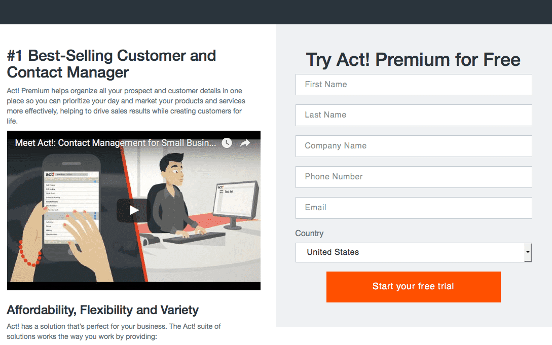
For example, Act uses a fictional character to tell a story explaining how the software can be used to organize prospect customer details in one place, so campaigns run more effectively:
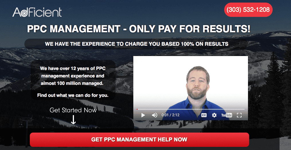
In contrast, AdFicient’s video doesn’t tell a story: It’s just the founder letting prospects know that they’ll only have to pay for actual results and not AdFicient’s services. While this may be intriguing, the video falls flat because it fails to build up a story.
Plus, the video is set to autoplay, which is a big no-no:
Remember, for landing page videos to tell a story they must have three necessary ingredients:
- A hero (the customer)
- A villain (the problem they’re facing)
- A savior (your product, which will save the day and solve the customer’s problem.)
It’s not necessary to include fictional characters in the video because you can weave a compelling story just by explaining things from your customers’ point of view.
TouchBistro does this with their video:
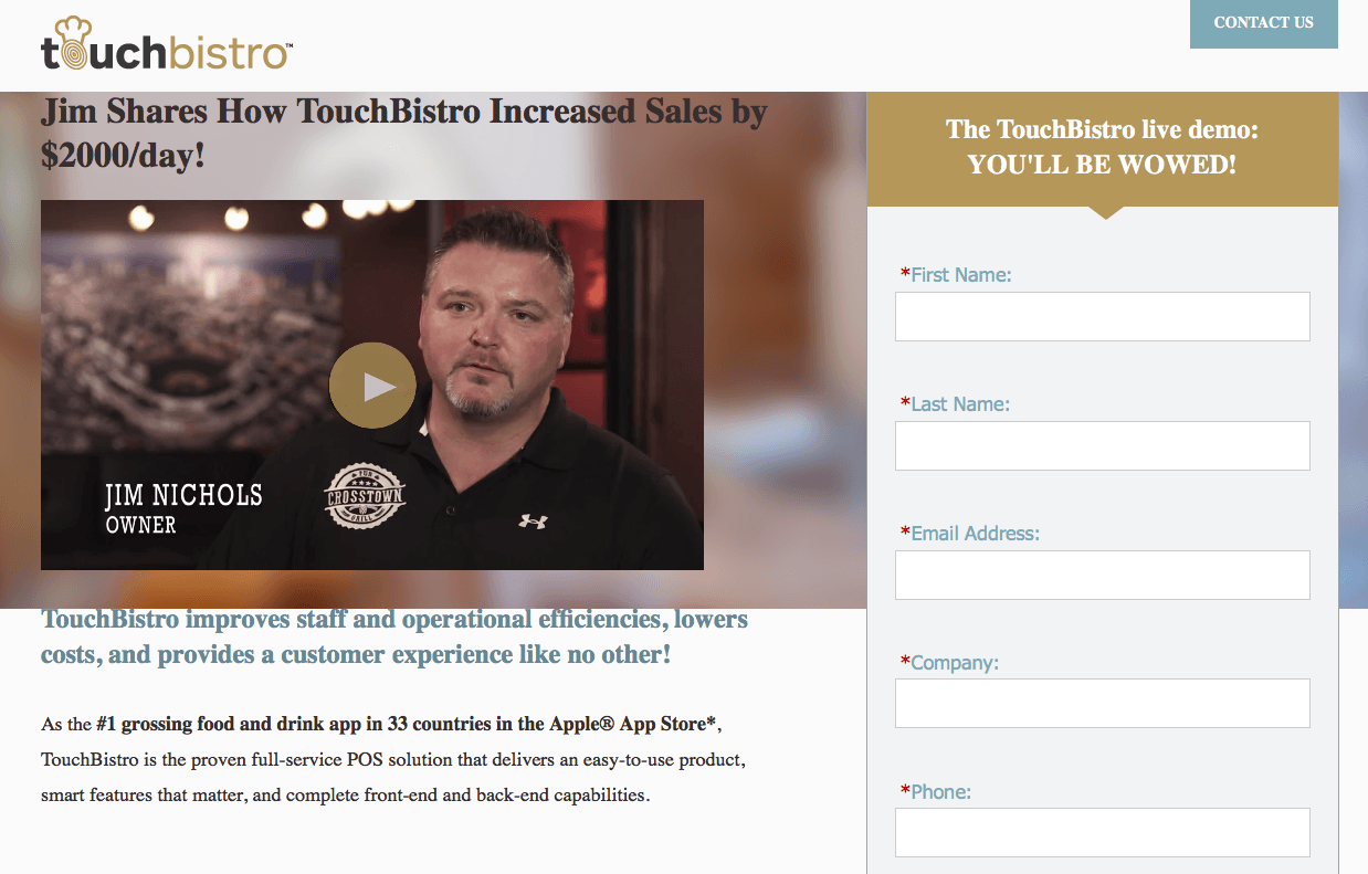
In their story, the “villain” is the old, traditional way to manage bar customers and sales. The savior, TouchBistro (aka the all in one food and drink app), saves the customer from poor front and back-of-house problems.
4. Landing Page Videos Should Always Include a CTA
Landing page videos should convince your visitors to perform a specific action and fulfill your conversion goal. You should always, then, include a call-to-action at the end of your video.
Camtasia has two CTA buttons featured at the end of their landing page video, with different goals:

The video CTA button should align with the landing page CTA button. So, if your landing page offers a free eBook, don’t try to sign up visitors for a free trial at the end of the video.
Stick to the script and maintain consistency and message match between your page and the video.
You could also gate your video with a CTA button or a form, but this approach is a little aggressive. Therefore, it’s best to A/B test videos to find out which approach works best for your brand.
5. Choose Your Video Thumbnail Wisely
Your video thumbnail performs the same role as the feature image of the landing page, so it must be relevant and enticing.
It doesn’t matter how compelling or creative PLM’s video is, the thumbnail is a huge turnoff. It doesn’t even display the play button letting visitors know it’s a video:

Would you want to click the button to watch the video? Yeah, didn’t think so.
On the other hand, WordStream’s thumbnail image is inviting because it clearly depicts a story with characters and everything (and displays the play button indicating it is a video):
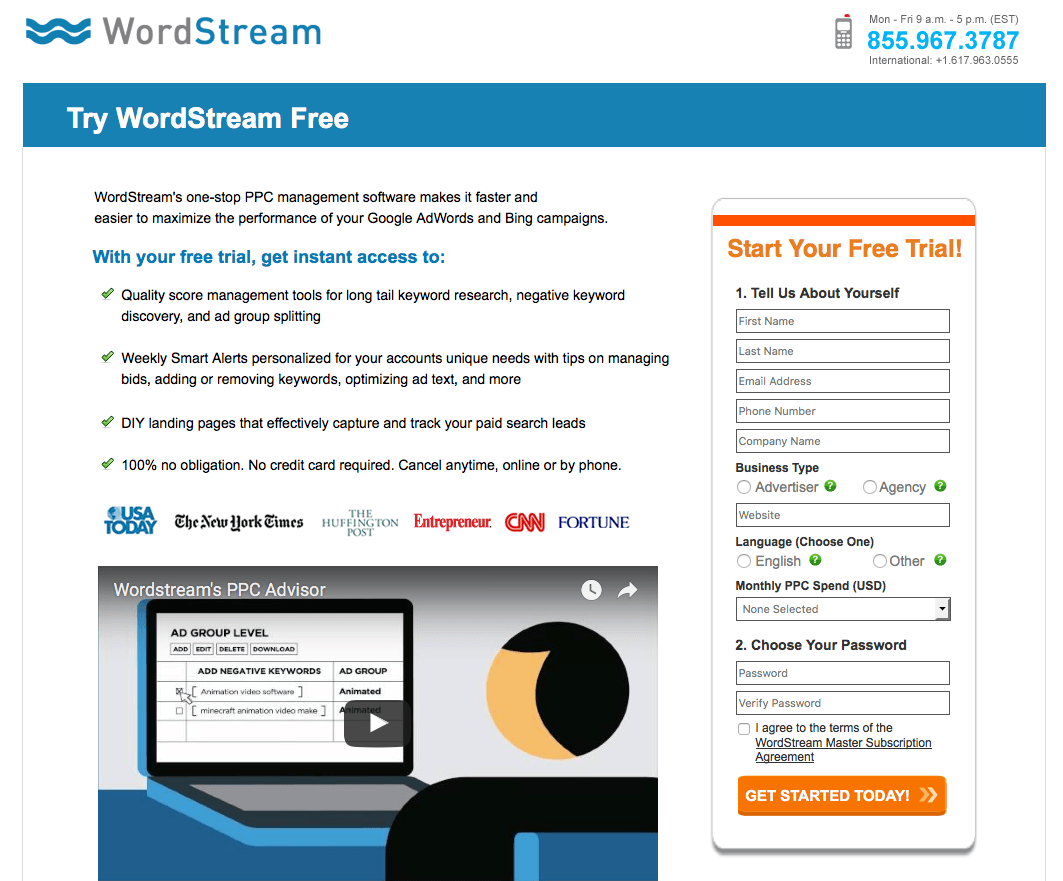
The thumbnail image will be seen as a preview of your landing page video, so give it some extra thought and make it click-worthy.
How Many Best Practices Do Your Landing Page Videos Follow?
Landing page videos provide you with the unique opportunity to add a physical element to the online world and they enable you to add your voice to an otherwise silent page. Ultimately, this combination creates a story-like experience that can help persuade visitors to convert on your offer.
Videos help you connect with your visitors on a personal level. Granted, you can do that with copy as well, but with video it’s easier, faster, and proven to be more effective.
Create a video for your landing pages today keeping in mind the best practices discussed above and the difference in your conversions will be proof that videos pack a significant online punch.


