Online Retail Marketing: 7 Strategies That Will Help You Sell More Product
by Aden Andrus • June 26, 2018
Online retail marketing is a lot of work. You’ve got product descriptions and images to optimize, a website to manage and test, reviews to cultivate and respond to, campaigns to monitor and run…the list goes on and on.
If you’re just getting into retail marketing, this can all feel overwhelming. Even if you’ve been running an ecommerce business for years, it can still be hard to stay ahead of the competition.
The good news is, while there are always more things you could be doing, most retail businesses can get great results online by using a few specific strategies. In this article, we’re going to take a look at these tactics and how you can use them to sell more product online.
1) Target People Who are Ready to Buy
The easiest people to sell are people who are already looking to buy. As a result, Google Shopping is an incredibly important tool in any retail marketer’s arsenal.
Google delivers results for over 40,000 internet searches a second, so running ads on Google Shopping is virtual must for most ecommerce businesses—especially if you want to stand a chance of showing up on the first page when someone is searching for a product you sell.
Case in point, here’s what shows up if you search for “trench coat” on Google:
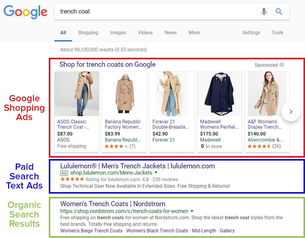
As you can see above, Google displays 3 different types of results for product-related searches: Google Shopping ads, paid search text ads and organic search results.
When you look at these search results, what is the first thing that you notice? The Lululemon ad or the Nordstrom link? Probably not.
If you’re like most people, the pictures are what you notice first. Before you even realize that Lululemon text ad or Nordstrom’s organic search result are there, you’re already scanning through purchasing options.
And that’s the power of Google Shopping.
Of course, if you scroll through the 30 products on the search engine results page and can’t find what you’re looking for, you can always click “Shop for trench coats on Google” and filter through all of the options available on Google Shopping:
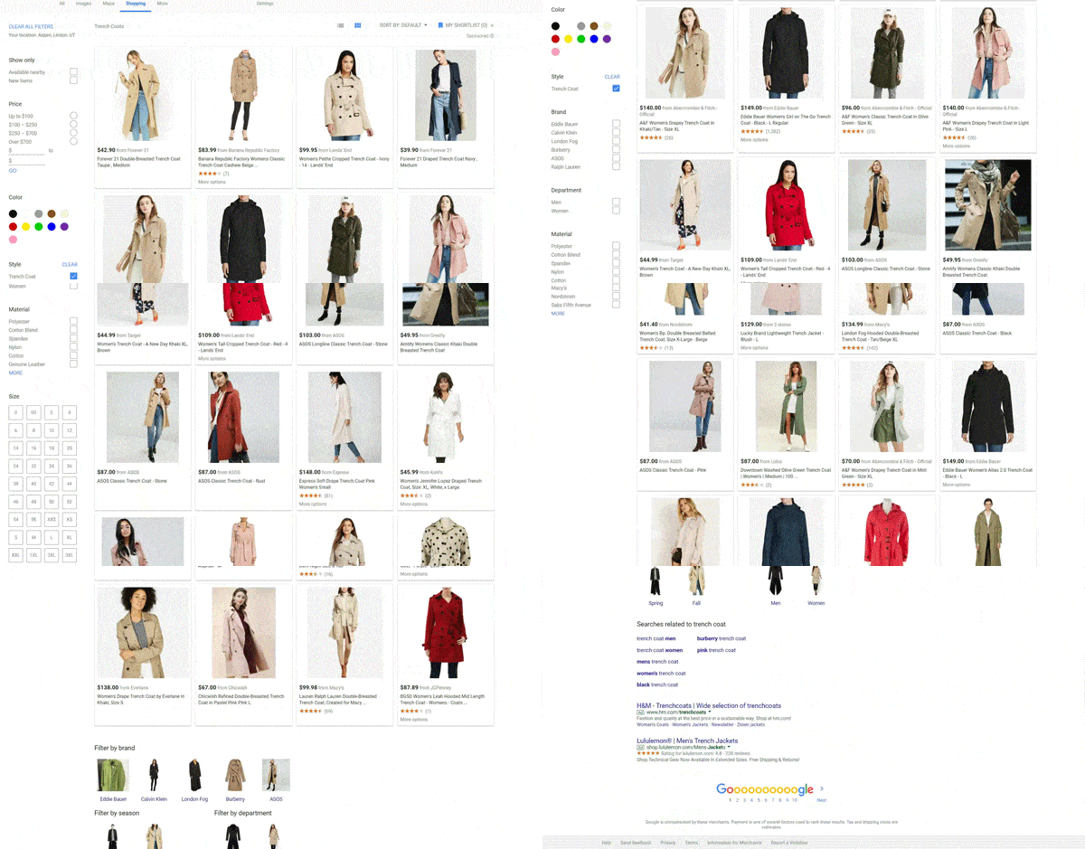
What makes Google Shopping truly powerful, however, is the fact that virtually none of the products or companies that show up in these ads can be found on the first page of organic search results. Without Google Shopping, these products would never be seen by potential customers.
Best of all, Google Shopping puts your products in front of high-intent, low-funnel search traffic that wants to buy what you’re selling.
Unlike most forms of advertising—like display advertising or social media marketing—people who see your ads on Google are looking for what you have to sell. When someone searches for “trench coat” on Google, you don’t have to convince them that winter is coming and they should buy a stylish coat—you just have to convince them that your trench coat is the coat they should buy.
2) Get People Ready to Buy
Google Shopping allows you to get your products in front of people who are already searching for them. But what about the people who don’t yet realize that they want and need what you’re selling?
To reach them, you need Facebook Ads.
Unlike Google Shopping ads, Facebook Ads allow you to put your business in front of people who aren’t looking to buy…yet. Unfortunately, most people won’t make a purchase the first time they see your ads on Facebook. And, if they do buy, you can expect to spend a $1-5+ for every click (and a lot more for a sale).
So, to make the most of your Facebook campaigns, you need to generate brand awareness and guide people towards making a purchase.
For example, instead of running an ad showcasing a product and asking people to buy, it’s often better to run an engaging video ad that will grab their attention. Instead of paying $1-5 a pop for clicks that might turn into a sale, you’ll probably pay around $0.05 to build guaranteed brand awareness.
From there, you can put them into a Facebook audience and retarget them.
At this point, you still probably haven’t generated enough brand familiarity to ask them to buy, so you can create an ‘Engagement’ campaign that is focused on getting people to respond to your ad with clicks, clicks, shares, comments, likes, etc. Here, you’ll probably pay around $0.30 per engagement.
Now that they’ve watched a video and engaged with your content, they’ve had time to think about your business and your products. As a result, they’re a lot more likely to buy from you.
If you take this second audience of people who have engaged with our ad and put them into a traffic campaign, you can drive high-intent clicks to your product pages. These clicks often cost about $0.50 a piece, but anyone who clicks on your ads at this point is clicking because they want to buy.
Using this approach, you are bringing people who want to buy—and buy from you—to your website for less than you would have spent on a single, low-intent click from a single touchpoint campaign. Instead of trying to force people to buy when they weren’t ready, you win their interest and their loyalty over time…and then reap the benefits.
For more tips on how to use Facebook Ads for retail marketing, check out this blog post!
3) Provide More Detail with Video
Product descriptions and images are great, but they can only get you so far. To really sell someone on a product that they can’t see or feel in real life, nothing beats a good product video.
Let’s look at a few different types of product videos you can create.
Product Close-Ups
Product close ups are unsurprisingly the most popular type of ecommerce video marketing that you’ll see.
These videos involve literal close-ups, and often show the product from multiple angles. There may or may not be text or narration detailing different features of the product to help sell it. This is about as close to a face-to-face sales presentation as you’ll get online.
Alternatively, you can create videos that showcase both your product and your business:
Regardless of the approach you choose to use, product close-ups are a great way to introduce people to your products and show them why they should buy.
Product Tutorials
Something may look excellent online, but we all know that online isn’t real life. We’ve all purchased a product that looked great in theory, but once you were actually using it, it was a nightmare. Maybe it was an electric tea kettle that had a weirdly short plug, was difficult to clean, or had an alarm system that went off constantly.
In addition to giving people general use tips, you can also use product tutorials to show them how to use the product to do or create something specific:
https://www.youtube.com/watch?v=eTdT1BPRNXc&list=PLC835212C2551541B
Alternatively, you can showcase ways that your product can be used as part of a broader creation process:
Product tutorial videos are more of a content play than a sales pitch, but that also means they’ll draw in a broader audience and help you build brand awareness for your business.
Technical Instructions
This type of ecommerce video technically falls under the tutorial umbrella, but there’s a clear distinction. You aren’t just showing customers how to use your product—you’re showing them how to set it up, troubleshoot it, or use it on a purely technical level.
Setup is a big concern for a lot of purchasers (especially if any element of construction or technology is involved),and showing them not only how simple it is but exactly how to do it will increase sales and can even reduce returns you get from frustrated customers.
Finally, this type of video can be great if you need to show someone how to put together a complex product. Sometimes, no matter how good your manual is…some things are best explained in live-action.
Each of these types of videos can be a great retail marketing asset. They give potential customers a feel for what your product is and how it looks and feels—something they can’t get from a static image or a block of text.
80% of all online traffic will be from video by 2019, so now is as good of a time as any to get started! To learn more about creating and using product videos, check out this blog post!
4) Suck Them in with Lifestyle Shots
Like video, lifestyle shots give your potential customers a better feel for what your products are like. This is especially important if you can’t afford to put videos together.

In addition to giving your customers a sense for what your products look and feel like in real life, lifestyle shots also do a great job of helping people envision your products in their lives. This is important, because once someone starts to imagine life with your product, choosing not to buy it makes them feel like they are losing something.
Most people don’t like to give things up, so lifestyle photos can be a huge asset to your retail marketing—especially if you combine this with influencer marketing (see next section for more on this).
For example, in the images above, it’s easy to imagine what it would be like to wear the apparel, fitness watches or accessories in the photos. You can easily picture yourself in matching “pizza” shirts with your kid, wearing the baby bump shirt during your pregnancy or sporting orange socks during fall.
The key to effective lifestyle shots is giving the viewer the experience of owning, wearing or using your product.
So, if creating stylized lifestyle shots isn’t your forte, you can always take a simpler approach. Instead of showing the product “in action”, you can take photos of a model wearing or using it. It’s not quite as effective as a fully stylized shot, but sometimes simpler can actually be better.
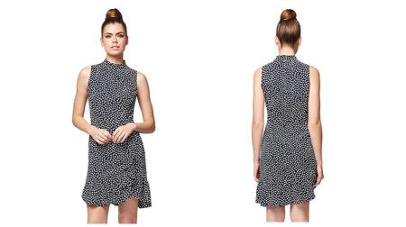
With the right approach, you can also use lifestyle shots to get people to make additional, complimentary purchases. For example, in the photo below, Modcloth features a variety of items—all sold by Modcloth—on their model.
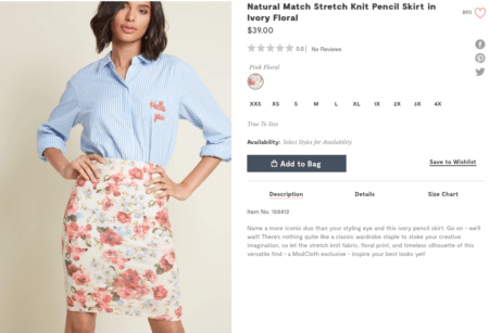
If a potential customer isn’t particularly style-savvy, they might be inclined to buy both the shirt and the skirt to get the same look as the model in the photo. That means more sales for Modcloth.
Overall, lifestyle shots are another great retail marketing asset to have at your disposal. They simultaneously help potential customers understand your products better and get inside your customers’ heads—making it hard not to buy your products. For more product photography tips, check out this article!
5) Build Trust with Influencer Marketing
These days, brands have trouble developing strong trust with their targeted audiences. People are constantly inundated with an endless stream of retail marketing, so it can be hard to convince them to buy from you…instead of the competition.
In fact, Nielsen reports 92% of people trust recommendations from individuals—even if they don’t know them—over brands.
To put that trust to work for you, you need a social influencer on your side.
People trust people, so influencer marketing is a way to build your business trust. When you align your business with a well-known person that people trust, not only do they bring their loyal audience to your business, they also bring an audience that already trusts them and—by extension—you.
For example, Twitter reports nearly 40% of Twitter users say they’ve made a purchase as a direct result of a Tweet from an influencer. Those numbers are often even higher for Pinterest and Instagram.
To find an influencer for your ecommerce business, you’ll want to look for someone who matches your brand’s tone, style, and mission. You are not just paying someone to say “buy this”—you want someone who can create meaningful content around your business and its objectives.
Social media monitoring is a great way to find influencers who work in your niche. For example, if you own a weighted blanket business, you might want to look for an influencer that is:
- Popular in the fitness/health world
- Posts heavily about fitness products
- Partners with stores and places you would be interested in selling your product in
- Creates giveaways and promotions for followers
- Engages with fitness conferences
If you are scrolling through social media profiles, you might also want to take a look at hashtags and identify the hashtags that your target audience is using. By tuning into hashtags, you can find the active influencers who are talking to your target audience.
As you identify influencers who seem like a good match for your brand, it’s a good idea to put them on a list so that you can organize and follow them. Stalk them for a little while to get a feel for what kind of a partner they will be and if they seem like a good fit, reach out!
Historically, most influencers were high-priced stars like Jennifer Anniston. These days, however, social media has made influencers out of all kinds of people from many different walks of life, which makes working with an influencer affordable for even small ecommerce businesses.
Influencer marketing is a great way to expand the reach of your retail marketing at a relatively low cost, so it’s well worth trying. To learn more about how to find and work with influencers, check out this article!
6) Analyze Everything
Google Analytics can tell you a heck of a lot, especially when it comes to ecommerce businesses. You can get an idea of where your traffic is coming from and what’s triggering conversions and purchases.
That’s excellent, but it’s not enough.
To really make the most of your retail marketing, you need to understand how people are moving through your different marketing funnels…and many of those funnels don’t live exclusively on your website.
Most ecommerce marketing funnels are made up of strategic steps that are designed to push users from Point A (which could be anything from social media to an offer shared online to an email) to Point C, D, or E—which is where they convert.
Remember our Facebook Ads example? A good retail marketing funnel works just like that, but it may operate across a variety of platforms.
For example, your funnel may look something like this:
- Users see a Facebook post or a Facebook ad about a new product you’re offering. They watch the video.
- They click to learn more.
- They’re taken to a designated landing page. They have the option to add to the cart or to get more information on your company. They aren’t ready to convert, so they choose the latter.
- They’re given more in-depth information about the product, and then feel secure about purchasing.
- They add the product to the cart.
- They get distracted and leave your site.
- You send them a cart abandonment email.
- They return to your site and checkout.
Multiple analytics tools will ultimately be needed in order to get an accurate idea of how users move through this funnel.
Maybe they had to see multiple Facebook Ads, and finally converted after they saw a video. Maybe your email was partially responsible getting them back to your site. And, if that’s the case, getting information from Facebook Ads or your email software about the effectiveness of different campaigns is crucial.
Ultimately, the better you understand your potential customers and how they move through and interact with your retail marketing funnel, the more you can optimize your funnel and drive more sales. To learn more about how to set up and use your ecommerce analytics, read this article.
7) Test Your Website
The final key to retail marketing is website testing. No matter how good your site looks, there are always elements that can be improved. After all, your product lineup and target audience is always changing, so if you aren’t constantly testing your website to see what your audience responds best to, you’re losing sales.
With that in mind, here are a few changes to consider testing on your ecommerce website.
Eliminate Diversions
One problem many ecommerce sites struggle with is too many diversions. Diversions are anything that has the potential to distract your user from reaching their destination.
Contrasting buttons, images, other offers, menus, links, content, pop ups…if it leads people off course, it’s a diversion.
For example, take a look at the page below. There are 5 major elements on the page competing for your attention—none of which take a potential customer to view a product—and that’s just above the fold!
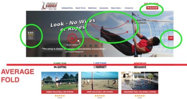
What does this business really want people to do? Watch a video? Read a review? Look at the picture? Read the Q&A? Visit their cart?
As it turns out, the answer is “none of the above”.
This page is from a client of ours who—like most e-retailers—simply wanted people to come to their site, look at their products and make a purchase. But, with all the diversions on their site, people were getting lost before they even had a chance to see the client’s products.
To put the focus where it belonged—on the products—we tried eliminating all of the diversions by redesigning the site experience to focus on product call to actions. That way, when people came to the page, they immediately saw Cobra’s products and a simple call to action (CTA) that said “Shop Our Products”.
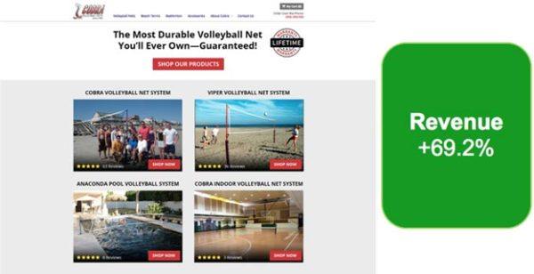
The new page design increased revenue (not just conversions) by 69.2%!
We’ve seen similar results with many of our ecommerce clients. For example, we often test to see how removing different elements and offers from a client’s homepage affects their conversion rates (this is called “existence testing”).
Existence testing is one of the easiest, fastest ways to discover what is distracting from conversions and what is helping conversions.
If you remove something from your page and conversion rates go down, that item is helpful to the conversion process. If you remove something and conversion rates go up…bingo! You found a distraction.
The GIF below shows you how this works. Essentially, you just remove a page element and then see which version of the page performs better. Easy enough, right?

For this particular client, we tested to see how removing 8 different elements from their home page would affect their revenue. As it turned out, 6 of the 8 elements were actually decreasing their revenue!
By eliminating those elements during our test, their revenue-per-visit (RPV) increased by 59%.
Why? Well, once again, we discovered things that were diversions to the user experience (as it turns out, the diversions were other products!).
Unfortunately, you can only do existence testing after your site is up and running. However, even without testing your store, minimizing diversions is almost always a good way to get more out of your theme.
Simply take a step back from your site and ask yourself, “What do I want people to do when they visit this page?”
If you have page elements that are distracting or diverting people from doing what you want them to on your site, you need to make a change.
Reduce Anxiety
Ever have that moment when you’re driving a car and you suddenly get hit by a huge gust of wind? What happens to your heart rate?
Whether you’re in the driver’s seat or an office chair, anxiety is never a good thing. Unfortunately, when it comes to your site, people are already in a state of high alert. Anything that adds to their stress level (clicking on something that isn’t clickable, feeling confused or swindled) may lead to you losing a customer.
As a quick example, one of our ecommerce clients had a mobile page that forced users to scroll all the the way back up to the top of the page to make a purchase.
So, we decided to try a floating “Buy Now” button that people could use to quickly buy the item once they’d read all about it:
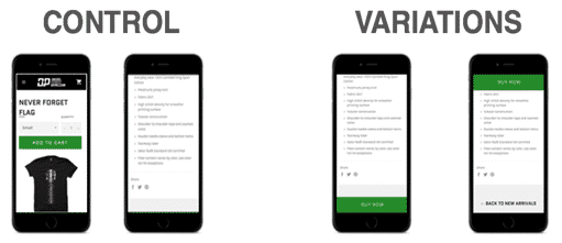
Yes, scrolling to the top of the page seems like a relatively small inconvenience, but eliminating this source of anxiety improved the conversion rate by 6.7%.
Even more importantly, it increased the RPV by $1.54.
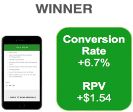
Given the client’s traffic volume, this was a huge win!
As you can probably imagine, the less confusion, alarm, frustration and work your site creates for users, the more likely they are to buy.
When you get right down to it, making a purchase should be a seamless, almost brainless process. If a potential customer ever stops to think, “Wait, what?” on their buyer journey, you’ve got a real problem.
To identify potential anxiety-inducing elements on your site or page, try going through the whole purchasing process on your site (better yet, have someone else do it and describe their experience to you). Watch for situations or content that force you to think. Odds are, you’ve just discovered a way to improve your theme.
Make Things Simple
Nothing frustrates potential customers more than having to fight with your site to find the products they want to buy. To avoid this, it’s a good idea to create “collections” of similar items.
For example, I might have an “armor” collection, a “swords” collection and “clearance” collection in my hypothetical costuming store. I could then use those collections in a template to create focused pages for customers interested in those items.
To create collections, click Products > Collections in the left-hand sidebar. Once you’ve created your collections, you can assign products to them on the product set-up page.
Offer Discounts
Any good retailer knows that discounts sell product. However, how you talk about your discounts can affect how motivating your discounts are.
Fortunately, to get the most out of your discounts, all you have to do is remember one simple truth: people don’t like math.
Sure, your customers may be bargain hunters, but if you phrase your deal the right way, many people won’t bother to do the actual math—they’ll just assume you’re selling things for cheaper than the other guys.
Take the “Rule of 100”, for example.
This rule states that, for products with a price under $100, displaying the discount in terms of a percentage (a relative metric) is more powerful because the percentage will be a larger number than the actual dollars saved with the discount.
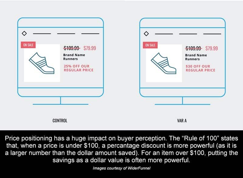
If a product costs $10, a $1 discount represents 10% off the price. Getting 10% off may be perceived as a larger discount than the $1 savings (since 10 is bigger than 1).
On the other hand, for products that cost over $100, showing the discount in terms of dollars off the original price (an absolute metric) is more powerful since the dollar amount will be a larger number than the percentage of actual discount.
The Power of Discounts
Now, this isn’t all just a nice theory. One of our clients sells high-end parts and accessories for outdoor, all-terrain vehicles. Most of their products have a high price point (over $100), so their customers are sensitive to sales and promotions.
However, since this client’s margins are fairly slim (typical for this industry), they can’t really afford to do the sorts of mega-sales you see stores like Hobby Lobby or Wal-Mart offer. But, they do offer the regular wholesale discount a manufacturer passes on to them on every product (around 10% on most items).
With a fairly fixed discount price like this, we knew we had to make every deal look as compelling as possible.
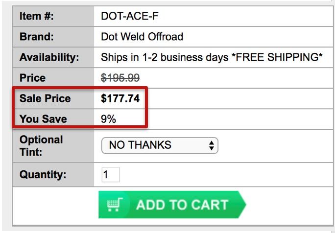
Originally, the client had been using a basic “percent off” model to advertise their discounts. So, if a part cost $300 and the discount was 10% ($30), the page said “You Save 10%”. If a part cost $3,000 and the discount was 10% ($300), the page still said “You Save 10%”. Unfortunately, this meant that while the actual savings could vary significantly, the perceived savings were identical.
Taking all of that into account, we decided to give the “Rule of 100” a shot.
Instead of listing the percent off for products over $100, we decided to list the actual discount. That way, potential customers could easily see exactly how much they were saving and how good of a deal they were getting.
For this test, tested the original “percentage off the original price” model…
…against a percentage discount model (since almost all products cost over $100):
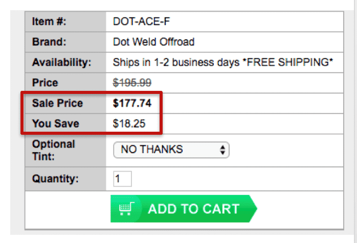
After testing 40,000 visitors, the “$ off” discount increased cart visits and sales by 12% and produced $15,000 of additional sales in just two weeks!
We didn’t offer crazy deals. We didn’t cut into their profit margin. All we did was take their existing discounts and offer them in a more compelling way…and you can, too!
Conclusion
While online retail marketing may seem overwhelming, it doesn’t have to be. By following the 7 strategies we’ve discussed in this article, you can dramatically increase both the profitability and total revenue of your ecommerce business.
Now, I won’t lie to you, it will be a lot of work, but the results will be worth it.
By the way, if you’d like help with your online retail marketing efforts, let me know here or in the comments. I’d love to help!
How do you approach online retail marketing? Are there any tried-and-true strategies you’d add to this list? Leave your thoughts in the comments.

