Selling with Big Cartel: How to Build a Profitable Big Cartel Store
by Aden Andrus • June 6, 2018
If you’re an artist or a maker trying to sell your products online, Big Cartel just might be the ecommerce platform for you. As a creative myself, I really appreciate the fact that Big Cartel offers a cheap way to sell products online.
As a creator, you want to create, not pay through the nose for features you’ll never use.
This is where Big Cartel really shines. It’s not the most robust (or even easy-to-use) ecommerce platform out there, but it’s cheap (potentially even free) and gets the job done so you can focus on, well, getting the job done for your customers.
If you don’t want to pay the Etsy premium and are willing to put in a little work, you can join the ranks of over 250,000 artists and makers who sell on Big Cartel. In this article, I’m going to discuss everything you need to know about Big Cartel and how to set up, manage and optimize a successful Big Cartel store.
Let’s dive in!
What is Big Cartel?
First, before we go over the details of setting up and running a Big Cartel store, let’s pause for a moment to discuss what Big Cartel is, what you can expect from Big Cartel and some of the strengths and weaknesses of the platform.
Big Cartel is a cloud-based ecommerce store platform designed for artists and makers.
Whether it’s custom T-shirts, hand-made costumes and armor (my particular passion) or anything in between, creating your own products takes a lot of time and work. As a result, you probably don’t have a complex inventory and—since we live in a world where our potential customers are used to paying for goods made for pennies in other countries—your profit margins are usually fairly slim.
To meet these needs, Big Cartel offers four subscription levels ranging from free to $29.99/month:
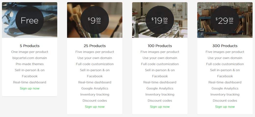
Considering that Shopify’s entry-level monthly fee is $29/month, Big Cartel makes opening an ecommerce store pretty affordable.
At the free level, you kind of get what you pay for. You can only sell 5 products and while you can use Big Cartel’s very limited selection of pre-made themes to create your store experience, you won’t be able to custom your store very much, offer discounts or track things like website traffic or inventory very easily.
Once you make the jump from free paid, you can sell a lot more products and you get access to a lot more handy features. However, the only real difference between Big Cartel’s paid tiers is how many products you can include in your store.
You can always increase your subscription level, so my general recommendation is to pick a tier that fits the number of products you want to sell and then increase your subscription level as your store becomes more successful and you begin to offer more items.
Big Cartel’s Strengths
If you’re an artist or a maker, there are a lot of things to love about Big Cartel. It’s affordable and easy to set up and use—especially if you don’t care about creating a highly customized experience for your customers. And, let’s be honest, if you’re only selling 5-25 products, you don’t need Amazon-level usability. You just need a store that features your products in an attractive, approachable way.
Here are a few other great features Big Cartel offers:
- Connects directly to your Facebook account so you can sell from your Facebook page
- Customizable code
- Search engine optimization
- Built-in credit card processing via Stripe or PayPal
- High-level data encryption that keeps your customers’ information safe
- Inventory tracking
Now, most of these features are only available through paid plans, but they can help you make the most of your store, so they are generally worth a $10+/month investment.
Big Cartel’s Weaknesses
Unfortunately, with ecommerce platforms, you kind of get what you pay for. If your goal is to sell hundreds-to-thousands of products through a fully customized store, Big Cartel probably isn’t the platform for you.
Here are some other things to keep in mind:
- It’s easy to set up a basic Big Cartel store, but if you want to really customize the look or features of your store, you’ll need to do a significant amount of coding (or pay someone to do it for you)
- Once you pick a name and URL for an item, you’re stuck with it
- Very few design templates to choose from (which, when you can’t really customize things without coding, means your store will probably look and feel like almost every other Big Cartel store)
- Customer support is only available via email from 9 am to 6 pm EST
For most artists and makers, none of these weaknesses are truly crippling, but it’s important to know what obstacles you will need to navigate as you create your Big Cartel store. You won’t get all the features of a Bigcommerce or Shopify store, but you won’t have to deal with the price tag of those platforms, either.
Getting Started with Big Cartel
Once you’ve signed up with Big Cartel and given them your basic information (username/password, address, domain name, etc), Big Cartel takes you to your new storefront management interface.
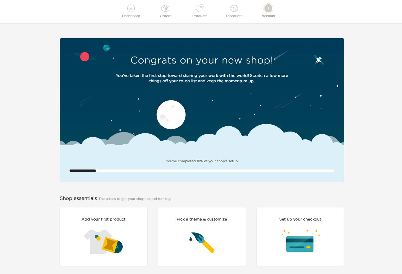
This is where you’ll do the majority of your Big Cartel management tasks, so it’s a good idea to spend a few minutes getting familiar with the interface.
As you can probably imagine, Big Cartel wants the setup process to be as simple and straightforward as possible, so your homepage immediately gives you the option to add your products. Go ahead and click “Add your first product” and let’s take a look at your options.
Adding Products to Your Big Cartel Store
When you add items to your Big Cartel Store, Big Cartel gives you a variety of fields to complete.
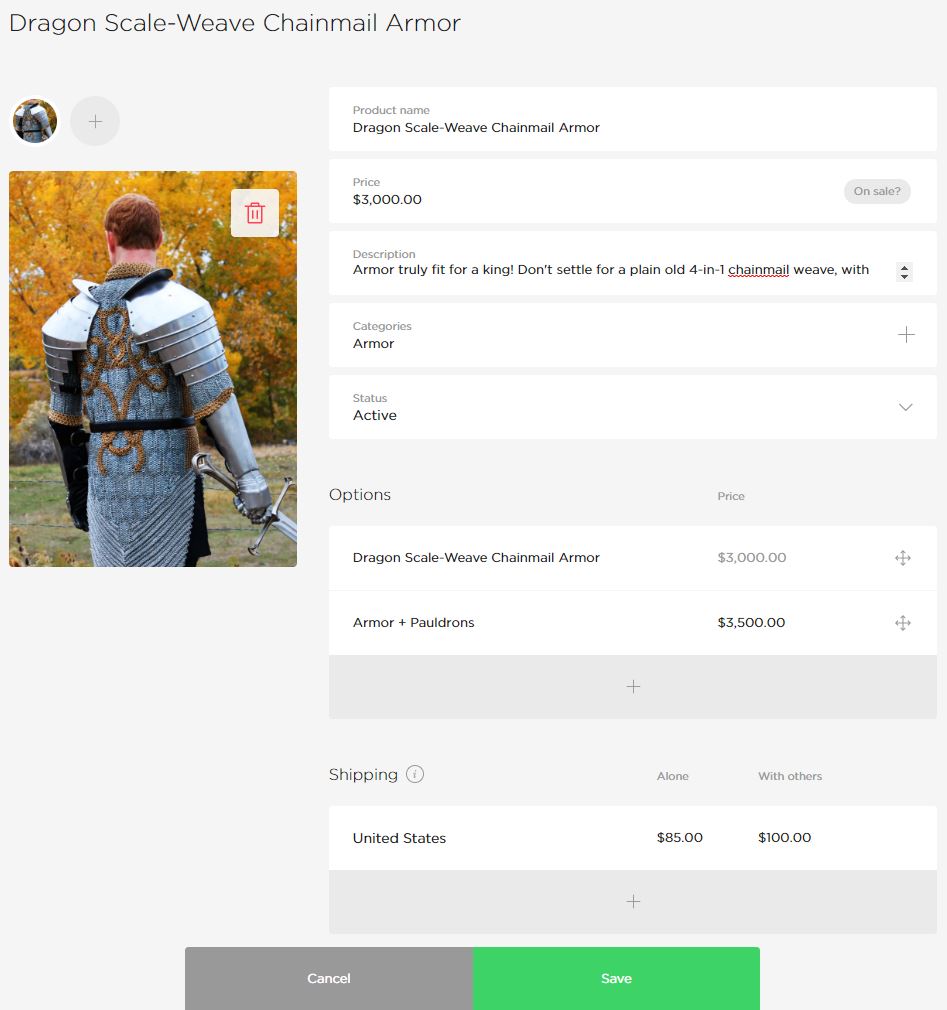
Most of these fields are pretty straightforward:
- Price is what you want to sell it for (you can include a sale price if you want).
- Categories help you and your customers sort through your products (really only valuable if you have more than 25-50 products).
- Options gives you a way to allow customers to further customize what they’re buying (if you use this feature, at least one of your names must match the name of your product).
- You can use Status to show, hide or give information about the availability of a product.
- Shipping allows you to manually enter your shipping costs for a particular item alone or grouped with other items.
Your title, description and images, however, will take a little more time and though to get right. Ultimately, how you set these fields up can have a huge impact on the success or failure of your Big Cartel store, so let’s take a moment to discuss how to effectively complete these fields.
Title & Description
Your title and description field contain text that tells your potential customers what your product is, how it’s made, what it does and other important information. In addition to telling your customers about your product, your title and description are what Google will look at for determining which organic searches your product can show up for.
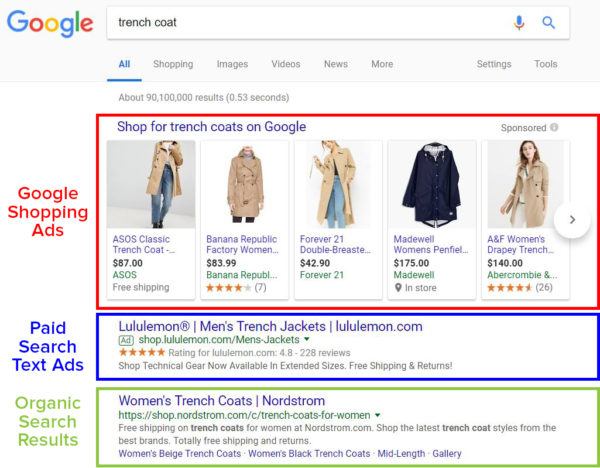
It’s important to note that these organic search result placements are different than paid search text ads or Google Shopping ads.
If your product page ranks organically for a particular search, you can get clicks to your page for free. However, there’s no guarantee that your product page will rank organically—even if your product is a perfect match for someone’s search.
You can improve the likelihood that your product page will show up for a relevant search by optimizing your title and description (this is called “search engine optimization” or “SEO”), but even the most optimized page can still struggle to rank—especially there is a lot of competition for your target keyword(s).
Images
In online shopping, image quality matters…a lot! Since people can’t actually examine your product in person, they are forced to rely on your images to make a decision.
So, if you don’t have great images, you probably won’t have great sales, either.
Image Optimization
Ideally, it’s best to have high-quality, clear images taken from a variety of angles. In addition, if your product has special features that you want to highlight (detailed embroidery, hand-carved trim, etc), it’s a good idea to include specific photographs of those features on your page.
Another great way to get more out of your images is to feature them in actual use. This helps people envision what owning or using the product will be like.
For example, most people who are interested in buying medieval armor want to look like (or have their significant other look like) a studly, manly knight, so including pictures like this might help convince people to buy:
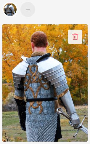
Image used with permission (Source).
As you photograph your products, make sure that your lighting and color schemes match the feelings you want people to associate with your product. High-end products like jewelry look best in clean or high-contrast environments, while eco-friendly products work better with more natural hues, tones and backgrounds.
Loading Speed Optimization
Unfortunately, images are something of a double-edged sword. While high-quality images are great at convincing people to buy, they can also slow down your website.
Most people will only tolerate a page load time of about 2 seconds, so if those beautiful photos don’t load quickly, they could end up killing off potential sales instead of aiding them!
As a general rule of thumb, each image should be less than 70 kb.
Now, most high-quality photos are a lot bigger than 70 kb, so you’ll probably need to resize them for your product page. The easiest way to do this is to use photo-editing software like GIMP (free, but clunky) or Adobe Photoshop (easy, but costs money).
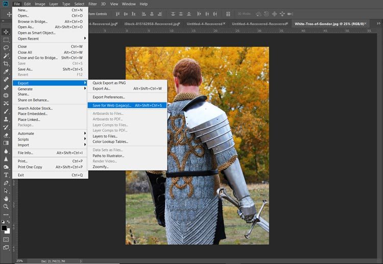
To resize your photos in Photoshop, open your image in Photoshop and click File > Export > Save for Web:
From there, you can play around with a variety of settings until you find the right balance between file size and image quality:
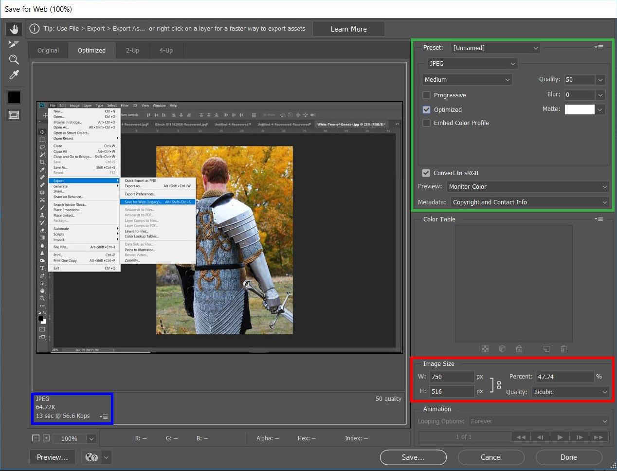
Let’s take a quick look at each of these settings and how they affect your images:
- Quality. Lower numbers = lower image quality and lower file size.
- File format. In terms of file size, JPEG < GIF < PNG. But, the same rule applies to image quality.
- Optimization. Checking the box tells Photoshop to optimize your image for web use (decreases image size).
- Color. Fewer colors = lower image quality and lower file size.
- Image size. Allows you to choose the actual number of pixels in your image. Fewer pixels = smaller image and lower file size. Keep in mind that if you save an image at smaller size than it will be shown on your page, your image may be stretched to fit your page, resulting in heavy pixelation and/or image distortion.
You can see the file size in the bottom left-hand corner of the window. This number—along with a preview of your final image—will update as you make changes to your export settings.
Photoshop’s “Save for Web” tool (other photo editing programs have similar tools) make it fairly easy to balance image quality and file size. That way, you can make sure that your pictures really sell your products without compromising on load speed.
Choosing Your Big Cartel Theme
Once you’ve entered all of your products, it’s time to put your store together. Head back to the setup page by clicking the white “You’ve completed XX% of your shop’s setup” bar at the top of your products page and then click “Pick a theme and customize”.
Here, you have a variety of options you can use to customize the look and feel of your Big Cartel store:
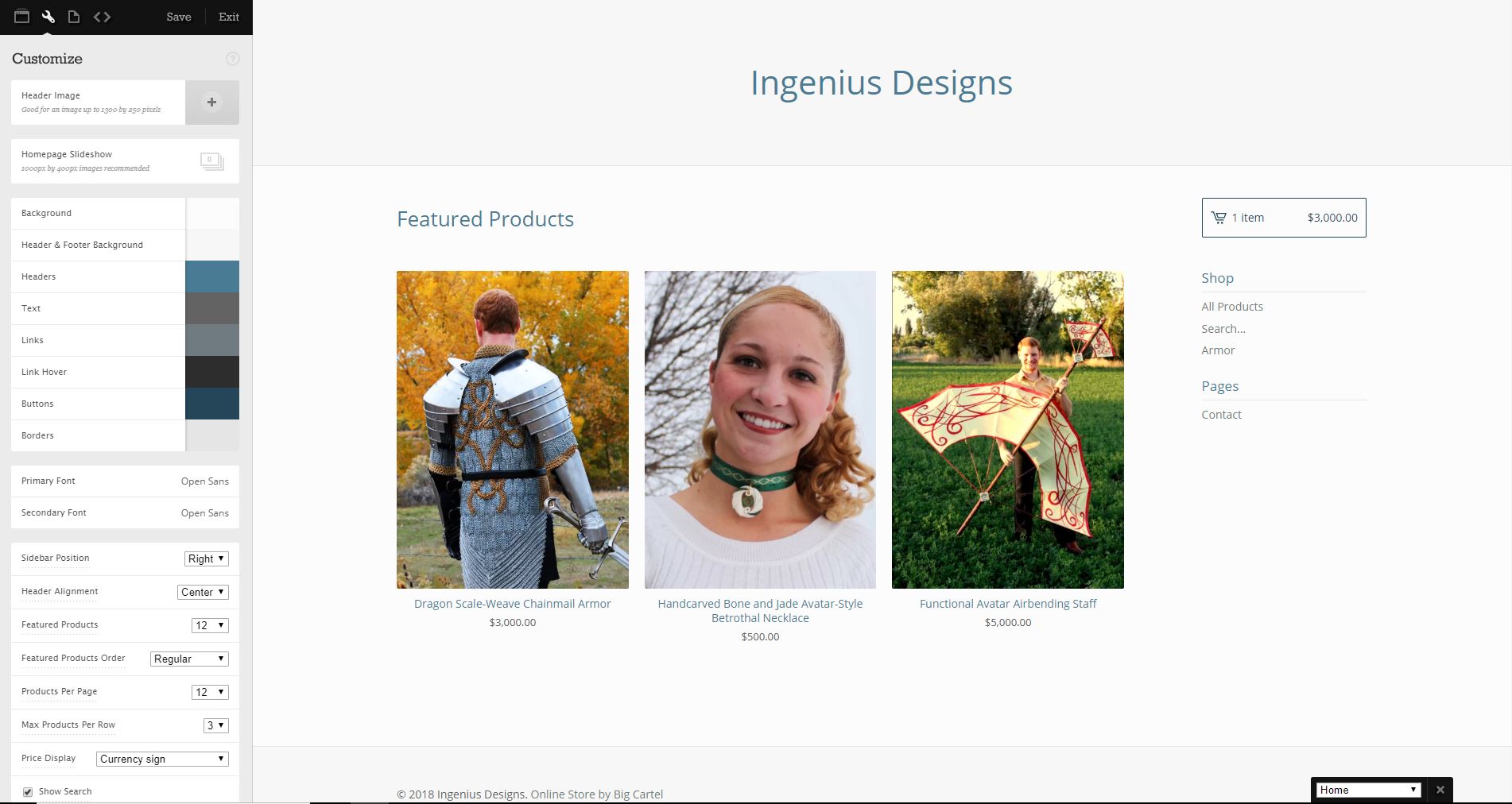
Big Cartel themes are predesigned store designs that you can use to feature your products without having to hire a designer or a developer. At the moment, Big Cartel has 15 themes to choose from. The base theme (shown above) is called “Lunch Break”.
With any of these themes, you have the ability customize your background, colors, fonts and alignment, amongst other things. It’s not a ton of flexibility, but with a little time and effort you can put together a good-looking—if not particularly imaginative—ecommerce store.
Big Cartel Themes
Let’s take a quick look at each of these themes. Aside from cosmetic differences, they are all very similar, so the right theme for your business will mostly depend on what you’re selling and what sort of look and feel you want.
Since Big Cartel doesn’t carry any of your changes or uploaded images across when you change themes, I’ve gone ahead and taken screenshots of these themes with tweaks made to them so that you can compare them side-by-side without repeatedly uploading everything.
Obviously, since I was doing this 15 times, there are a lot of fine-tuning tweaks that you’d want to make to really nail the look and feel of your store, but the following breakdown should help you pick the theme that’s right for you.
1. Lunch Break Theme
My favorite thing about the Lunch Break theme is the slider on the top (note, I’ve sped up how quickly the slider triggers in this GIF):
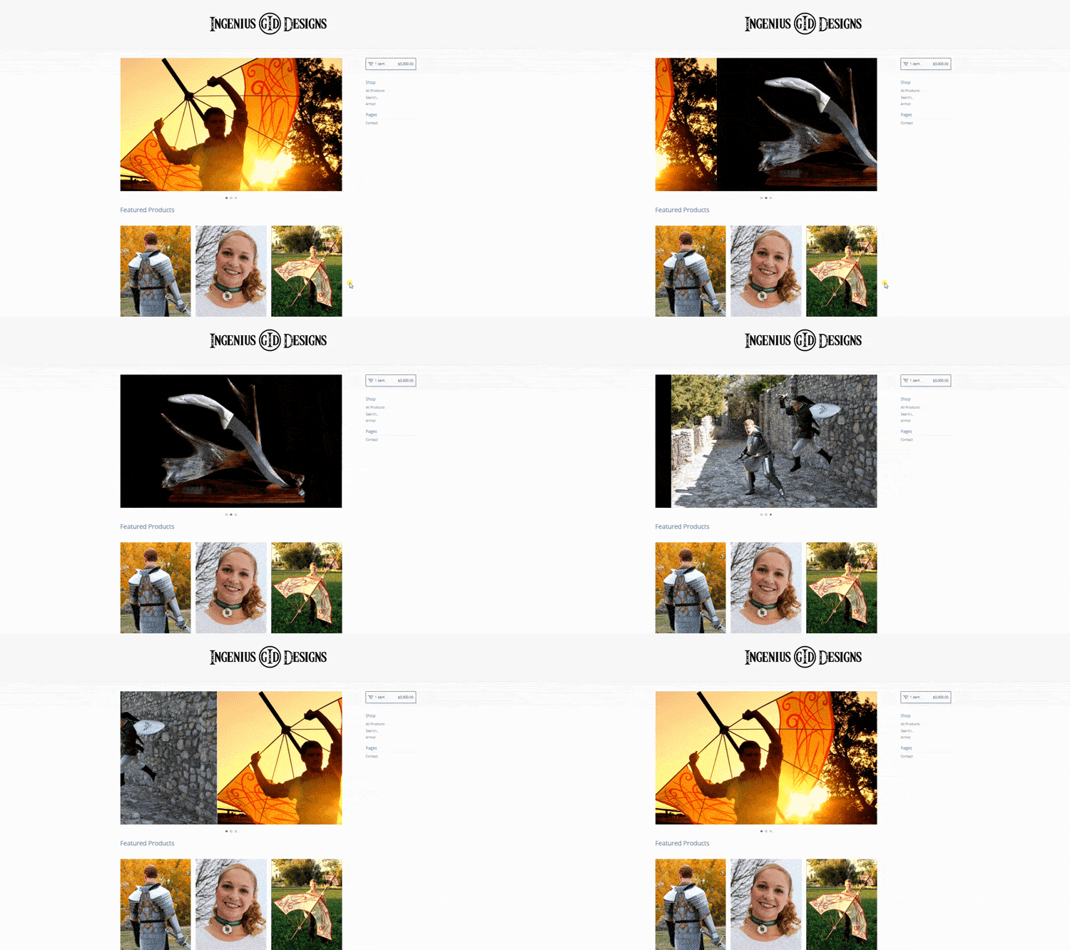
This slider is a great way to feature specific products or images to catch a potential customer’s eye. When you have hundreds of items, this doesn’t work so well, but for artists and makers, this is a great little widget.
In addition, the overall form and function of the Lunch Break theme makes it one of my favorites of the 15 themes you have to choose from. The biggest downside? It’s the default theme, so a lot of other people are probably using it, too.
2. Parade Theme
After Lunch Break, the next theme option is Parade, which looks like this:
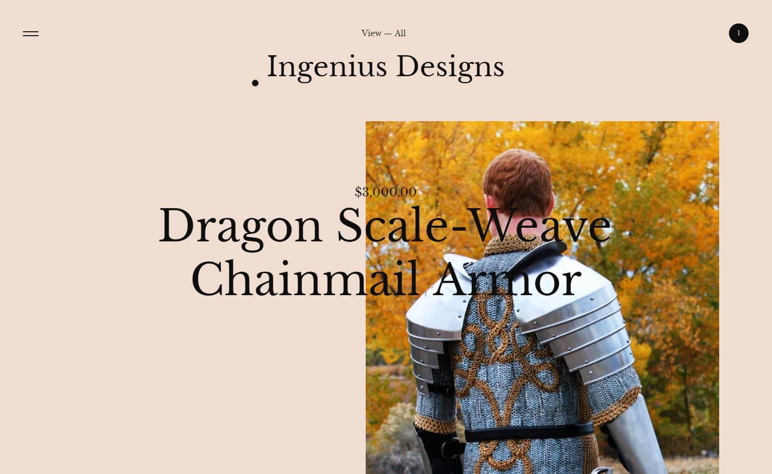
Out of the box, I hate the look and functionality of this theme, but with enough tweaking, you could probably create something that looked nice and presented a user-friendly experience. Unfortunately, I’ve yet to see an example of this theme being executed well, so the jury’s still out.
3. Hopscotch Theme
Your third theme option is Hopscotch:
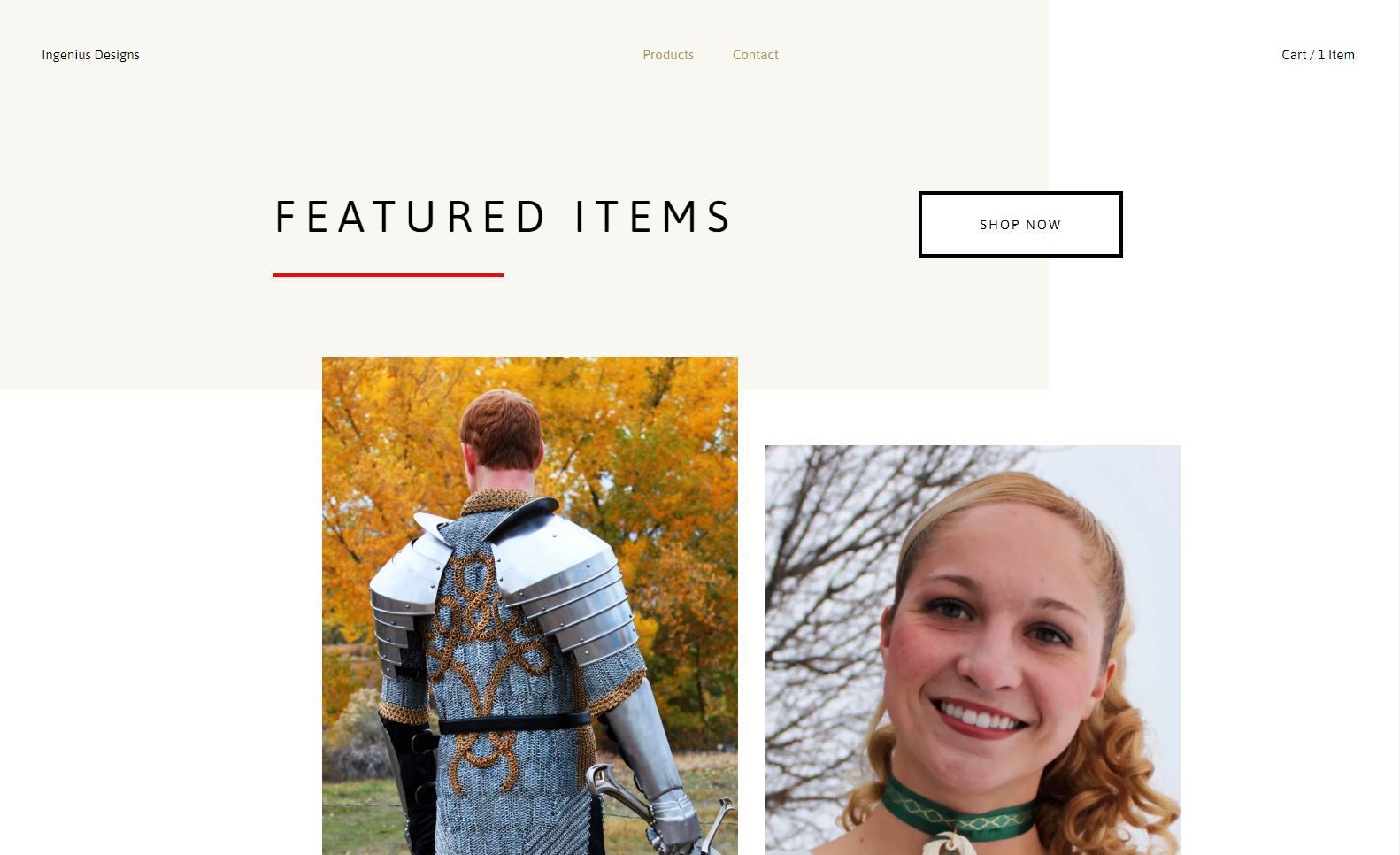
This theme is very similar to Lunch Break, but it has a nice modern look that would work well with a variety of chic or elegant products photographed against a solid background.
4. Snacks Theme
Next, we have the Snacks theme:
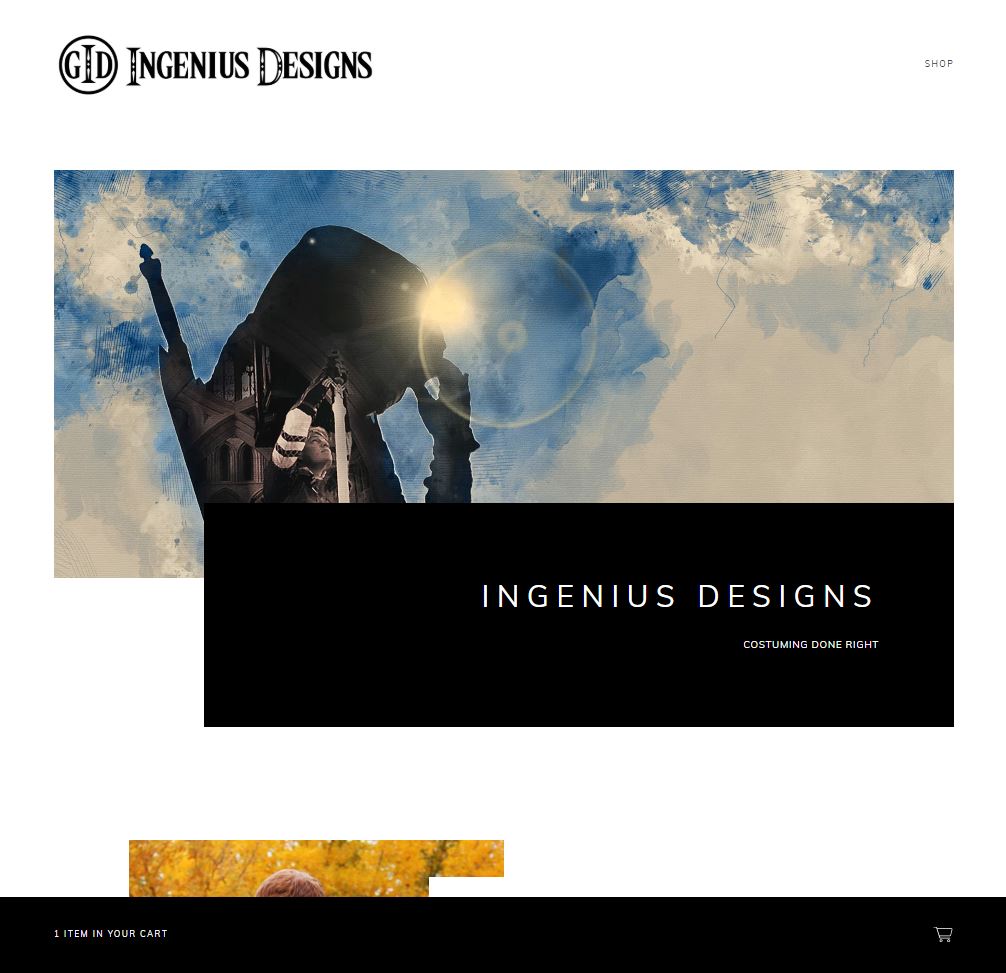
This theme is more minimalist than the other themes and works well for stores with only a few items. If you have more than 10 items, however, this page could quickly get very long and difficult to navigate. In addition, the Snacks template places the cart on the bottom of the screen, which is definitely different, if that’s the feel you’re going for.
5. Setlist Theme
Like the Parade theme, the base version of Setlist doesn’t look very good.
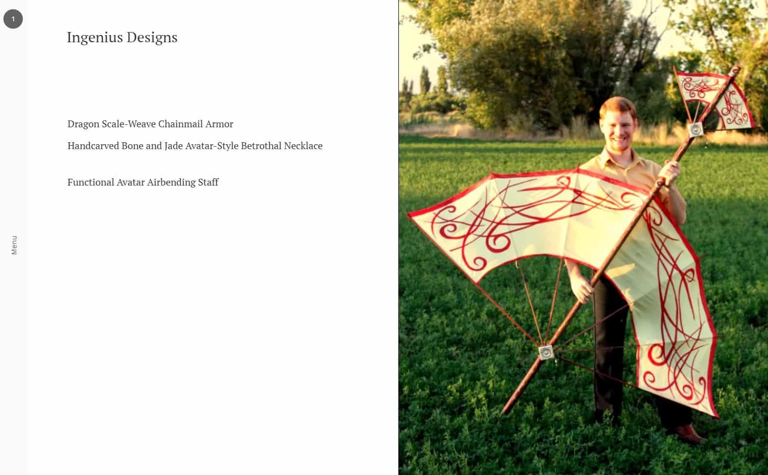
However, unlike Parade, I was able to find some examples of this theme being put to good use:
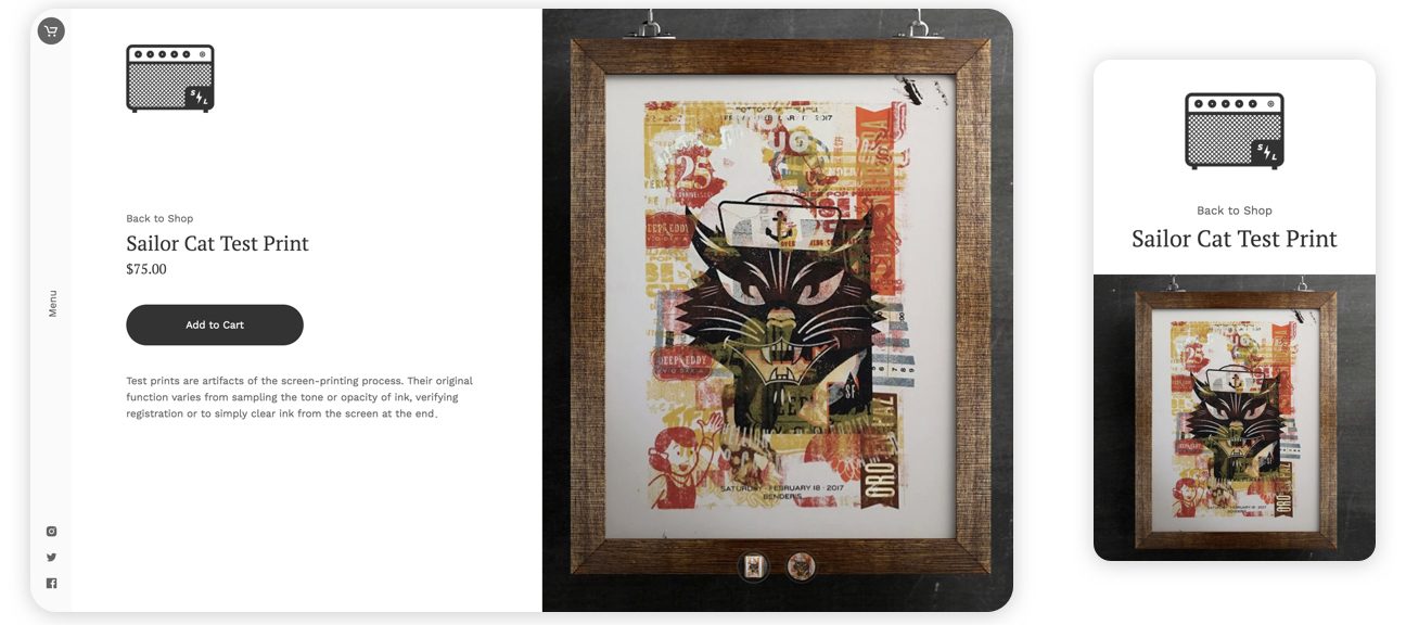
Even if you do it right, though, I still have a hard time with this theme. The left-hand navigation seems counter-intuitive to me and while the product slideshow is a nice touch, the inability to scroll through or find products makes this theme hard to use.
Now, don’t get me wrong, when it’s done right, this theme is very reminiscent of visiting an art gallery, but the template is too hard to use to really impress me.
6. Ranger Theme
On the opposite end of the spectrum, we have the Ranger theme:
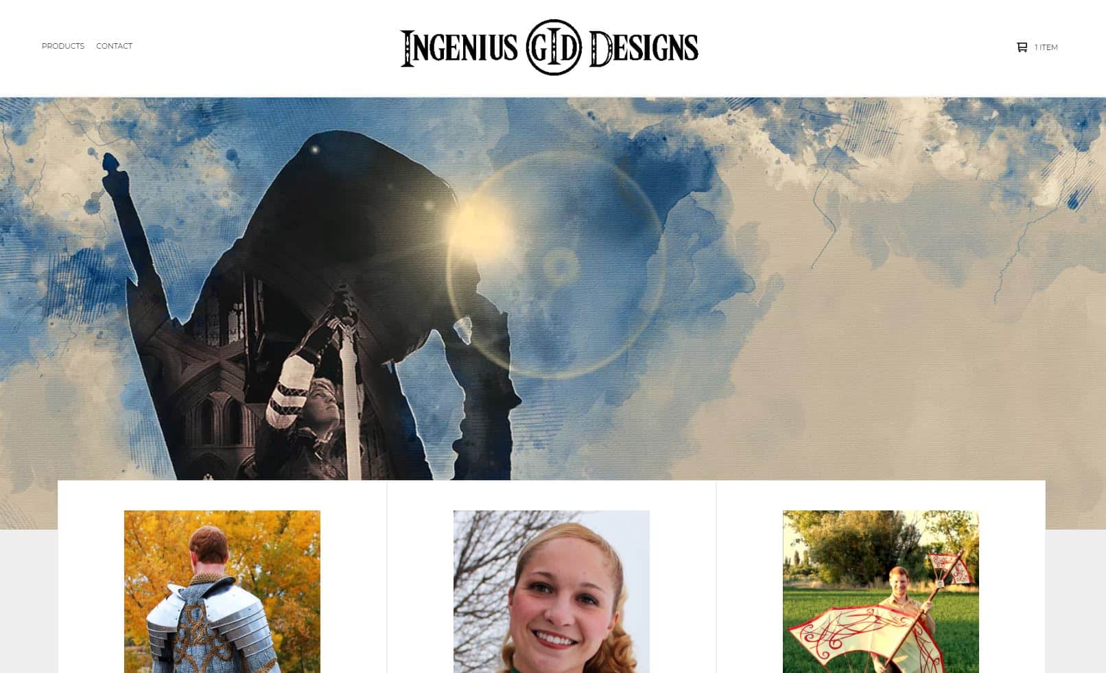
Unlike the Setlist theme, Ranger has a very classic ecommerce store look. As you can see below, this design looks a lot better when your product images have a white background (rather than the full-background images found in my mock store design above):
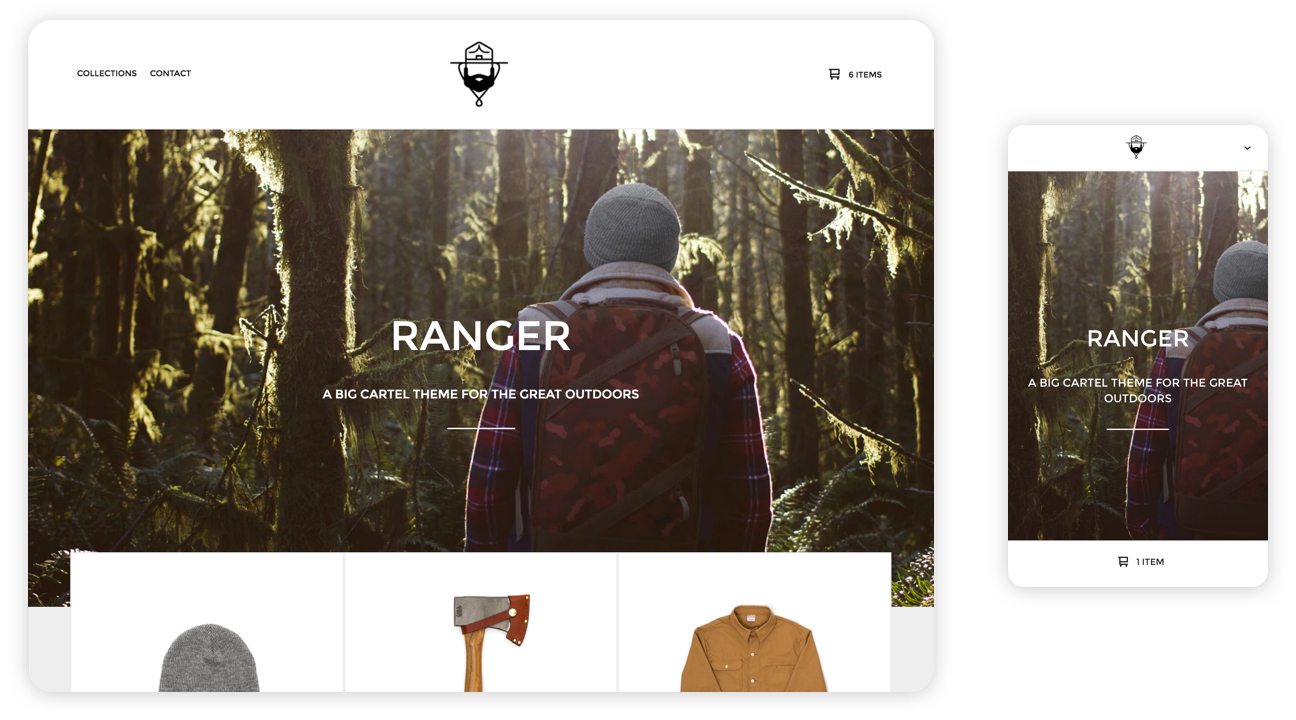 Ranger is a good theme for more conventional ecommerce products like custom apparel or if you have access to a white cyclorama for photographing your products.
7. Trace Theme
The next template in Big Cartel’s bag of tricks is Trace:
Trace is very simple and to the point. My favorite feature is the featured images section at the bottom of the home page, where users can click between featured products. This is ideal if you only sell a few products and a good way to guide people towards your best-sellers if you sell a lot of different items.
8. Foundry Theme
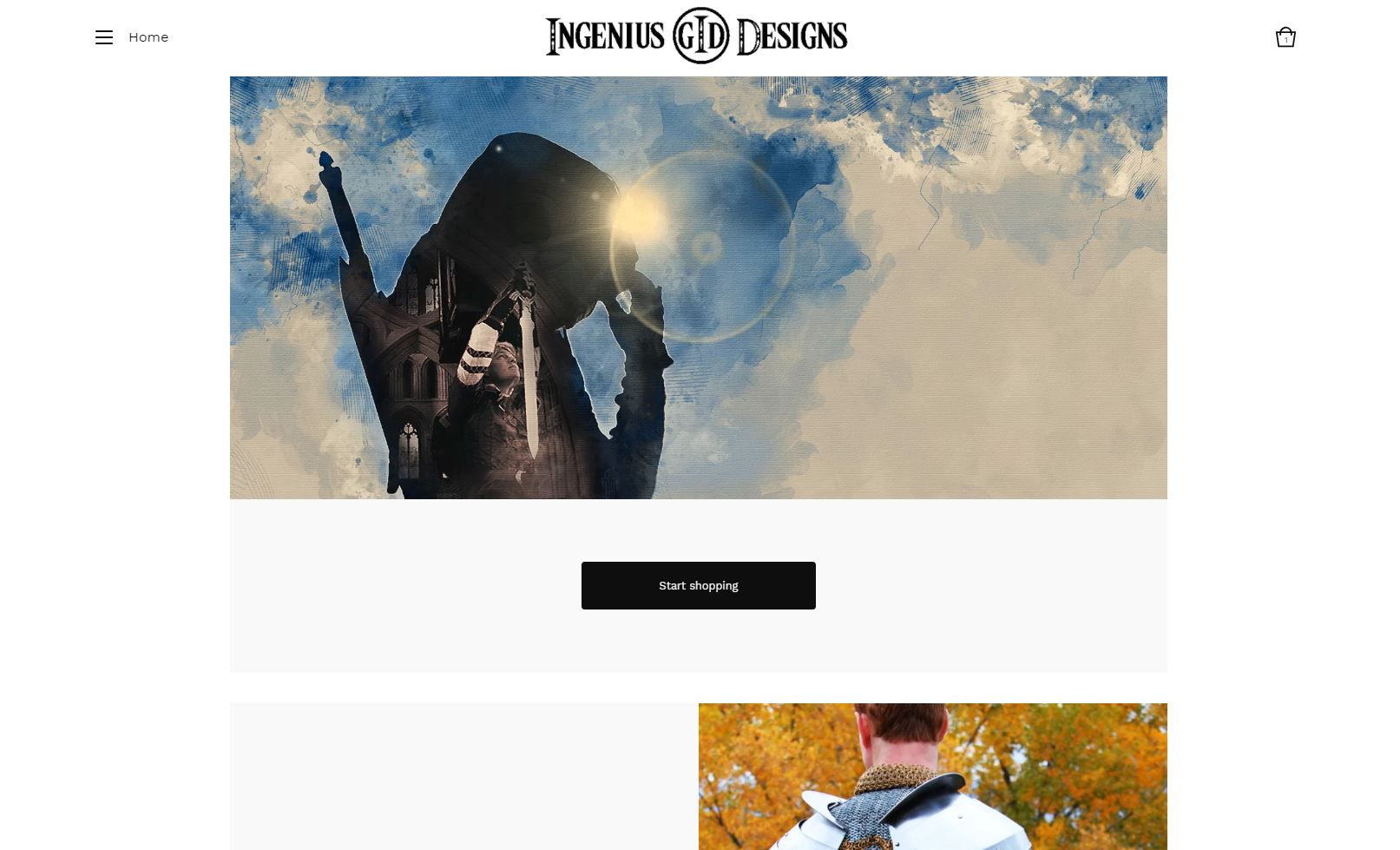
Our next theme, Foundry, gets right to the point with a very dramatic above-the-fold experience:
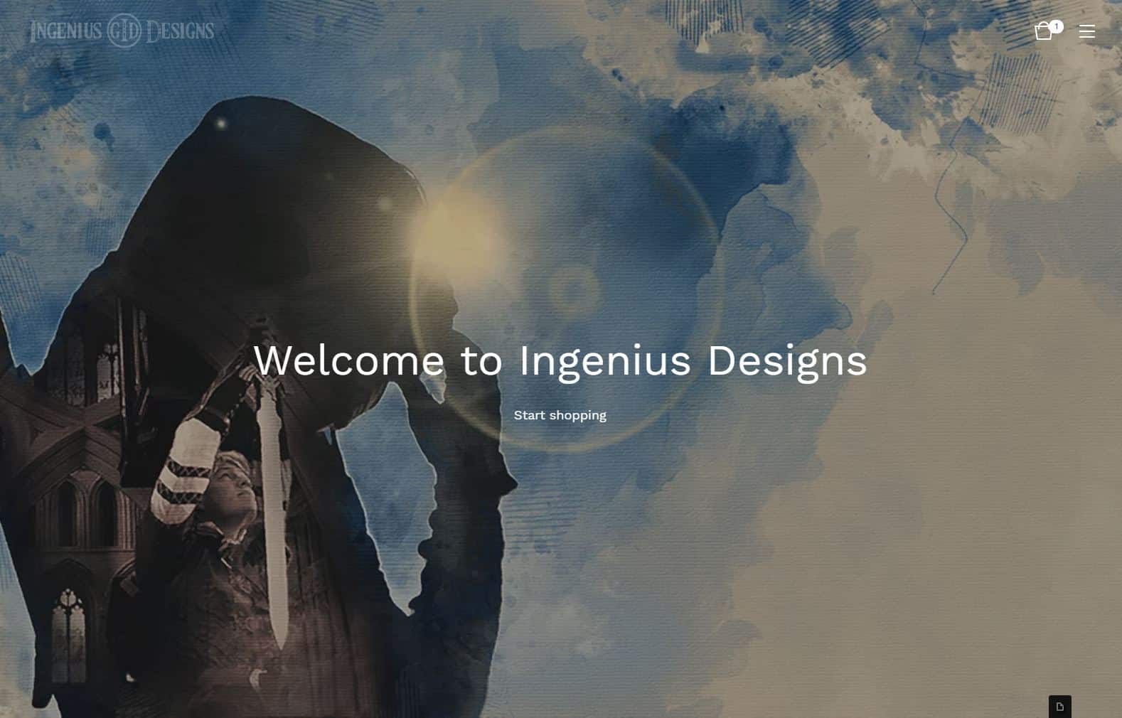
This theme leaves users with no doubt about where they are and what they should be doing. If your main selling point is bold, dramatic photos of your products or items in use or your brand is well established on social media (or elsewhere), this can be a great theme to use.
The downside to this theme, however, is that it doesn’t really showcase your products until people either click the “Start shopping” text or scroll down to your actual items. If people happen onto your site at random, this could lead to some confusion and people potentially abandoning your site instead of finding products to buy, which is why this template should work best for artists with an established brand.
9. Neat Theme
If Trace’s one screen-filling image didn’t create enough visual impact for you, Neat lets you turn your above-the-fold experience into a slideshow (again, I’ve cut out some of the time between slides to showcase the effect—the actual interval between pictures is closer to 5 seconds, not 2 seconds):
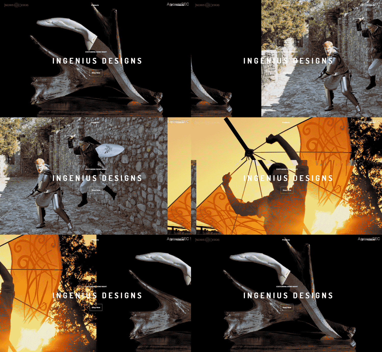
Honestly, if you have glorious images that you want to feature and you really want to make your store an experience, this is the template I would go with.
If you do choose Neat, though, be thoughtful about the images and font colors you choose. As you can see above, my darker images look great with the white text, but the text is hard to read against the orange image, so that may make things difficult to read.
Here again, like Foundry, this theme doesn’t immediately showcase your products, so that’s something to keep in mind if you don’t have a well-established brand.
10. Sidecar Theme
Yet again, we’re now going to go to the complete opposite end of the design spectrum with our next template, Sidecar.
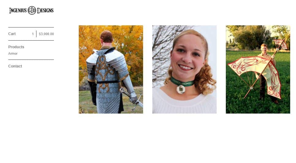
Unlike Foundry and Neat, Sidecar is completely focused on your products. Design-wise, Sidecar feels like a return to the early 2000s, but a simple approach like Sidecar puts the focus on what matters most to you: selling products.
Sidecar is probably a good option if you have a ton of products for people to see. It won’t be the prettiest experience, but it will help your customers find what they’re looking for as quickly as possible.
One word to the wise, unless you really want to look like your site is straight out of the nineties, avoid using the repeated featured image option. Clutter in your workshop might not be a big deal, but visual clutter on your Big Cartel store is a great way to lose potential customers.
11. Luna Theme
From a functionality standpoint, Luna is a lot like Sidecar, but it’s design is a lot more modern:
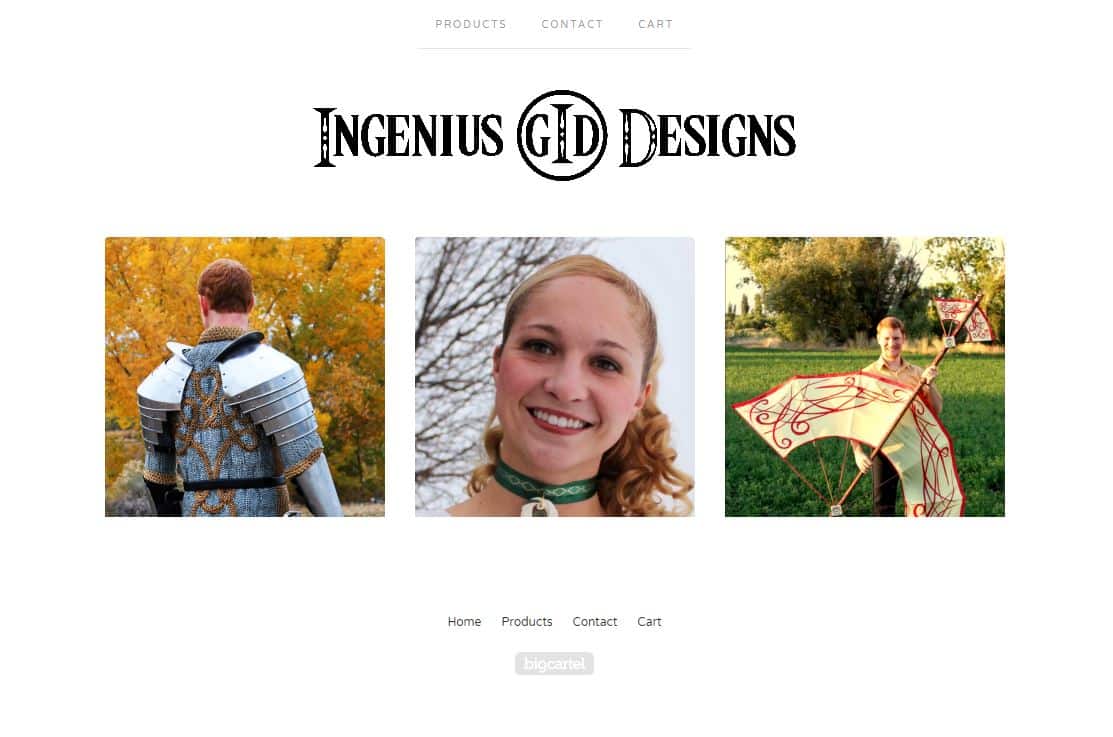
Like Hopscotch, Luna’s modern look works well for chic or elegant products photographed against a solid background (ideally a darker background with this particular theme). If you happen to offer digital products or services, Luna could also work well with flat art-style depictions of what you’re selling.
12. Good Vibes Theme
Finally, if you like the idea of a slideshow, but Lunch Break’s images are too small and Neat feels to large, you can use Good Vibes (again, intervals between pictures have been shortened):
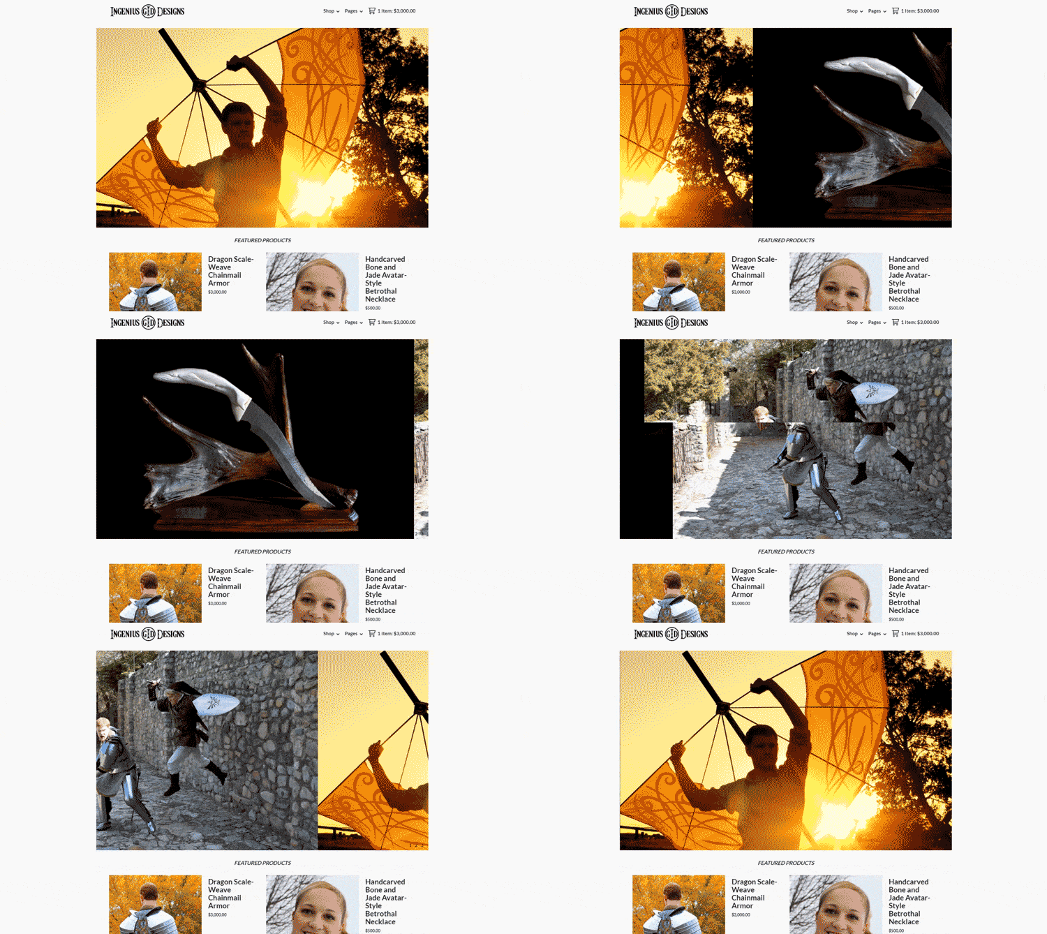
Honestly, aside from slight differences in how products are presented, the size of the slideshow frame is the biggest factor between these themes, so it’s really up to you to decide which one suits your fancy.
13. Picklejuice Theme
If you’re more of a digital artist than a photographer but you still want to use a slideshow, you may want to give Picklejuice a look:
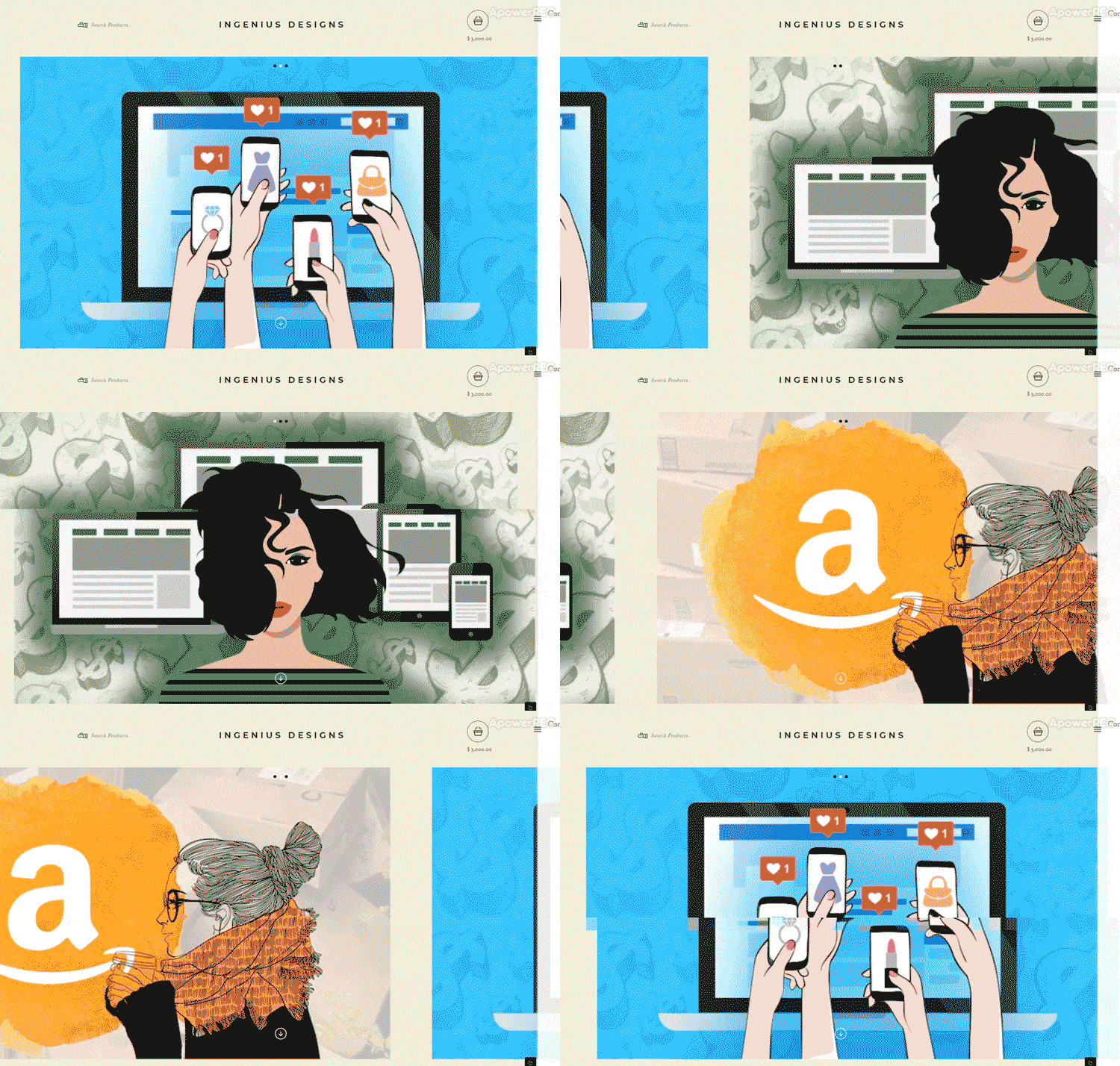
Unlike our previous slideshow options, Picklejuice works best with flat art-type images, so if you sell digital products or services and flat art is your thing, Picklejuice could be a good way to go.
My biggest complaint about Picklejuice is the tacky-looking, counter-intuitive navigation bar on the right hand side of the browser. With the right tweaks, it wouldn’t look as bad, but it still makes for a difficult user experience.
14. Nova Theme
If you run a blog (or plan to as part of marketing your ecommerce store) and want a blog-like look for your store, Nova is the theme for you:
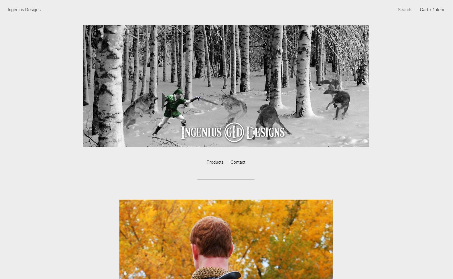
That being said, blogs are designed for content, not selling stuff, so Nova doesn’t offer a particularly user-friendly shopping experience. If you only sell a few items, that’s not a problem, but if you want to sell 10+ items, I’d pick a different theme.
15. Snakebite Theme
Finally, rounding out our selection of slideshow options, we have Snakebite:
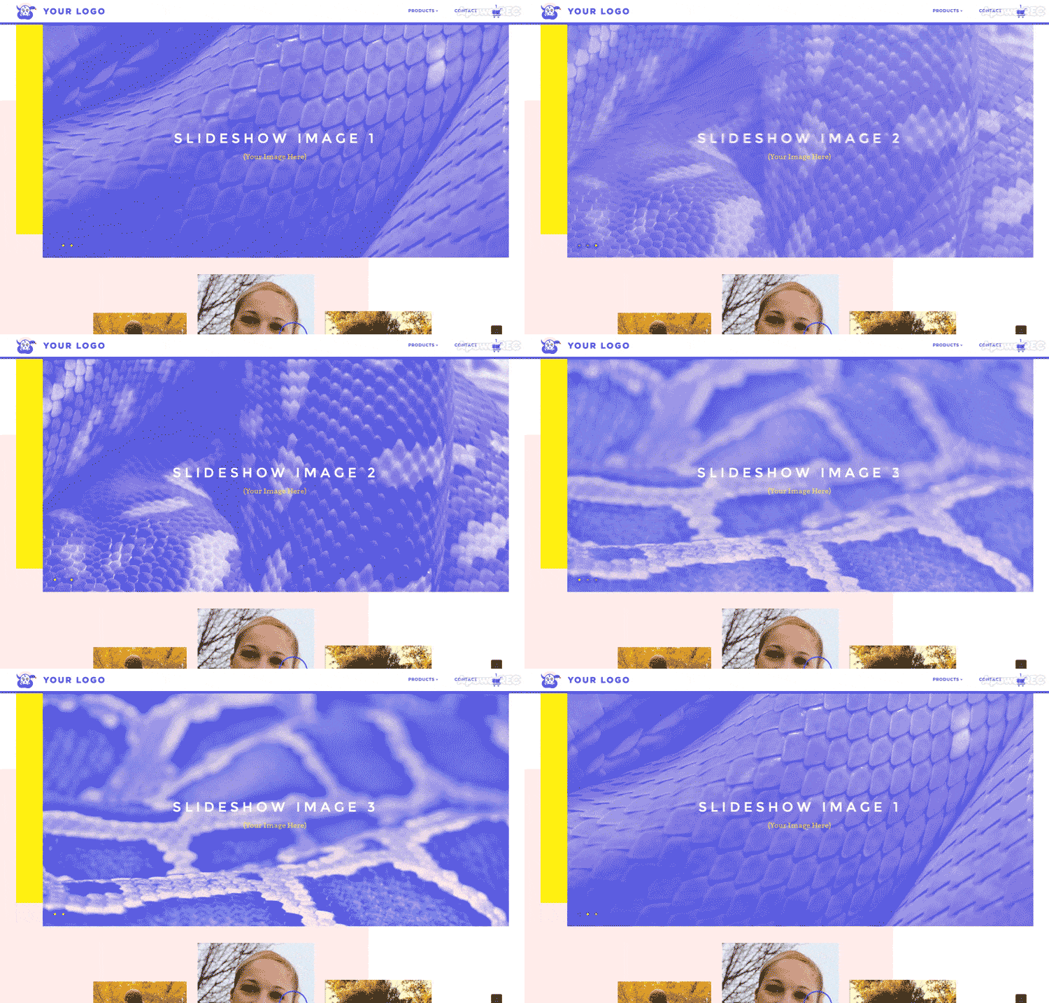
This theme was clearly designed to provide an “in your face”, eye-catching experience. You can certainly use less intense imagery and colors in the theme, but it kind of misses the point, which is why I chose to leave the sample images in the slideshow for you (monochromatic really isn’t my thing, so I don’t have pictures that match this style very well).
Snakebite is designed for businesses with very strong visual branding. If you are opening a Big Cartel store because you already have a strong design brand and experience, this theme may be ideal. If not, I’d probably avoid this theme.
Adding Non-Product Pages to Your Store
If you’d like to add a non-product page to your store (“About Us” page, “Contact Us” form, etc), click on the small page next to the wrench icon at the top of the editor interface. This will bring you to a new area where you can build the content for your page.
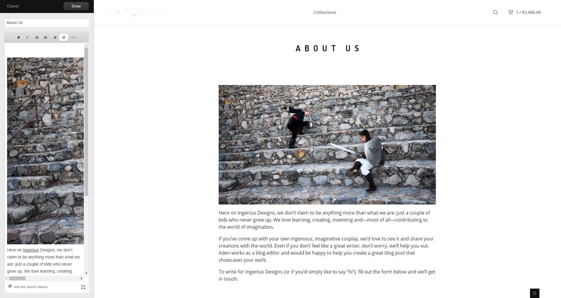
By default, Big Cartel will create a page that matches the theme you’ve chosen, but you can disable that option if you’d like to style it on your own. Of course, doing that (or doing anything beyond adding simple text or images to your page) will require some coding knowledge, but it is an option.
As soon as you hit “Save”, the page will show up in your navigation bar. That’s handy, but remember that every page you create will show up in the navigation, so you’ll want to limit the number of pages that you create to avoid cluttering your navigation.
Conclusion
And that’s about it! Once you’ve added your products, picked and customized your theme and added your pages, you’re just about ready to go.
Of course, you’ll still need to set up your payment options with Stripe and/or PayPal, decide if you want to install any apps (if you have a paid account, I highly recommend installing the Google Analytics app at minimum—more about why here) and set up a custom domain (assuming you have a paid account).
But, all of that is a simple matter of filling in the blanks or clicking enable in a couple of areas, so I’ll leave that up to you.
As you launch your store, keep in mind that this is just the beginning. To really get the most out of your ecommerce business, you’ll need to market your store, optimize it for maximum conversions and sales and much, much more.
But don’t worry, we’ll be with you every step of the way.
When you’re ready to take things to the next level, either let me know here or check out the links above. We want to make sure that your Big Cartel store is everything you hope it will be.
How do you feel about Big Cartel? What has your experience with this ecommerce platform been like? Anything you’d add to this article? Leave your thoughts in the comments!

