2 Questions to Ask Before Designing Your Next Landing Page
by Aden Andrus • June 29, 2016
Landing pages are a great way to get better results from your online marketing campaigns.
Your audience is looking for something specific and a custom landing page gives them exactly what they are looking for.
But why, then, if landing pages are such a great idea, do so many companies still send their PPC traffic to their home page?
Or, for companies that use landing pages, why don’t those pages produce more conversions?
As it turns out, most companies with a poor landing page experience struggle because they simply don’t understand how to align their customer’s needs and expectations with their landing page content.
By nature, a landing page isn’t like a typical page on your site (otherwise, you’d just send traffic to your site, right?). So, if you want an effective landing page, you need to approach your design process with different goals and key elements in mind.
To understand what your landing page needs to succeed, you need to ask yourself 2 key questions:
1. What Do You Want Your Traffic to Do?
The goal of every marketing campaign is to convince someone to do something. If your landing page isn’t designed to get people to do what you need them to do, you’re not very likely to get good results from your page.
Depending on your marketing campaign, success usually takes one or more of the following forms:
- You get their information. Maybe you want their name, phone number, email or website domain. Perhaps you need even more sensitive information like their home address or credit card number. Regardless of the specific information, though, the goal of your campaign is to get information out of your traffic.
- They contact you. You might want them to submit a form, call you directly or start an online chat. In any case, you want them to reach out.
- A purchase is made. It might be a service, it might be software or it might be a physical product. The point is, you want them to make an actual transaction on your page.
Once you’ve identified what you want people to do, you need to build your landing page to encourage them to take that action.
There might be a lot of elements that go into getting your audience to act—allaying their fears, showing how your offer will make their lives easier, etc—but your page needs to be focused on producing the desired action.
Call-to-Action
One of the most important parts of getting people to act is actually asking them to do something—giving them a call-to-action (CTA).
Specifically, your CTA should both motivate and clearly explain the benefits of taking your desired action.
For example, consider this classic CTA:
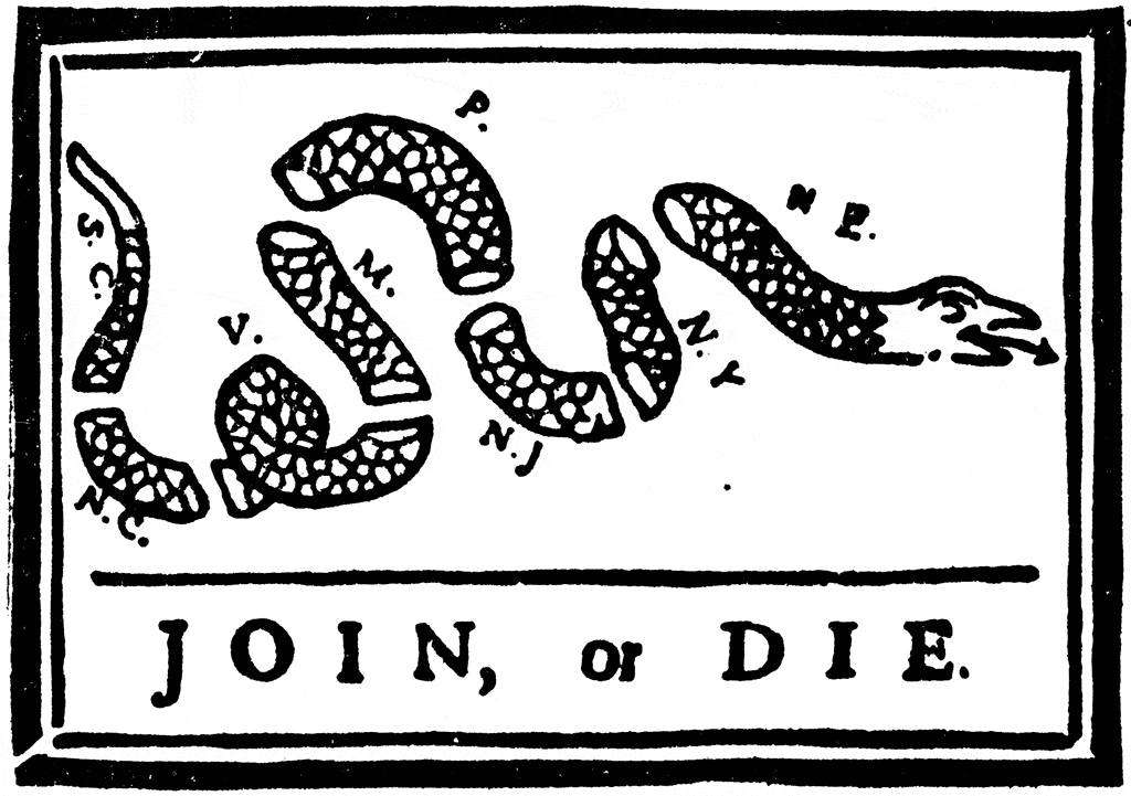
Basically, the benefits of taking the recommended action are life…that’s pretty motivating.
Motivating enough, in fact, that it helped turn 13 British Colonies into the United States of America.
See how powerful can a good CTA can be?
In any case, you can’t expect people to do what you want them to on a wish and a prayer. Your user is giving you something—you should offer them something in return.
So, if you want people to give you information, you should tell your audience what they get in exchange for that information. “Get My Free Proposal”, “Fix My Computer” or “Send Me My 20% Off Coupon” all clearly explain what a user gets for giving away their information.
[clickToTweet tweet=”Clarity is the key to a successful call-to-action.” quote=”Clarity is the key to a successful call-to-action.”]
Not suprisingly, CTAs like “Click Here” or “Submit” aren’t great choices. “Submit” simply tells you what to do, it doesn’t give you a reason to do it.
Regardless of what your CTA is, your whole page should be designed to get people ready for the next step. Your CTA simply tells them what the next step is and gives them an easy way to act.
2. Why Should Your Traffic Do It?
Once you know what you want people to do, it’s time to think about why they should do it.
Without lying to people (which is highly unethical and a very bad way to run a long-term business—I strongly recommend against it), you can’t build a landing page that will convince someone to do something that they don’t want to do.
I may want rich people to come to my landing page and give me a million dollars, but that’s simply never going to happen.

If you want people to do something, you need to convince them that you are worth it. This is where your unique selling proposition (USP) comes into play.
Your USP is the why behind your marketing. It’s what sets you apart from the competition. It’s what makes you worth their time, information, money or whatever else you are asking for.
In general, you should be able to boil your USP down to a sentence or two, say something like, “fastest sandwich delivery in the west” or “our customer service representatives are available 24 hours a day, 7 days a week.”
For example, check out this USP:
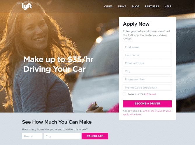
Clearly, if you become a driver (their CTA), you could make up to $35/hr driving your car.
Sure, for some people, that may not be all that interesting, but for most of us, that sounds like a USP that’s worth applying for.
When it comes to the specific USP you use on your landing page, you may need to be a bit flexible.
For example, if emphasizing the speed of your service doesn’t seem to speak to your audience, you might need to shift gears and focus on quality. What you prize in your company may not be what your target audience actually cares about.
Once you’ve identified your USP, you need to use it to convince your audience to act.
Depending on your audience and offer, you may need more or less content to do this, but essentially, every landing page should at least have the following 6 elements:
1. Main Headline
Basically, your main headline should be similar to that 1-2 sentence description of what makes your offer unique and worth having.
In addition, your main headline should immediately communicate to your audience that they are in the right place and give them an idea of what they can expect from the rest of the page.
2. Sub-Headline
Your sub-headline effectively clarifies and expands on your main headline. It might be that second sentence in your 1-2 sentence description or it might add further detail to the USP you’ve already described.
Generally speaking, the sub-headline shows up right below the main headline, albeit in a smaller font.
3. Hero Shot
Your hero shot is usually the first image your traffic will see and it is typically shown together with your main and sub-headlines.
Essentially, your hero shot needs to communicate in broad terms the concepts and emotions contained in your USP.It simultaneously represents your offer, your USP and encourages a user to convert.
As you might imagine, the right hero shot really is “worth a thousand words.”
One great way to do this is by giving your traffic context of use.
In other words, your hero shot should help the user picture themselves experiencing your product or offer (and hopefully in a way that makes them think,“That’s me!” or, at least, “I wish that was me!”).
In effect, you want people to believe that doing what you are asking them to do will make them feel like this:

For example, if you provide a service, a picture of happy people enjoying the benefits of your service would be a great choice. On the other, hand if you are selling a product, a picture of someone using your product can go a long ways towards helping your traffic identify with your USP.
4. Reinforcing Copy/Content
Basically, reinforcing copy and content supports the statements in your main and sub-headlines. This might be videos, photos or written copy, but it should all work together to build the case for your USP.
Note, depending on what you’re trying to get people to do, you may have a lot or very little reinforcing copy.
In general, if your ask has a high perceived risk or is complex (ie, a lot of information), you may need more reinforcing content to convince people.
5. Social Proof
As compelling as your site and USP might be, everyone knows that marketers have an agenda.
Sure, you say your offer is awesome, but you’re getting paid to say that. What do real people have to say?
Social proof is one of the most effective ways to put these fears to rest. In essence, putting social proof on your page gives people a way to silence their inner cynic.
They’ll feel like they’ve done their homework, so they can just take the plunge and act! (for more info on how to effectively use social proof, check out this article).
6. Closing Argument
Hopefully, if your traffic takes the time to read through your whole page, they should be ready to convert. If not, they are probably moments away from leaving your page.
Either way, this is a critical opportunity to make a final argument for taking your desired action.
In your closing argument, you simultaneously want to take your audience back to what brought them to your page in the first place, summarize your USP and urge them to action. That’s a tall order for 5-7 words, but with a little effort, you should be able to put something compelling together.
Conclusion
If you want highly effective landing pages, you need to understand what you want your traffic to do and why they should do it.
Once you have those two pieces, building your landing page is simply a matter of using your USP to building a compelling case for your desired action. Easy, right?
By the way, if you’d like me to help you identify a few ways to improve your landing page approach, let me know here or in the comments!
What questions do you ask yourself before you build a new landing page? In your opinion, what makes a successful landing page work? Would you add any other elements to these 2 questions?


