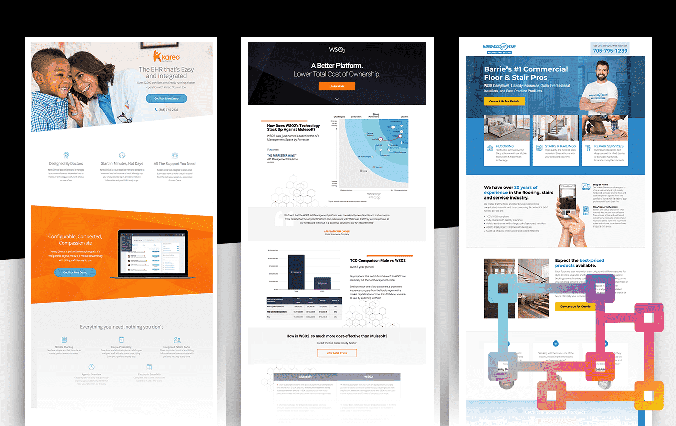
What Is a Landing Page? 11 Landing Page Examples
by Saunder Schroeder • January 28, 2022
By Saunder Schroeder
Spend any amount of time in online marketing and advertising spaces and you’re bound to notice the term “landing page” pop up dozens of times. But what is a landing page — and how are they different from other web pages?
Despite being an incredibly important concept, online marketers have failed to provide a solid definition. That’s because landing pages aren’t just one thing. They just serve a similar goal. In this article, we hope to provide you with a well-rounded understanding of what makes a good landing page, as well as some of the tools you can use to set up a landing page of your own.
What Is a Landing Page?
The shared aspect between all landing pages is that they’re the page you “land on” after clicking on a link. This is your introduction to the website, and it should serve as an attention grabber. In other words, a landing page could be anything: your home page, a blog post, or even a sign-up page.
To be more specific, landing pages are often used to convert incoming traffic into leads for email marketing by collecting the visitor’s email address and contact information. By using these criteria to identify landing pages, you’ll find that we’re eliminating home pages and blogs from the definition.
The confusion is understandable. Most landing page definitions are written by online marketing experts who want to sell you tools and services to build a landing page. So naturally, their definition of a landing page often only includes the services they offers. For instance, you may have stumbled upon content like this:
Even compared to the Oxford Dictionary definition of a landing page, it’s still hard to come out on top with a solid understanding.
It’s much easier, however, to think of landing pages as web pages designed for a particular marketing campaign. Following this definition, here are a few examples of actions you may want visitors to take through your landing page:
- Book a call
- Fill out a form
- Make a purchase
- Reach out via chat or email
- Register for an event
- Subscribe to a newsletter or email list
Now things are more clear. A landing page’s purpose is to lead people further down the sales funnel, getting them closer to becoming a customer.
Landing Page Elements
While there isn’t one right or wrong way to create a landing page, most landing pages have a format that includes five main elements—give or take. For reference, we’ve made this handy infographic to help you follow along.
1. Above-the-Fold Content
“Above-the-Fold” is another term online marketers adapted from the newspaper industry. It refers to the content visitors see upon visiting a landing page without scrolling down and is usually 600 pixels in length.
This is where you’d want to catch the visitors’ attention. It needs to be as compelling as possible without being a cliche or an overwhelming wall of text.
Let’s take a look at what makes good above-the-fold content:
1A. Main Headline
A good headline is a bright lighthouse that tells potential customers: “Yes, you’re in the right place! Here’s what you can expect.” Your main headline is where you show your creativity. If they don’t like the first sentence, it’s unlikely that visitors will keep reading. One could argue that the main headline is the most important part of your landing page copy.
For example, if you run a pilot certification program and your landing page aim is to get people to sign up for one of your courses, you can use a headline along the lines of “Learn to Fly Today!” On the other hand, maybe your visitors are still further up the sales funnel, and you want them to join a mailing list. In that case, you can say: “Learn more about flight school.”
Landing page example 1
The key to writing a great headline is putting yourself in your target audience’s shoes. Why they’re on your landing page, and what are they’re hoping you’d help them with. Once you’ve got that figured out, you can start brainstorming for headlines.
1B. Supporting Headline
Sometimes, it can be hard to address the who, why, and what of your audience in the main headline. As the name suggests, a supporting headline provides additional information and detail.
While main headlines should be short, easy to read, and straight to the point, the supporting headline can be two sentences long — three tops. For example, here’s one of Disruptive’s landing pages.
Landing page example 2
In our case, most of our customers feel like they’re wasting money on Pay Per Click (PPC) advertising. They’re often business owners or company marketers looking for third-party solutions.
With a couple of sentences, our supporting headline managed to confirm that:
- Everyone is wasting money on PPC
- This is a PPC agency, just like the link you clicked on said
- We are PPC experts and can help you
All together, we’ve managed to tell the potential client that they’re in the right place and that we’re the right people to help them. Used correctly, the supporting headline can then lead them towards the next section of landing page content.
1C. Hero Shot
Both the main and supporting headlines combined, average to under 70 words. That’s oftentimes too little to provide enough information. Fortunately, a picture is worth a thousand words. People will see your landing page’s main image even before they read the heading. That’s why it’s important to have an aesthetically pleasing and meaningful hero shot.
Going back to the flight academy example, which page do you think is more appealing to an aspiring pilot — this one?
Landing page example 3
Or this one?
Landing page example 4
Even with the same headlines, the second page is likely to convert better results. After all, if an aspiring pilot lands on the first page, they’re likely to think something’s wrong. They’re here to fly, not swim.
Okay, this landing page example may be a bit extreme, but it highlights an important point: Your hero shot can make or break your headline! Check out this article to learn more about choosing the right hero shot.
1D. Benefit Summary
Landing page example 5
This section doesn’t always fit above the fold, but when it does, it acts as your hook — drawing people in to read the rest of the landing page.
Your benefits summary is your elevator pitch. It should give the user an idea of what they’ll receive if they do what you’re asking of them. It needs to be short, simple, and to the point. Any further details should remain below the fold.
2. Call to Action (CTA)
It’s not wrong to put your call to action above the fold, but it’s an incredibly important part of the landing page that deserves its section.
You need to decide on a single call to action (CTA) for the page. Otherwise, you may end up with multiple CTAs that divide the visitor’s attention — or worse, ask them to do contradictory things.
Here’s a not-so-great example by Spotify.
Landing page example 6
It’s unclear whether Spotify wants you to sign up for their free trial or to just create a free account and listen to music at no charge. Furthermore, this page is also their home page. There are other CTAs scattered around like the “Download,” “Sign Up” and “Log in” buttons in the header.
Alternatively, here’s a Neil Patel landing page.
Landing page example 7
There aren’t two CTAs on this page, but the same one is repeated twice. Also, it’s consistent with the message of the page. If you’re looking to grow your business fast, Neil Patel is making it clear that clicking on the CTA is the way to go. Another element to consider is the design. People’s attention span online is mere seconds long. By creating a brightly-colored button or section with exactly what the visitor is supposed to do, they’re more likely to click.
You can go the creative and personalized route by making a CTA that’s unique to you like “Contact Us Today for 10% Off” or Niel Patel’s “Yes, I want Neil to teach me how to grow my business!” But generic and straight-to-the-point CTAs are also effective. For example, “Get Your Free Quote!” “Contact Us Today” or “Get Started Now!”
3. Show Them the Benefits
Now that you got your visitors to scroll further down your page, they’re showing you that they’re interested in what you’re offering. The problem most businesses fall into is egocentrism. Visitors don’t care that you’re a dedicated company or that you offer the best solutions. Just like you, they only care about themselves. They want to know how your products and service will benefit them. You want visitors to ask themselves:
- Will this make my life easier?
- Will this help me achieve my goal?
Landing page example 8
While the answers should almost always be positive and affirmative, what information you provide to support your claim of excellence is different depending on your target client. For instance, if smooth-running and bug-free software is a big deal to them, advertise that. Maybe they’re looking for simplicity and ease of use. If your service doesn’t require a lot of work on their end, make that as clear as day.
4. Social Proof
Unfortunately, this is the internet, people tell lies. You can’t blame people for wanting proof to believe your claims. You might think your products or services are great—you created them, and you benefit from selling them. They need recommendations from someone who has nothing to gain or lose if you make a sale.
They want to hear from an actual customer of yours.
Landing page example 9
Social proof and testimonials are one of the simplest and most fool-proof ways to add legitimacy to your landing page. But as we said before, people lie on the internet. With that in mind, here are some ways you can present believable testimonials:
- Cite high authority sources: If a highly-regarded businesses leader has something nice to say about you, chances are, you’re doing something right.
- Embed content: This allows you to embed reviews and testimonials from third-party review sites and social media, which are much harder to fabricate.
- Include a variety of testimonials: Encourage your clients to give you a testimonial. The more people you have that compliment your brand, the higher visitors will think of you.
- Include pictures: Include a headshot or a brand logo alongside the testimonial. This can help people identify more with the person instead of just reading nice words about you.
- The more details, the better: Testimonials with name, location, and job title are easier to track down verify than anonymous and ambiguous ones.
- Video testimonials: Video testimonials are even harder to fake. They seem more genuine and enthusiastic about your product if others are willing to go on camera to recommend it.
Landing page example 10
According to Reevo, testimonials and reviews increase sales by 18%. But not all customer reviews deliver the same effect. Check out this cool article on how to effectively use social proof.
5. Closing Argument or Reinforcing Statement
A good landing page needs a good conclusion. You’ll need to remind them of exactly what you want them to do and confront any final aversions as to why they may not want to do it. This is also where you’d address their concerns.
Landing page example 11
If someone made it through your landing page, chances are they’re interested in your product or service. If not, this is your final opportunity to convert them. Summarize your entire page and throw in any additional selling points before you add your final CTA.
To be honest, most people won’t read this section. They have already made their mind. This is for converting the final percentage who might still be hanging by a thread.
Creating Your Landing Page
Understanding landing pages is nice. But reading about what makes a great landing page isn’t the same as actually creating one. You have two options for your landing page. You either:
- Build the page directly on your website
- Create a landing page using specialized tools
Building Landing Pages on Your Website
This option is relatively straightforward. You can create your landing page the same way you’d create any other page on your website. The only difference is intent and planning, as it should be part of a bigger marketing campaign.
But most businesses believe that running dozens of marketing pages on your website would clog it down — especially if they’re only temporary. Also, you’d need to have solid web design and coding skills. Otherwise, your landing page is going to look amateur-made.
Using a Landing Page Tool
Landing page building tools streamline the process of building landing pages through third-party services. Yes, there’s a fee involved, but most free landing page design tools lack even the most basic functionalities and the support you may need along the way.
Here are the biggest players in the field. This isn’t a ranking of the best-to-worst landing page platforms. The best platform for you depends primarily on what your business needs, your skills, and how many features you’re looking for in a tool. To learn more about how to make a landing page using various tools, check out this article.
Unbounce
Unbounce was one of the first easy-to-use, non-technical landing page design tools. It has gained and solidified its standing on top over the years. With a little personal bias, Unbounce is a great option for businesses looking to get the most out of their landing pages.
This tool is stacked with features. It’s highly customizable and versatile. You can start from scratch or play around with their built-in templates, and buy more from ThemeForest.
With Unbounce, you’ll get powerful mobile optimization, allowing you to reach a bigger portion of your audience. Additionally, it’s easy to integrate with most Customer Relationship Management (CRM) platforms, as well as Google Analytics, Zoho, and Campaign Monitor, and dozens more.
Unbounce is the perfect tool for intermediate-to-advanced online marketers who are looking for enviable results. We’ve used Unbounce here at Disruptive for years, and it’s become one of our all-time favorite landing page design platforms. However, if you’re looking for a quick fix, Unbounce may be overkill.
Instapage
Instapage is suitable for those who don’t have the time to master a robust platform like Unbounce. It’s simple, quick, and easy to use. By sticking to Instapage’s template-based approach, you won’t have as much flexibility with your design. But on the plus side, Instapage offers built-in A/B testing options to get feedback on your work.
If you’re in a highly-competitive industry, templates aren’t the best option to stand out. If you need a more focused and conversion-oriented landing page maker, Instapage isn’t the best option for you.
Webflow
If your strategy is mainly trial-and-error through advanced A/B testing, Webflow might suit you. Unlike other tools, Webflow is a web-building tool.
If you’re looking for an in-the-middle solution between using tools and making your landing page, Webflow’s got you covered. It allows you to design landing pages straight on your website. It also takes A/B testing to the next level by allowing you to use dedicated A/B site testing tools like VWO and Optimizely.
LeadPages
Out of all the tools mentioned, LeadPages is the most on par with Unbounce in terms of features, personalization, and optimization options. The only real downside compared to Unbounce is that you have to start from a template, which can be limiting.
Still, what sets LeadPages apart is that it lets you order templates by conversion rate. But while this isn’t a result-guaranteed way of choosing your template, it’s nice to have this information before investing your time.
Testing Your Landing Pages
Unfortunately, like with most marketing campaigns, there’s no one guaranteed step-by-step guide to success. While you can follow experts’ best practices and look into how your competitors’ landing pages converted, it can still be hard to predict how it’ll go for you, regardless of what tool or platform you end up using The only way you can get the most out of your landing page is by launching and testing various designs and approaches.
Fortunately, testing strategies aren’t hard to make. Sure, it takes a decent amount of planning and documentation, but a reliable testing strategy could end up saving you a lot of time and effort in the long run. Testing could be the reason your landing pages succeed.
Start by creating a decent landing page for your product or service. Then, come up with a profile description of your ideal customer. This is where you’d want to answer your Who, Why, and What questions to create your main and supporting headlines. Next, brainstorm multiple ways your page copy can meet your target audience’s needs. Once you have a handful of viable options, build your testing strategies around those ideas.
There are countless ways to write the copy of your landing page and even more ways to present your CTA. None of them is particularly wrong or right, but some are better than others. By running a handful of A/B tests and observing the page’s bounce and conversion rates in relation to the number of visitors, you’ll start to get an idea of what works and what doesn’t with your audience. You don’t need fancy analytics tools — a simple spreadsheet would do, like this one.
Your tests don’t happen in a vacuum. After every test, you learn something new which sets up the next one. Also, by having everything documented, you’ll be able to justify certain choices and even understand what went wrong if a certain hypothesis failed.
Done right, less than a dozen of page tests can provide you with massive amounts of data and information to help you understand your audience and achieve the results you’re after.
Conclusion
The term “landing page” can be applied to virtually any page of your site. In online marketing, however, it strictly refers to web pages made for a marketing campaign with the specific goal of converting visitors into customers or leads. Landing pages can help you achieve marvelous things for your online brand.
Throughout this article, we’ve explained the theory of what makes a great landing page and the importance of rigorous testing. Still, this is only surface-level information. Start by building a page or two. The more experience you have in the area, the more in-depth content would make sense to you.


