5 Dental Website Design Tricks to Make a Good First Impression
by Ana Gotter


Think about the last time you were looking for information about a business—especially one you weren’t particularly familiar with.
Did you call them right away or check out their website first?
If you’re like most people, you checked out their site after a Google search—which is possibly how you discovered them in the first place– and tried to find the information you were looking for there.
If you’re like most people and if you’re at the very beginning of the sales funnel, you’ll also mentally check out and try to find another similar business if you don’t find what you’re looking for really fast.
This is just as true for dental practices as it is for all other businesses, which is why your dental website design is so important. Your website will affect how people view your dental practice and whether or not they call to make an appointment, so it needs to be well designed and optimized to attract new patients.
In this post, we’re going to go over five different dental website design tricks so that you can guarantee your site makes a good first impression.
1. Your Site Needs to Be Thorough
The introduction of this piece shows the importance of this concept. People are flocking to dentists’ sites to find the information they’re looking for. This includes people who are already patients, but it’s particularly true for people who have never set foot in your office.
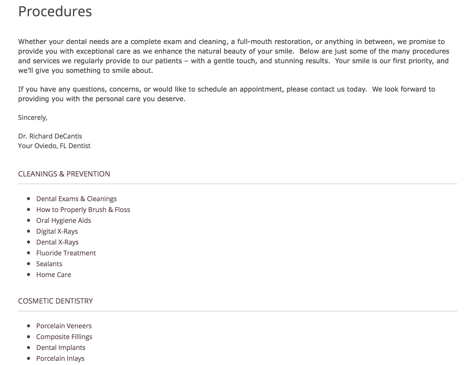
Your site should answer all the important questions that you may assume people would call or ask (or just assume the answer to)—even if the information is clearly listed on Google. This includes:
- Where you’re located, hours, and contact information
- Who you are and what your credentials include
- What services you offer (do you offer emergency services, cosmetic services, and/or surgery?)
- Whether or not you take insurance and, if so, what insurance you take
Remember, if users come clicking to your site looking for information and can’t find it, they’ll go find it with your competitors.
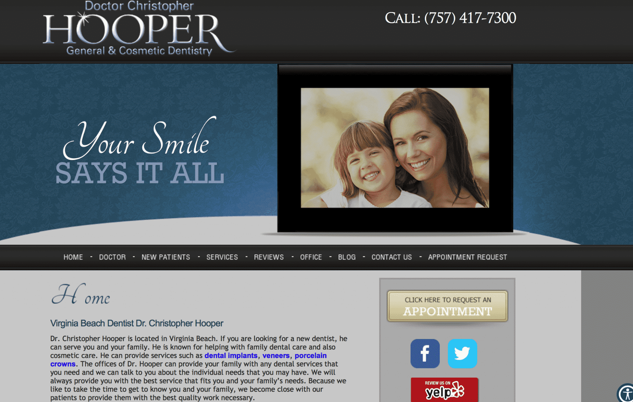
2. Organize Your Site for Ease of Use
You now have lots of information about your practice on your site. Excellent. Now organize it properly. People shouldn’t feel like they need a map to navigate your site and find what they need.
https://giphy.com/gifs/lidl-voyages-confused-lost-d2jjuAZzDSVLZ5kI
Again, this is all about ease of use and helping your potential patients and existing patients to find the information they need as quickly as possible.
Use an intuitive navigation bar or visible drop down menu to sort your content into the appropriate pages, like the example page below.
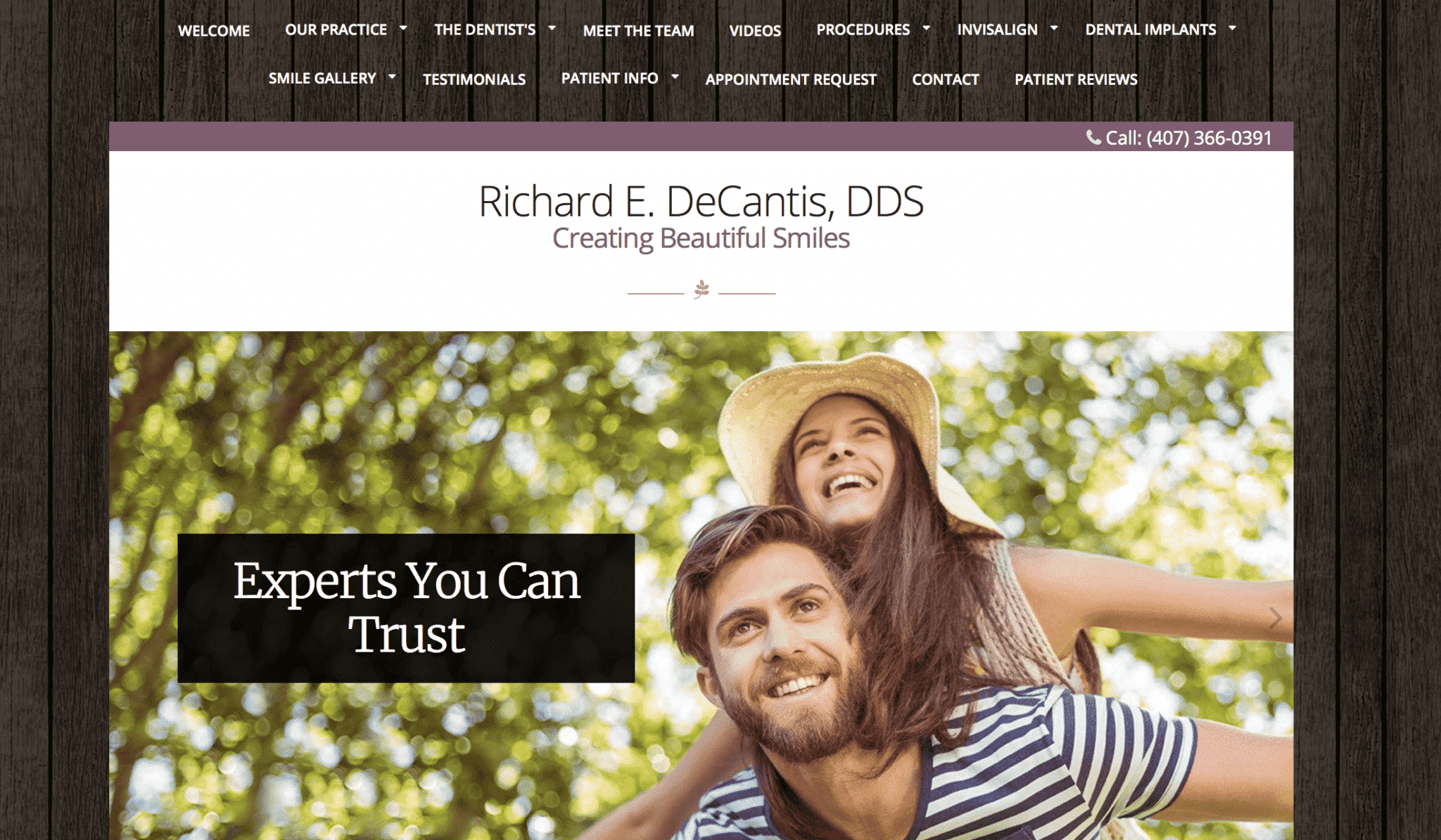
These may include:
- Home
- About Us
- Contact Information
- Insurance
- Services Offered
- Blog/News (if applicable)
- Client Testimonials (if applicable)
3. Have an About Us Section
Set yourself apart from other practices and make an excellent first impression by making it easy for potential patients to get to know you long before you walk through the door by having a thorough “About Us” page on your site.
This can include a brief snippet of information about what makes your practice different and what you offer, but it should highlight the people who work there.
You should include biographies and pictures of all the dentists who work there, and (at the least) an office picture that includes your office staff and hygienists. If the office is small enough, include bios and individual pictures for them, too.
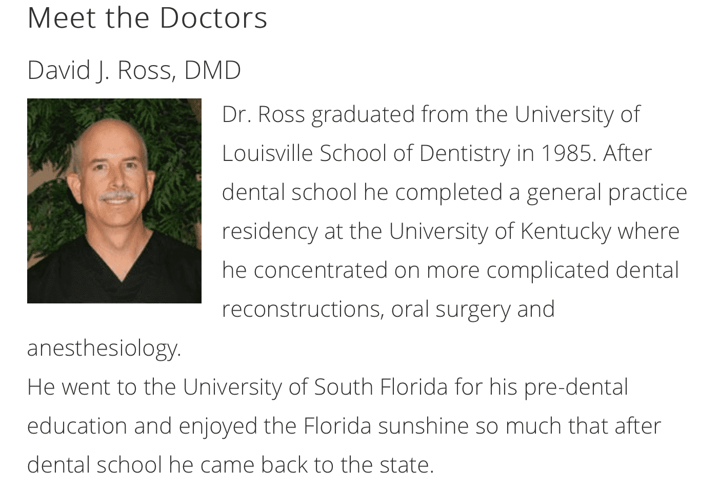
This strategy can improve trust building and relationship nurturing. One thing I’ve found over the years is that while many people hate going to the dentist, a large number of those people also really like their actual dentist and/or hygienist.
Personally, I have always fit into this category, so highlight what makes the patient experience with you great in these bios, because you know it’s not having the plaque scraped off their teeth.
4. Feature Customer Testimonials
Client testimonials can set you apart in an instant, and it’s easily the fastest way to earn the trust of new patients. My dentist automatically sends out emails after every cleaning asking for reviews. If submitted, they ask if they can share these reviews publicly, and if so, they’ll list them on the site.
Even if you only get one great review for every ten emails you send out, you’ll have a page full of great testimonials in no time that you can use to build trust.
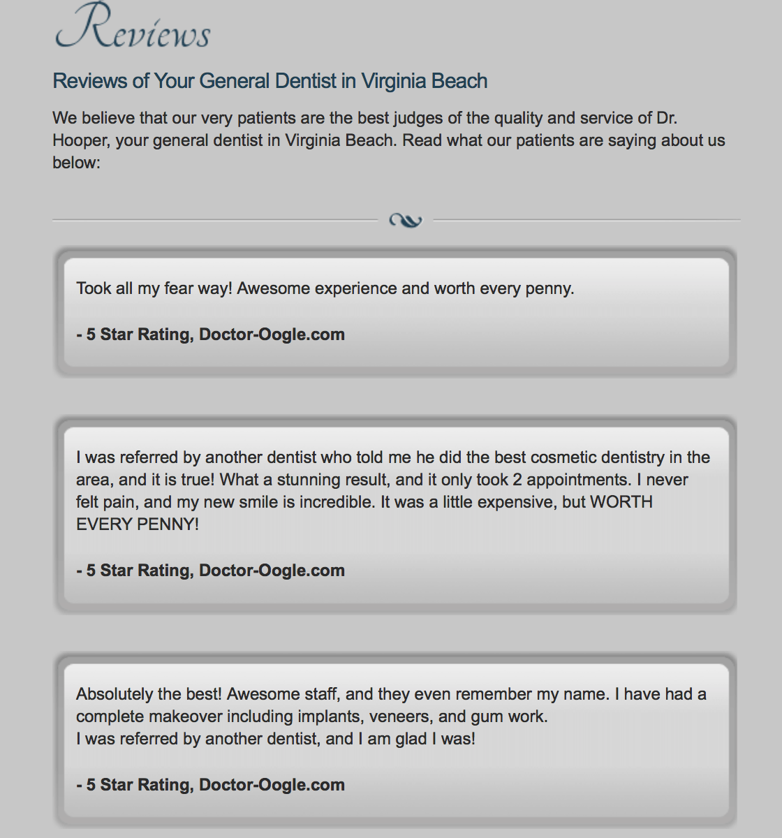
You have two main options when it comes to organizing reviews on your site. Some practices will put the reviews in a sliding bar, or just feature a few on their home page.
Others will place their best reviews on a testimonial page, which is highly visible in the main navigation bar. Either way, adding a few reviews (two or three) to the home page will capture user interest quickly before they have a chance to sign you off.
5. Choose a Clean, Professional Design
When someone visits your site for the first time, it’s a little like online dating: it only really matters how good it looks. Frankly, if your site looks like a mess, people won’t stick around to see what you have to say. You won’t look as credible, and we can all be shallow, fickle people.
https://giphy.com/gifs/zdf-astrid-lindgren-pippi-langstrumpf-kinderprogramm-l2SpS6MdfeYgPHZpC
You’re a healthcare provider, after all, and patients may subconsciously trust you less to stay up to date on healthcare practices if you can’t even keep your site up to date.
Choose a design (or have your designer create) a clean site with lots of white space. Keep the clutter not only to a minimum, but off your site all together, and use a subtle color palette and easy-to-read text that will look good on all screens like the following:
Dental Design Website Mistakes to Avoid
We’ve talked about what you can do right to help your site make a good first impression and attract more clients. Now let’s take a quick look at what you shouldn’t do wrong to hinder those efforts.
Dumping All Your Info on the Home Page
Please, please don’t do this. Ever. Having an information overload and jamming everything you have to say on your home page is one of the fastest ways to get people clicking away.
It’s too difficult to find what they’re looking for, it looks cluttered and it makes you look less professional. Don’t lose credibility over this one small mistake and make sure you’re adding visual components like images and/or videos along with lots of white space to make sure that your site looks great.
Keeping Your Site Stagnant
A lot of dental practices are guilty of this one. They have a site built once and they feel like they’re done. Not only should you be updating it regularly based on changing SEO, keyword, and design trends, it’s also beneficial to add updated additional content on a regular basis.
This often takes the form of a blog. Not only does this give you more staying power and keeps users coming back, it helps with SEO, too.
Not Making It Easy For Patients to Contact You
Does your site have a contact number clearly listed, but it’s not optimized so that it becomes clickable on mobile? Have a contact form that asks for just too much information up front? Is your contact information buried somewhere abstract and is difficult to find?
You’ll never hear from these people.
If you want to get those appointments calling in, you need to make it as easy as possible for them to do so. Have your contact information listed in your site’s header, and make it clickable from mobile devices.
Neglecting SEO
Search engine optimization (SEO) is a necessity in order to get users clicking to your site in the first place. Some practices just haphazardly try to throw general dentistry keywords onto a few pages and hope it’ll work.
Instead, use a combination of long-tail and short-tail keywords that your specific audience is looking for, like “Denver dentist,” “Orlando tooth whitening,” or “Roanoke dentist takes insurance.” Do keyword research for your specific area, and optimize most heavily for location-based searches, because this is how you’ll connect with your target audience best.
Conclusion
Long gone are the days when having a website was just a great bonus for dental practices. It’s now a requirement not only to have a site, but to have a great one.
A professional, well-designed site will give your practice instant credibility and help you build trust with customers early on. They’ll feel like your practice is modern and up to date, and that you have nothing to hide because it’s all out there in the open.
Keep these website design tricks in mind when updating your site, and you’ll be able to make a better impression in no time at all.
Do you feel like your site design needs a revamp, or at least a touch up? Get in touch to see how we can help you.
What do you think? Have you used any of these dental website design tricks to improve your site’s performance? Which are you going to implement? Let us know what you think in the comments below!