How to Create a Killer Law Firm Landing Page
by Ana Gotter • March 15, 2018
Most law firms have the home pages of their websites fully decked out with high resolution images, great copy, intuitive designs, and strong CTAs. They put all this time and energy onto their home pages, but they ignore other crucial landing pages that could be one of the first touch points for other users.
Landing pages can be any site page that a user will land on after they click a link to your site (like through a social campaign or PPC ad). Your home page absolutely can be included in that, and is the most common landing page that most firms will have. That being said, your home page likely won’t be your only landing page, and the outliers are the ones that are often forgotten about to the detriment of your campaigns and their results.
We want to help you fix that, so we’re going to show you how to create a killer law firm landing page to help you book more consultations with new leads.
Plan on Creating Separate Landing Pages
Landing pages, unfortunately, are not one size fits all. It’s a good practice to create separate landing pages to accomplish different purposes. This can help you accomplish different goals more effective, and optimize for different keywords (both organically and through PPC). It can do this by:
- Giving you a better quality score in Google, which looks at how well your landing page matches a user’s search or the keywords you’re targeting
- Letting you create tighter-knit keyword ad groups, which can increase both your CTR and conversion rates since your ads will be more relevant
- Keeping users on your landing page once they get there, because they’re easily able to find what they’re looking for
If you were running an AdWords campaign, for example, for a law firm that offered multiple specialties but with ad copy that focused just on personal injury settlements, you’d likely get better results all around if you sent users to a landing page about your personal injury services that details what you can do for these specific clients.
There are several different ways you can break down how you want to create landing pages. These include:
- What goal you’re optimizing for. Encouraging users to call for a free consultation would be more effective if it was on a separate landing page than an email opt-in. If you give people too many things to do, they won’t do any of them.
- The audience you’re trying to reach. A landing page for family law would look very different than one for business law. Specialization will get you the best results.
- What keywords you’re targeting. You should take keyword into consideration when creating your law firm landing page. Placing the right phrases on your pages will help increase organic hits, giving you more potential touch points to bring customers to you.
Choose a Simple, UX-Friendly Design
Law may be complicated, but your law firm landing page should not be. Design is key when it comes to these pages, because you want users to get the gist of what you’re offering and to take action quickly.
Your page design should match your overall site and your branding. It should be simple, and not too overwhelming or cluttered. More than that, though, it should be designed to quickly provide potential clients with the information they need and a clear focus on driving them through the digital funnel.
An example of a strong law firm landing page design is from Unbundled Legal Help.
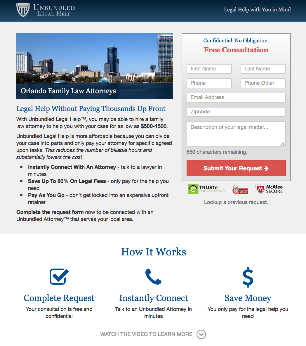
This landing page has a clear headline and copy that quickly breaks down what they can do for you. Next to this is the contact request form, bolstered by several badges assuring customers that the form is secure.
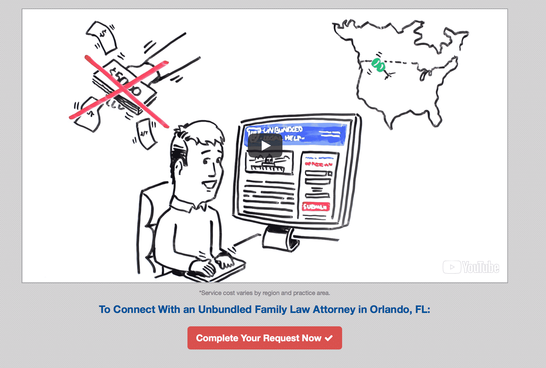
Underneath the form (and technically below the fold) is information designed to overcome potential objections for users who just weren’t ready to convert yet. This includes a “how it works” breakdown of the process. Below is a video to explain the process further and another CTA, making sure users are constantly reminded.
Get the Copy Perfect
Good copy is crucial for your landing pages. It should be simply written so that the text is easily digestible. Break it up with bullet points and different font sizes or stylistic elements (like bolding or italics) if needed to get your point across faster. It should also contain a strong balance of keywords to increase your spot in the SERPs and get you more organic hits.
Copywriting can be exceptionally difficult, even for those who are otherwise excellent writers. Even many content marketers struggle with actually writing copy. For that reason, I typically recommend hiring a specialized copywriter just as you’d hire a professional site designer.
If you want to write it yourself or want to oversee the process, however, make sure that your copy contains the following three components that are essential to success.
Attention-Grabbing Headline
You want a quick, to-the-point headline above your copy that quickly summarizes what you can do for them. This should ideally set you apart and make users want to keep reading, and do it in eight words or less.
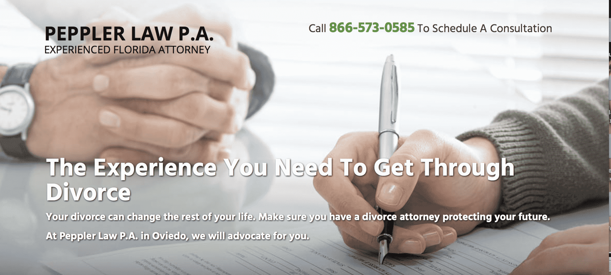
Some great hypothetical examples could include:
- Find a lawyer that won’t break the bank.
- Client-oriented law firm that puts you first.
- Law is flexible. So are we.
- 10,541 cases won. Yours is next.
Value Proposition
Your value proposition explicitly tells potential clients what you can do for them and why they should choose you instead of your competitors. You should touch on this in your headline.

When writing this section, think about your clients’ pain points. Is it the money it will cost to pay the lawyer? Is it the money they could lose if they don’t pay a lawyer? People could be worried about everything from how to keep their family glued together to how to protect their business. Understand their pain points to create the best value promotion that will resonate with them.

Remember, though, to make it about how you can help them. Feature-benefit selling can help with this. Instead of just saying “10 years of experience,” you should say “10 years of experience that can help you win.”
Clickable Call to Action
Ah, the CTA. The call to action may be the most crucial element of your law firm landing page, whether you want users to call you, fill out a consultation form, or download an ebook. This is what will get users to take that desired action, so your CTA has to be good.
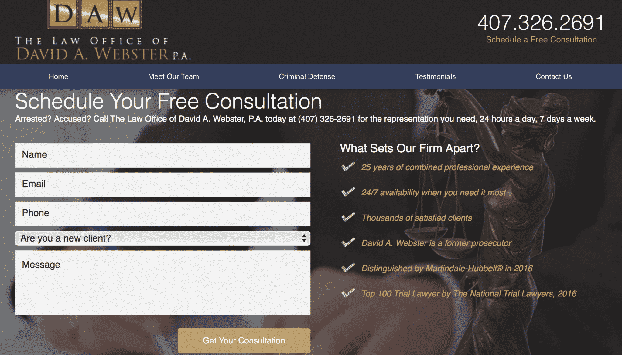
Clickable CTAs are always a plus, and contrasting colors can help draw users attention to them immediately. Like all copy, they should be simple. No one should be tempted to overthink it.
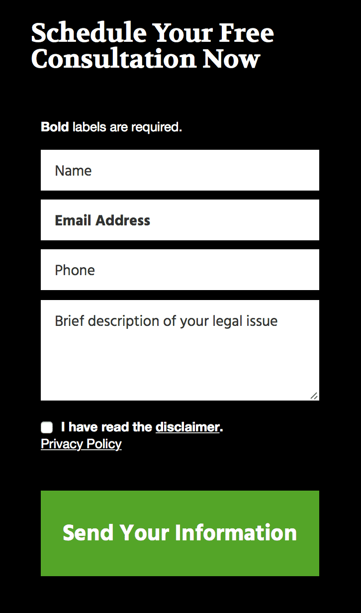
CTAs should also be placed throughout the landing page, so if users scroll because they aren’t ready to convert at the top of the fold, there will be an option at the bottom of the page when they are.
Include Interesting, High Resolution Visual Components
Both images and videos will be your best friend on your law firm landing page. They help break up the page, making it more digestible and improving retention and conversion rates.
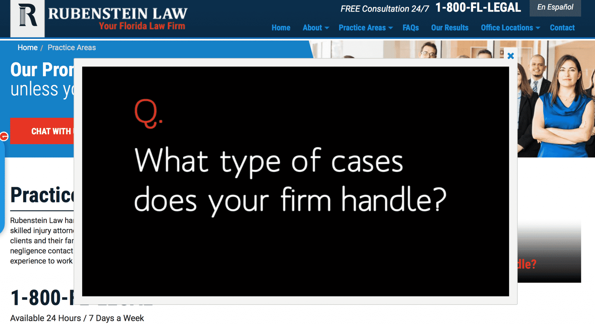
Visual components also help the page look more professional and trustworthy; users may subconsciously register sites with nothing but text to be not as high quality as the ones with them. They can also help to emphasize your branding, explain the process, or introduce your firm’s practitioners to potential clients.

Simply put, you can’t afford to skip out on the high resolution, engaging visual components. Even if you’re just using a stock photo of people sitting in a fancy office or graphics to emphasize a point, it will get you better results.
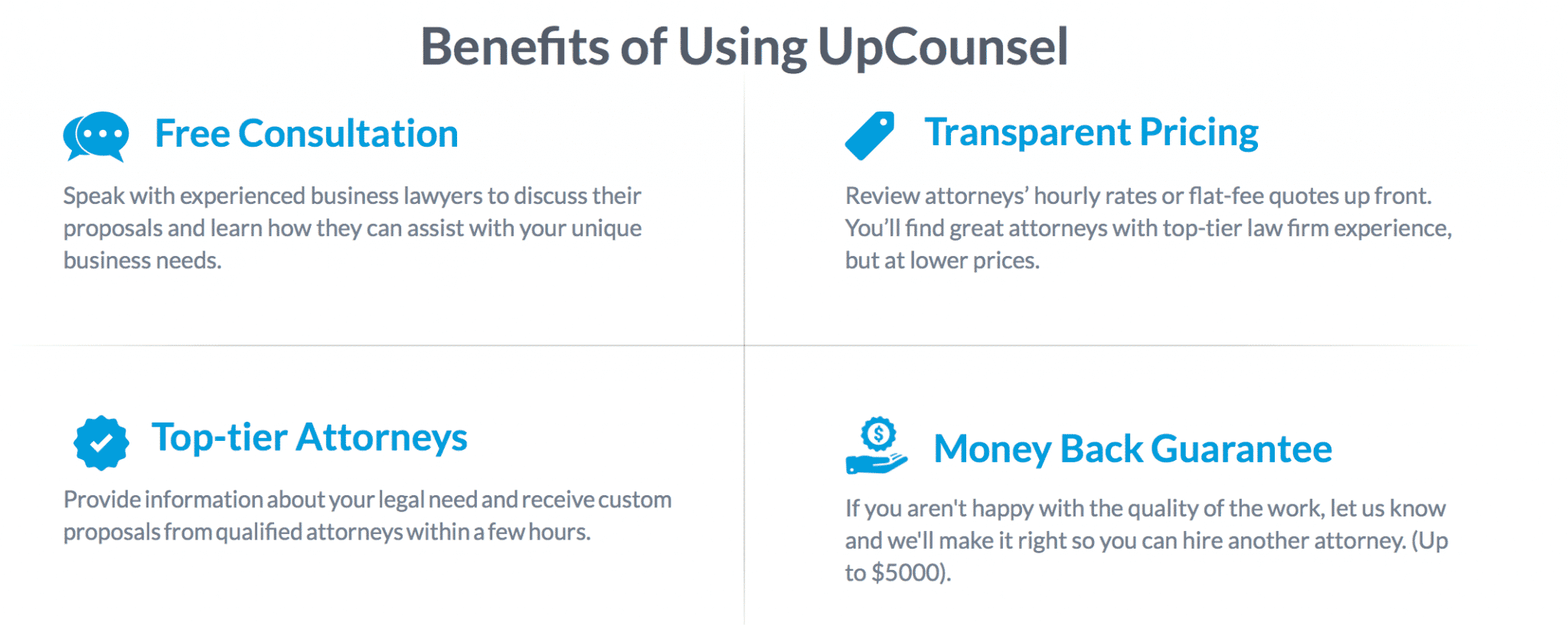
You can use stock photo sites like Shutterstock to find stunning images that will suit your site well. If you want to create your own graphics, check out graphic design software like Snappa.
Conclusion
Well-written, well-designed landing pages can make or break your campaigns. They’ll will have a direct effect on how many site visitors convert into new leads or new clients. Strong landing pages will increase your lead generation results from both organic and PPC marketing, so make sure you invest the time into every single one—and not just the home page.
By the way, if you’d like help putting together an effective law firm landing page, let me know here or in the comments!
What do you think? How do you increase conversions on your law firm landing page? What works best for you? Share your thoughts and questions in the comments below!


