The PPC Landing Page Optimization Series – Call-to-Action
by Sarah Rodriguez • May 4, 2016
For pay-per-click (PPC) marketers, a good PPC landing page strategy can add millions to your bottom line.
Each marketing channel has specific traffic with specific goals, expectations and pain points, so it’s important to understand which page elements to consider for each traffic source.
Since PPC advertising is often one of the most expensive ways to get traffic on your page, you need to get every possible conversion out of your visitors.
In this series of articles, I’m going to take a look at the 6 most important elements of a successful PPC landing page and explain how to use those elements to get more out of your landing page traffic.
Ready? Let’s start with your call-to-action.
Call Them to Action
Your call-to-action (CTA) is basically what you are asking your visitors to do on your landing page. This can be anything from filling out a form to calling a phone number or even straight up buying your product.
Often, I see landing pages with no CTA or 5 different (and even conflicting) CTAs.
Both of these situations are bad.
For example, clicking on Spotify’s PPC ad brings you to this page:
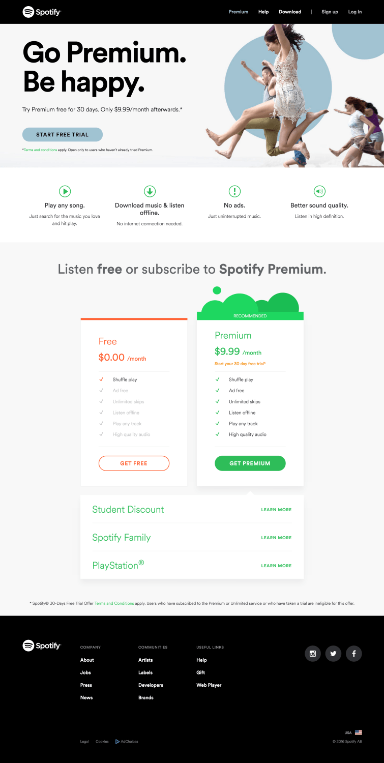
There are way too many options here.
After a bit of head scratching, it looks like the goal of the page is to get people to sign up for Spotify’s free month of premium service. However, the page also gives you the option of listening for free to their non-premium option.
This page also happens to be their home page, so there are options for “Download,” “Sign Up” and “Log In” in the header (and that’s ignoring all of the clickable elements in the footer!).
All of these options make it hard to know exactly what you are supposed to do on this page. In fact, if you scroll below the fold, you may not even be sure what you’re signing up for.
Focus Your Call to Action
Your homepage has to cater to everyone. After all, you never know who is going to show up and what they will be looking for.
PPC landing pages, however, should be geared towards a very specific audience.
Since you are paying to get in front of the right audience, you should have a deep understanding of who your audience is, why they are on your page and what they are looking for on your landing page.
With that knowledge, you should be able to pick a CTA that tells your audience, “Hey, you’re in the right place and here is the next step you should take.”
Typically, a single CTA or message (which can be split between different channels like a form, phone number, and chat) is the best way to optimize for conversions.
For example, here is how Neil Patel uses up his landing page.
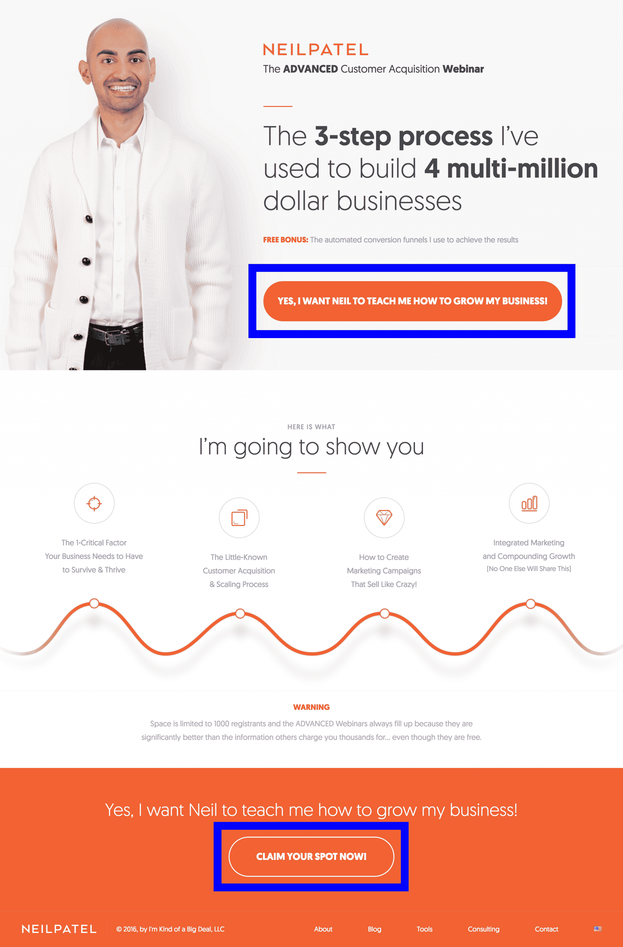
The CTA is simple and consistent throughout the page. If you’re looking to grow your business, his page quickly makes it obvious that you have found someone who can help you with that and then encourages you to take the next step to make it happen.
In addition, the CTA is obvious and straightforward. Most people on the internet are looking for quick information, so the easier you make it for them to find and absorb your CTA, the more likely they are to convert.
For example, “Get Your Free Quote!”, “Contact Us Now!” or “Get Started Today” are great examples of CTAs.
In addition, having a specific offer or benefit associated with the CTA helps to boost conversions. So, instead of “Contact Us Today”, try something like “Contact Us Today for 10% Off”.
Specific offers make your audience feel like they are getting something in return for their info and incentivizes them to act now.
Finally, making your CTA a color that stands out from the rest of the page and placing it prominently will make it easy to find and act on. Simple enough, right?
Conclusion
CTAs are one of the biggest differences between a home page and a landing page. Your homepage likely does not have a prevalent and singular CTA (which is ok!) because it’s often used as a resource.
However, if you’re trying to optimize your landing pages for conversions, you need a clear CTA that matches the reason your traffic came to your page and that helps drive your viewers towards a specific conversion goal.
By the way, if you’d like me to help you optimize your PPC landing pages for better conversions, let me know here or in the comments! I’d love to help.
How do you use your CTAs to improve your conversion rates?

