The Clarity Equation: Do Your Landing Page Elements Add Up?
by Sarah Rodriguez • July 28, 2016


A few weeks ago, I traveled to the beautiful city of Vancouver to attend Unbounce’s CTA Conference for a second time.
Last year, I learned a ton about digital marketing and conversion focused design, so I was very excited to attend the conference again this summer and learn from more experts about the latest digital trends, tricks and ways to better optimize landing pages and campaigns.
CTA Conf 2016 did not disappoint.
This year’s conference was full of awesome presentations and I strongly encourage you to check out all the full presentations here.
However, I wanted to share some of my thoughts on a speech given by Oli Gardner—one of the co-founders of Unbounce—that can help you in your digital marketing efforts.
To watch Oli’s full presentation, “The Conversion Equation”, click here.
Its always fun to hear from Oli Gardner, who claims he “has seen more landing pages than anyone on the planet.” That may or may not be true, but Oli is certainly one of the greatest minds in effective landing page design.
This year, Oli presented his own “Conversion Equation,” a formula that Unbounce is developing that will allow computers to predict and optimize landing page performance.
As you might imagine, this equation is huge and data from Unbounce’s own analyses, rapid experiments, conversion research, conversion data, video conversion and engagement data, academic studies and frameworks from industry leaders.
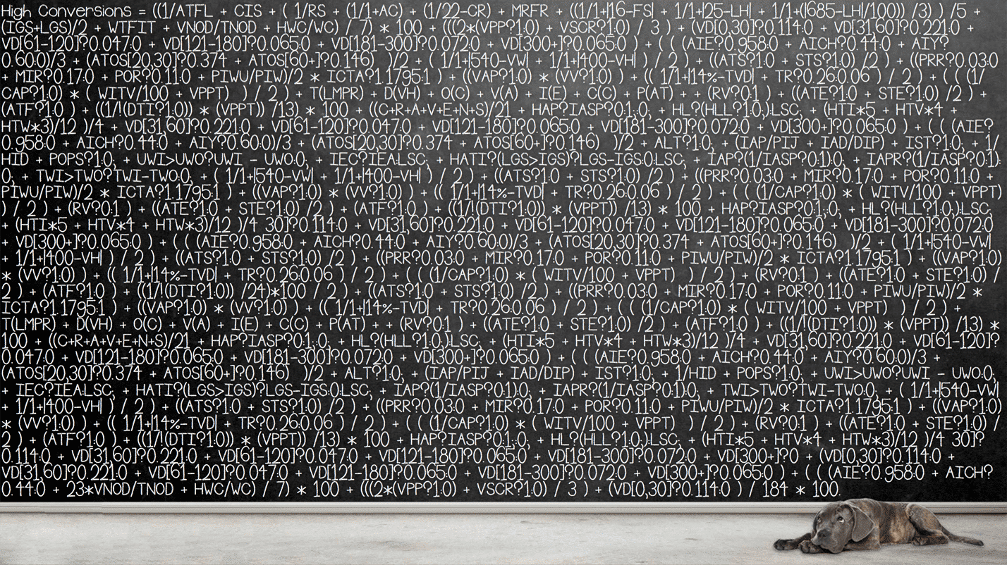
It will be interesting to see if Unbounce can truly “crack the code” on landing page optimization, but Unbounce’s efforts have yielded some interesting insights into why landing pages succeed and fail.
To me, one of the most intriguing was how page clarity affects landing performance.
The Clarity Equation
Essentially, Oli broke down landing page clarity into a seven-part clarity equation:
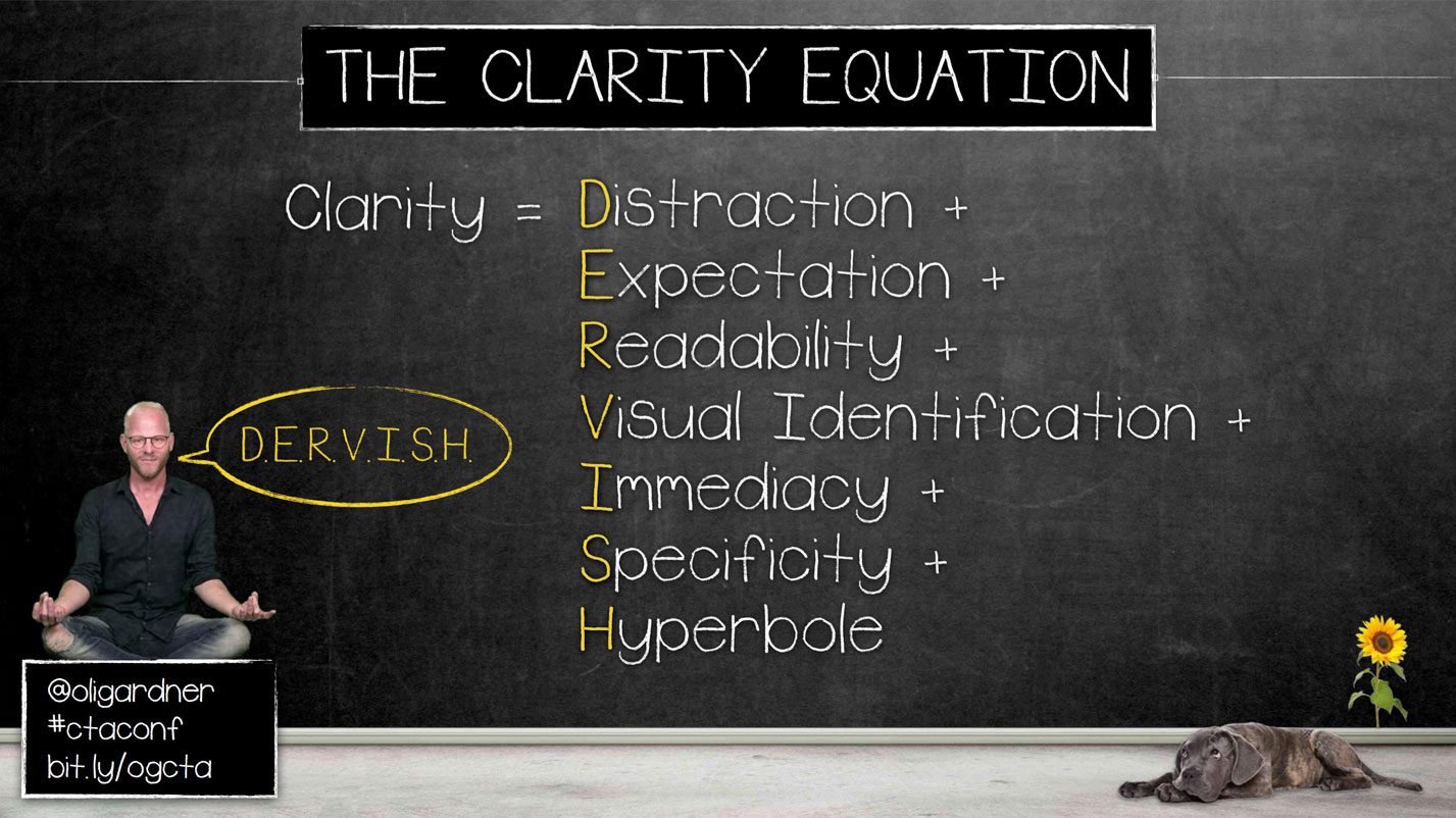
On the surface, this “clarity equation” seems fairly straightforward and possibly oversimplified, but the fact of the matter is, clarity is an important component of your landing page that is often overlooked.
Let’s take a look at each part of the clarity equation and how to use it to maximum benefit on your landing pages:
1. Distraction
What do you really want people to do on your page? Do you want them to sit and look at your flashy charts, graphic or read through lengthy blocks of text?
Or do you want them to convert?
If your call-to-action (CTA) isn’t the clear focus of your page, your visitors may get lost in your page content. Worse still, if you have off page links, they may end up leaving your page and forgetting all about your CTA.
Everything on your page should help lead people to your CTA, not confuse or distract them from the real point of your page: driving conversions!
2. Expectation
Do the content, CTA, copy and imagery on your page meet the expectations set by your advertising?
Basically, your landing page should match the keywords, audience, demographic, etc that you are using or targeting in your ads.
For example, if someone searches for an ‘Injury Attorney in New York’ they would expect the landing page they click on to have information about an Injury Attorney in New York.
Don’t show them a page for a National Law Firm, this means they have to search (again) for the specific service/location/etc. that they were looking for in the first place.
The better aligned your page is with your visitors’ expectations, the easier it will be for them to convert.
3. Readability
Is your content readable and accessible? Often, it can be tempting to “get creative” with your text or text styling.
The best text is easy to read. For example, flashing gradient text might be eye-catching, but it will be almost impossible to read.
In general, text should be a dark color (black, dark grey, dark blue) on a light background. You can put light colored text on a dark background, but that typically creates a less pleasant and readable page experience.
Another way to improve the readability of your landing page is by creating a visual hierarchy with specific headings, sub-headings, and body text that organize your content for easy reading and skimming.
As mentioned previously, text that is hard to read or overly creative is distracting, which can make it hard for people to figure out what you actually want them to do on your page.
4. Visual Identification
Can people tell what your page and images are about without a lot of explanation? On a landing page, your images and text should be self-explanatory.
This is the part where good design matters!
If your page is overwhelming, there are a variety of visual cues you can use to segment and organize content in a way that makes sense for your audience.
And, if your content makes sense to your audience, they’ll be more likely to engage with it and…you guessed it, convert!
5. Immediacy
Can your audience figure out what your page is about in less than 5 seconds? First impressions happen fast, so you only have a few seconds to convince people that they are in the right place before they bail.
With that in mind, you should always favor clear over clever.
To see if your page is easy to understand, try asking someone who is unfamiliar with your company or brand to look at your page for 5 seconds and then tell you what it is about.
For help with this, check out UsabilityHub, where you can create a 5-second test and get feedback on exactly what people think the point of your page is.
If they get it right, you’ve probably done a good job with your page. If they get it wrong, you probably need to clarify a few things on your page.
6. Specificity
Is your page specifically designed for the audience you are targeting in your ads, emails, posts, etc?
The purpose of a landing page is to segment your content (by service, product, price point, demographic, etc) to be more relevant to specific groups of people.
So, if you aren’t creating a page that is specific to the traffic you are sending to it, why are you building landing pages?
Creating specific landing pages for specific audiences can improve conversion rates by providing the right information to the right people.
7. Hyperbole
Are you explaining what you actually do, or are you just saying you’re really good at doing it?
For example, a headline that says “We have THE BEST product in the ENTIRE WORLD!” might make you feel good about yourself, but it doesn’t tell your visitors anything about what your product actually is or does.
Even if you really have “THE BEST product in the ENTIRE WORLD,” people are so used to these sorts of marketing cliches that no one will believe you (to see if your page is using any of these “jargony” words, check out this funny Chrome extension Unbounce built).
Instead of talking about how incredibly awesome you are, focus on the pain points your product or offer solves—that’s what will motivate your potential customers to convert.
Conclusion
Oli Gardner’s clarity equation is a great way to review the content and design of your landing pages.
If your page performs well in all 7 of these areas, you’ve got a good chance of converting a fair amount of your traffic. However, if your page is lacking in a few areas…you may be handicapping your conversion rate.
By the way, if you’d like me to take a look at your landing pages and give you some recommendations on ways to make your content more clear, let me know here or in the comments. I’d love to help!
Do you agree with this clarity equation? Are there elements you’d add or remove? How do you improve the clarity of your landing pages?