A Testing Roadmap for Increasing Landing Page Conversions
by Andrew Maliwauki • December 1, 2016
When it comes to landing page optimization, designing a landing page that actually converts traffic into meaningful leads sometimes seems like a pipe dream.
Simply creating your initial page can be tricky enough, especially if you’re not sure what to include or even focus on in order to grab the right target audience—let alone optimizing that page for conversions!
Luckily, a solid testing strategy can help you improve your conversion rates in a predictable, systematic fashion. However, here again, the question is “how?”
To help answer that question, let walk you through how I create a testing roadmap for Disruptive’s own landing pages. Not every potential change will be right for your pages, but the overall process should give you a solid model for creating your own testing roadmap.
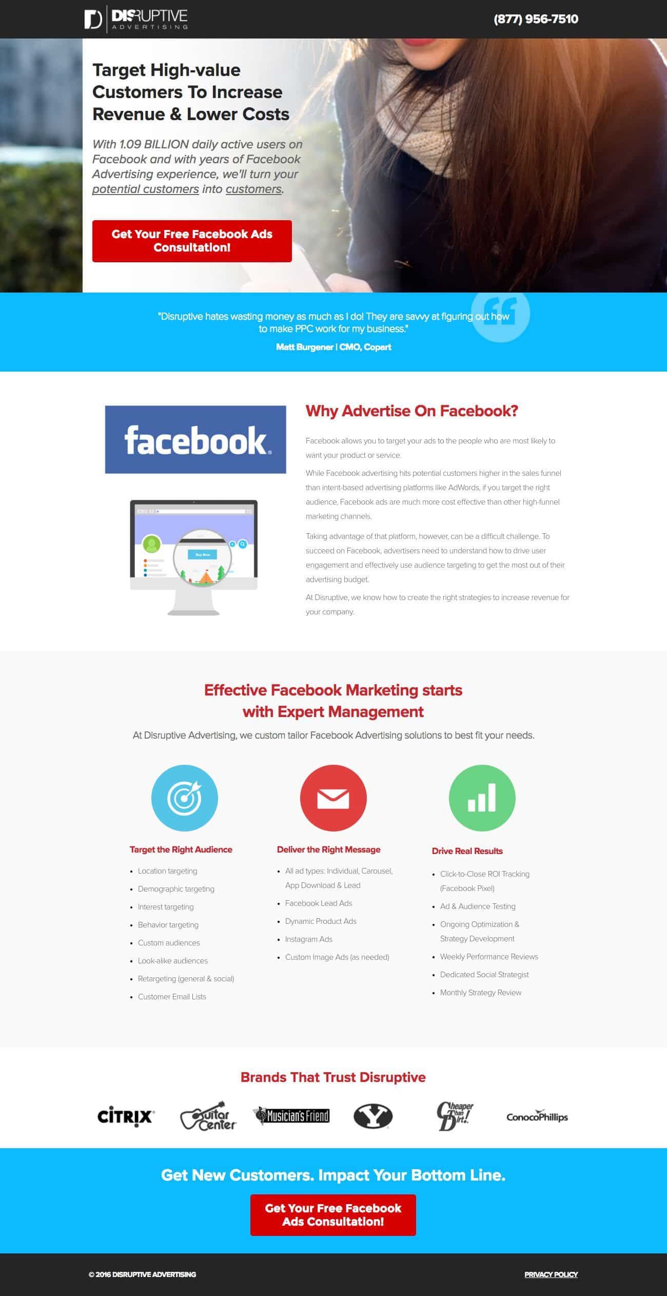
Here’s the page:

We’ll use this page as reference throughout the article and how we can improve it with a solid queue of proposed changes.
1. Call to Action (CTA)
One of the easiest and quickest items to test on your landing page is the call-to-action. This can be something as simple as a color change or a different wording. For this page, I would think a CTA such as “Get a No-Risk Consultation” could be one viable option.
The space around your CTA is also important to not neglect. Utilizing arrows or other visual elements can help draw even more emphasis to your call-to-action.
White space, or negative space, can also increase the effectiveness of your CTA placement as well. Give your page some breathing room to make your information easier to digest in short amounts of time.
2. Headline
Headlines are another testing variable that can be done relatively quickly. When building any landing page, it’s crucial that you put yourself in the shoes of a prospective lead. Brainstorm what issues they may be concerned about and what they’re looking to find on your page.
For our page, which targets Facebook advertising, it’s smart to focus on how these social media ads can grow their business.
A headline such as “Spend Less and Earn More from Your Customers” would be an enticing offer to someone whose business is currently not performing the way they would have hoped on Facebook advertising. Be wary of letting your headline get too long or using jargon that may be confusing at a first glance.
3. Hero Shot
The images you use above the fold are some of the most impactful content on your page. Finding the right hero shot can be one of the hardest things to get right, but that’s why we have testing!
There’s no real guideline to finding “the one” when it comes to hero shots, so brainstorm what you think resonates most with your product or service offering. Incorporating a more human element can often make your page look more inviting and relatable, but focusing on a particular product in action is also a good strategy.
For this page, I would look for images that visually push the viewers eyesight to the headline text and CTA. Avoid using obvious generic stock photos and look for images that have some personality to them. Our office has a subscription to iStock photography, which has a great collection of photos for a wide variety of industries.
4. Social Proof
When designing and testing your landing pages, never underestimate the importance of great social proof. This includes client & customer testimonials, brand recognition or video reviews to just name a few.
How and where you use these on your landing pages is completely up to you, but there are some recommendations for early testing.
Try to keep social proof as high up on the page as possible and see how it affects conversions. Information above the fold is still grabbing 80% of viewers attention in relation to the rest of the page, so make your placement count!
For our example page, we already have a testimonial directly below the hero shot, but it’s worth running a test that includes either a different review, include a picture of the person or include multiple testimonials.
5. Layout
Of the five elements we are going to cover in this testing roadmap, I’ve saved this one for last, as it is usually the most time-intensive and requires more thought in the execution. Fundamentally changing your page can have dramatic changes in your conversion rate, which can be a good or bad thing.
For example, replacing your form with a light box button or re-working entire sections are all viable options in giving your page a new, fresh feel for new or returning visitors. Layout doesn’t just include formatting, however, so consider changing colors and removing or adding content.
For this Facebook advertising page, I would like to test including the form on the page and seeing if that has any impact on the conversion rate.
Wrapping Up
Whether you use this testing roadmap as a template or create your own, it’s important that you continually set up and run tests on your pages that are getting traffic. I know I can forget to run tests at times and it doesn’t do anyone any favors.
Like I’ve outlined here, try to start with simple and measurable tests and work your way up from there. By starting small, it will be much easier to run regular tests and removes a lot of barriers to entry for first-time testers.
You don’t have to go it alone, either. You can find inspiration and testing ideas by looking at the competition, talking to your clients about their customer base or even drop us a line here or in the comments!
We’re always looking to help people become better testers when it comes to PPC and conversion rate optimization. Now get out there and hit the road with a new slew of tricks up your sleeve!


