Everything You Need to Know About A/B Testing
by Aden Andrus • September 6, 2019
A/B testing is hot topic in online marketing. And honestly, there’s a good reason for that. Without A/B testing, your online marketing will never reach its full potential.
At Disruptive, we’ve seen that firsthand with countless clients.
With one test, we made a client $70,000 in just two weeks. With another, we produced more than $43,000 in revenue in a matter of months. Another test added thousands in revenue over a matter of weeks.
And those are just a few examples of what A/B testing has done for our clients. The point is, if you aren’t A/B testing, you’re leaving money on the table.
So what exactly is A/B testing? How do you use it? More importantly, how do you get these kinds of results for your business?
Well, you’ve come to the right place. In this article, we’ll be covering all of that and more.
Now, as you can probably imagine, this is a pretty long post, so to help you navigate, here are some quicklinks to various sections of the article:
- What is A/B Testing?
- Why A/B Testing Matters
- How A/B Testing Works
- Coming Up With A/B Testing Ideas
- Making the Most of Your A/B Testing
- Multiple Variant Testing
Sound like a plan? Let’s take an in-depth look at the world of A/B testing.
What is A/B Testing?
The idea behind A/B testing is fairly simple. You put a lot of time and effort into getting people to your website or landing pages. Why? Because you want them to convert—to do something that benefits your business.
You want them to fill out a form, make a purchase, call you on the phone, visit your brick-and-mortar location, check out a certain page, sign up for your newsletter…the list goes on and on.
The only problem is, you don’t know whether or not your site is helping or hurting your conversion rate.
It’s almost impossible to predict how people will respond to your website. No matter how much you love (or hate) your site design, you really don’t know what works—and what doesn’t—for your site traffic. The only real way to know is to show different versions of your website to your traffic and see which version produces the best conversion rate.
And that, in a nutshell, is A/B testing.
With A/B testing, you create two different versions (version A and version B—hence the name) of your site or landing page. Then, you split your traffic between those two versions (also called variants).
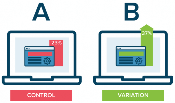
Once enough people have visited your website to determine which variant people prefer, you go with the winner…and start the whole process over.
Of course, all of this is just scratching the surface of A/B testing. Honestly, we’ve written dozens of blog posts about the ins-and-outs of A/B testing, how to come up with testing ideas and ways to improve your site design, but you don’t need all of that to get started.
So, for the rest of this article, we’re going focus on the basics of A/B testing and how you can start using it to make more money from your campaigns.
Why A/B Testing Matters
Now, you might be thinking, I already know that my site needs work. Can’t I just find some best practice article, improve my site and get all of the benefits of A/B testing without all of the, you know, testing?
That’s a great question. Unfortunately, even conversion rate optimization (another name for A/B testing) experts have a hard time predicting which changes will improve your conversion rate.
To prove this point, we actually ran an A/B test on marketers at a conference a couple of years ago. We had recently run a successful A/B test for a client and increased form completions by 146.2%.
We, of course, knew which variant had produced the best results, but we wanted to see if the conversion rate optimization (CRO) experts at the conference could predict the winner.
Here were the page variants they had to choose between. Which one do you think produced the best conversion rate?
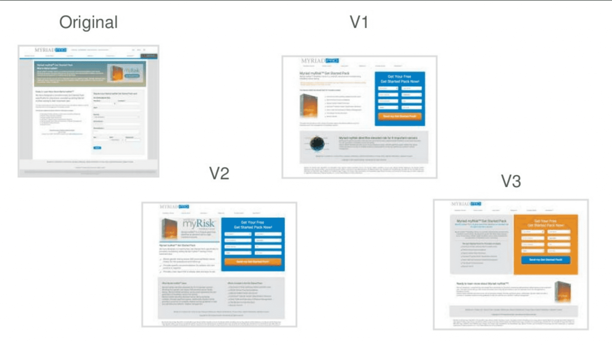
V3 was the winning page in our test, but guess which page our CRO experts picked? V2, not V3.
Now, these were CRO experts at the top of their game. When it comes to optimizing site design, these people really knew their stuff. But even with all of that expertise, well over half of them picked the wrong variant.
Why? Because you are not your customer. No matter how much you like a particular site element or design, that doesn’t guarantee that it works for your customers. The only real way to determine that is through A/B testing.
How A/B Testing Works
A while back, we used A/B testing to improve a client’s conversion rate by 22%. At first glance, you might think, “What a great case study! How did you get those kinds of results?”
And, if you really want to know what we did, the answer is fairly simple: we got rid of the testimonials.
Isn’t that exciting? Testimonials reduce conversion rates!
If you haven’t tested getting rid of your testimonials yet, you should go out and try eliminating the testimonials from your site. After all, your testimonials could be reducing your conversion rate by 22% or more…right?
Well, not really.
On average, testimonials often improve conversion rates. In fact, when we first started working with this client, if you had told me their testimonials were reducing their conversion rate, I probably would have argued the point with you.
So, if we were pretty sure that their testimonials improving their conversion rate, why did we try getting rid of them?
It wasn’t just a random guess. We tested a lot of other hypotheses first…
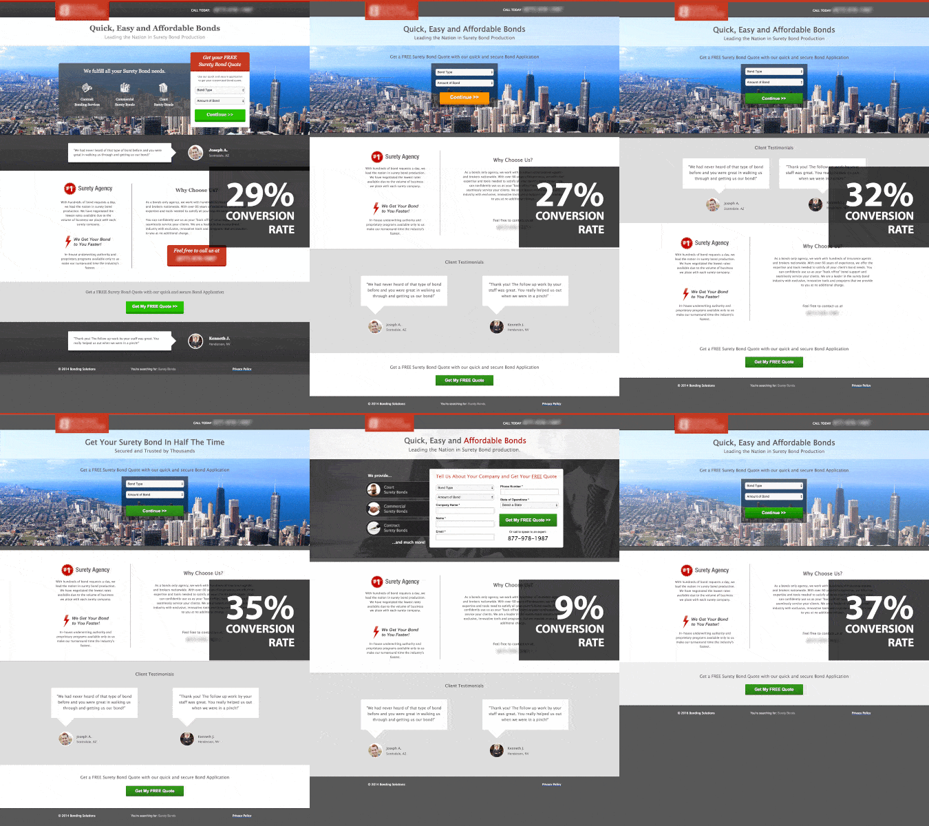
As you can see from this GIF, we worked through over a dozen versions of this page before we finally tried eliminating the testimonials.
Not every test improved the client’s conversion rate, but every test taught us something about our target audience and helped us uncover what our traffic really wanted out of their site experience.
Effective A/B testing teaches you something with every test. But, if you want to learn something from every test, you can’t just test random ideas—you need to test strategically.
With that in mind, let’s talk about the 4 basic parts of a solid A/B testing strategy:
1. Your Buyer Persona
Before you even start to brainstorm testing ideas, you need to create a detailed buyer persona.
Essentially, your buyer persona gives you a structure for defining your testing hypotheses and a framework for understanding your results.
At a minimum, your buyer persona should cover the following:
- Demographic information (age, gender, location, race, etc)
- Budget
- Motivations (responsibilities, goals, interests, etc)
- Pain points (fears, frustrations, needs, etc)
- How your business resolves their pain point(s)
You might need to talk to your current customers or your sales team to get this information, but knowing your target audience can help you produce great testing results much more quickly.
Case Study Notes: What We Knew About Our Target Audience
Thanks to some detailed discussions with this well-informed client, we knew a lot about the audience they were targeting. On average, our target audience was middle-aged men and women with money to invest.
Our audience wanted to be smart with their money, but they also recognized that they didn’t know enough to invest their money wisely on their own.
With that knowledge in hand, we were ready to define some goals for our tests.
2. Your Goals
If you don’t know what you’re trying to achieve with your test, it’s hard to build variants that produce meaningful results.
Now, you probably have a good idea of what you want to achieve with your tests, but let’s spell out a few specifics.
- What does success look like? (more leads? more phone calls? more sales…hint, the best answer is more sales).
- What steps do you want your customers to take? (what will help them move closer to becoming a paying customer?).
- What specific results will your test need to produce to be “successful”? (see the first bullet point).
Defining your overall goals and the specific steps your potential customers need to take on the path to reaching those goals will give you clear insight into what sorts of changes you should be testing.
Case Study Notes: Defining Our Goals
In this client’s case, we defined success as increased sales (see, I told you “more sales” was the best answer). To achieve that goal, however, we needed the client’s website to produce more qualified leads for their sales team.
Additionally, the client had a lot of different offers that potential clients could choose from, so the page need to identify which option or options potential clients were the most interested in.
Now that we knew who we were targeting and what our goals were, it was time to come up with some hypotheses.
3. Your Hypotheses
At this point, your job is to try and guess at which factors on your site are preventing your target audience from doing what you want them to do and how you can eliminate or reduce those factors.
Case Study Notes: Generating Hypotheses
Here are some of the hypotheses we came up with:
- Our offer was wrong. Maybe our headline or body copy wasn’t conveying the message that our audience wanted to hear.
- The next step was unclear. Maybe people wanted to simply fill out our form instead of clicking through a series of information-gathering pages.
- Our content was in the wrong order. Maybe our audience was getting lost in our page or wanted to see a particular page element as soon as they arrived.
- We had too much content. Maybe all our content distracting or overwhelming to our audience.
- We weren’t evoking the right emotion. Maybe our audience wasn’t resonating with our hero shot or color scheme.
Armed with these (and a variety of other hypotheses), we were ready to start testing.
4. Document and Learn
Your testing strategy doesn’t end when your tests start. You need to document everything and use what you learn to develop new hypotheses and tests.
Depending on how you like to do things, your documentation can be fairly simple or quite complex, but your approach needs to be methodical—each test needs to teach you something that you can use to produce better results from your next test.
For example, here’s how you might track the results of a series of call-to-action tests:
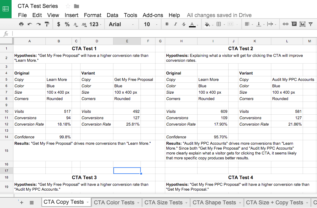
Yes, it takes some extra effort to document everything, but it is both easier and more effective than simply testing new ideas at random. Plus, if anyone ever asks you why your page is set up the way it is, you’ll have a solid, data-driven answer.
Case Study Notes: Learning From Our Test Results
Once we started testing, we discovered that our audience converted best when we put them in the driver’s seat. A strong sell was a major turnoff to this audience.
As a result, we ultimately ended up with a simple CTA that allowed our audience to indicate what they were interested in before we asked them to submit their information.
We also discovered that our target audience wanted something easy, so we made sure our headline and body copy emphasized how easy and quick the client’s services were.
After a certain point, however, there was only so much that we could say to make it clear that working with our client’s business was easy and simple.
So, we tried eliminating page elements to see if streamlining the page would help reinforce the idea that our client was completely focused on creating an easy, painless experience for their customers.
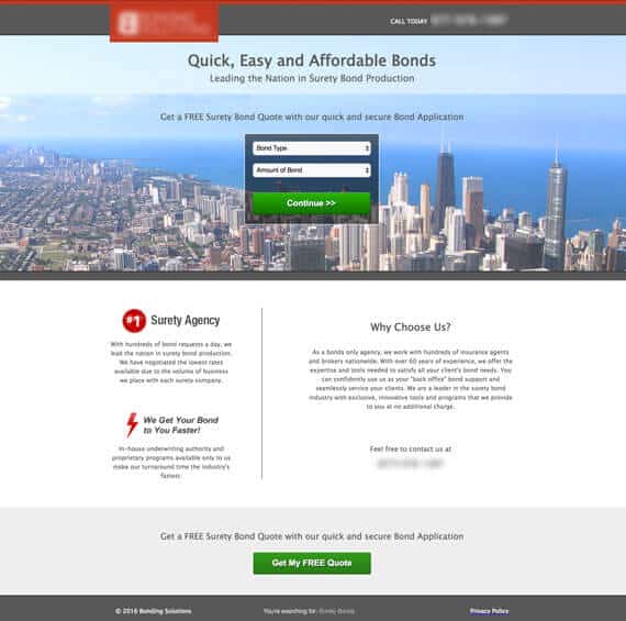
As a result, our conversion rate improved by 22%—but that was hardly a surprise.
After learning so much about what our target audience wanted from our site, we knew that a simple, focused page would convince our client’s potential customers to convert…and it did.
Coming Up With A/B Testing Ideas
As a rule of thumb, you should always be A/B testing something. Every click isn’t just an opportunity to get another conversion, it’s also an opportunity to learn something about your audience.
You can’t just test for the sake of testing, though, you need a strategy that makes sure that each test answers at least on of the following questions:
- How does this page element affect conversion rate?
- How do changes to this page element affect conversion rate?
- How does my page layout affect conversion rate?
- How does my copy affect conversion rate?
- How do my images affect conversion rate?
- How does my form affect conversion rate?
Answering and optimizing for each of these points takes a lot of planning and testing, but if you’re new to A/B testing or simply facing “tester’s block”, creating an effective testing strategy can be quite a challenge.
With that in mind, I’ve outlined some of the key components of a great A/B testing strategy, along with some testing ideas to help you improve your conversion rate in each area.
Consider a Big Change
Sometimes, your site just isn’t right for your audience. Maybe it isn’t a good match for your ads, maybe your value proposition is unclear, maybe your design just doesn’t gel with your traffic.
In many cases, you might not even realize that your site or page doesn’t work for your traffic, which is why it can be helpful to simply try something completely different.
This can particularly useful if you’ve got limited traffic. The bigger the change, the bigger an effect it will likely have on your conversion rate, which means the winning page design will be obvious with a lot fewer site visits.
There are actually a couple of different A/B testing strategies you can use with this approach:
1. Big-to-Little
If your objective is to get big results fast, you’ll want to start by testing sweeping changes to your page(s) or site. What you’re doing right now probably isn’t working, so you need to try something very different to get the ball rolling.
While this approach can certainly be effective, it does have downsides.
First off, you don’t really know why your test did or didn’t work. There are simply too many variables at work to really assess the individual impact of all the new elements on your conversion rate.
As a result, you’re kind of left where you started. Things might be working now, but all you really know is that what you’re doing now is better than what you were doing before. However, once you’ve got things working properly, you can strike from a position of relative strength and really optimize your new design.
If your site traffic is less than 6,000 visits per month, this is probably the best approach to take. With limited traffic, each test will take a significant period of time, so trying to optimize each site element upfront can take months-to-years.
2. Little-to-Big
On the other hand, if your objective is to really understand your target demographic and how specific changes to your site affect potential clients, it’s best to start small and work your way up. Your site is working well enough, what you want to know is how to maximize its potential.
This approach requires a lot more time and traffic to generate big results, but it also equips you with the knowledge you need to make informed future decisions. Over time, the sum of your small changes will add up to big design and content improvements that markedly improve the efficiency of your website.
This approach is fantastic for websites with 6,000+ website visits per month and is how giant websites like Amazon produce millions in added revenue.
Defining your overall objective allows you to structure your actual testing strategy to produce the results you are looking for. From there, you can identify the actual test parameters that will allow you to achieve your goals.
Switch Up Your Call-to-Action
Getting someone to act on your call-to-action is the ultimate goal of your site, so it’s a must for A/B testing. Simultaneously creating a sense of value, establishing what will happen when they convert and urging the user to take your desired action is no easy task.
Here are a few things to consider testing on your CTA:
Copy
Consider changing from a more generic phrase like “Learn More” to something like “Speak With An Expert.” The clearer your CTA is, the more effective it usually will be. Test it and find out!
Color
The importance of button color to conversion rate has been the subject of a lot of online ridicule and debate, but the fact of the matter is that—for some companies—changing button color has produced impressive results. It might not be a guaranteed win, but that’s why you run tests. At a minimum, your button color should stand out against the rest of the page.
Location
Where you put your CTA may have a big impact on your conversion rate. For some pages, putting it above the fold may be important. Other pages may have traffic that wants more information before you hit them with a CTA, so it’s worth A/B testing to see how a below-the-fold CTA works for your page.
Design
The design of your CTA can actually affect your conversion rate. Simple changes, like rounding the corners or adding a shadow or gradient are easy to test. You also might consider adding imagery (say a picture of the product they will be buying) or some sort of trust seal to make your CTA more compelling.
Additional CTAs
If you have a long page, it might be worth it to add a CTA or two further down in your page. Or, you could try adding a sliding sidebar CTA or a CTA to your sliding header.
This isn’t Lord of the Rings, there’s no “One CTA to rule them all.” Test different CTAs until you get a combination of elements that really works for your audience.
Experiment with Your Form
If the goal of your marketing is to get people to fill out and submit a form, then A/B testing form content and design is another absolute must.
There’s a lot of debate out there about form best practices, but there really isn’t any way to know what sort of form will work best for your audience. To really optimize the performance of your form, you’ll want to test several variations.
Consider the following tests (for even more ideas, check out this article):
- Shorten your forms (alternatively, if you have a lot of unqualified leads, you can consider lengthening your form to add qualifying fields)
- Left justify your form labels
- Change from a vertical form to a horizontal form (or vice versa)
- Change the background of the box containing the form
- Increase (or decrease) the number of required fields
- Break your form up into multiple steps
- Add a security seal
- Try a light box form
Along with CTA optimization, form optimization is one of the first things you should be A/B testing on your site. You don’t want them to click on your CTA only to lose interest while filling out your form!
Try a New Hero Shot
A picture is worth a thousand words and, in this case,it may be worth a thousand conversions.
Changing up your hero shot is a minor change that can produce major results. Traditionally, your hero shot is what grabs a user’s attention once they land on your page.
Here are a few tests to consider trying:
- Emotion of your hero shot. Does your hero shot convey happiness? Satisfaction with your product or service? Frustration with a pain point? Try changing it up and see what happens.
- Subject matter. Using a stock photo of a happy person? Try a cityscape, snapshot of an actual user or your product in action, flat art or even a solid color!
- Race/Culture. Depending on your product or offer, certain races or cultures may identify better with certain images. For example, if you are selling menorahs, pictures of a cozy African-American family sharing a Happy Hanukkah experience may not resonate very well with your target audience.
- Seasonal images. Is it winter and your hero shot shows people standing outside in shorts? Consider trying a seasonally appropriate image or, if you’re trying to sell how awesome a season-specific product is, consider contrasting the current season (for example, winter) with the seasonal benefits of your product (ie, happy people swimming at your resort in summer weather).
- Product images. Do your product images make it easy for your audience to envision themselves using it? Test different types of pictures of your product—in use, free-standing, with happy users, etc.
Your hero shot and other images are relatively easy to test and they can have a big effect on your conversion rate, so try changing things up!
Rewrite Your Content
Your headlines and body content are a key part of your messaging. Essentially, there are two key areas you should look into testing.
1. Headlines
Headlines are the part of your content that your audience is most likely to read, so these need to be succinct, compelling and on point for your messaging.
Try testing out headlines with industry buzz words against headlines advertising an offer to see which does a better job of grabbing your audience’s interest. However, if you are only changing your headline, you need to make sure that your new headline is consistent with the rest of your content—otherwise you’ll need to adjust the rest of your page, too.
2. Body Copy
How much do you really need to say? Sometimes a shorter page works better. Other times, you really need to explain more to convince people to convert. Try A/B testing various amounts of text or discussion points to see what works best.
In addition, consider changing the layout of your content to see if that affects your conversion rate. Your audience may be interested in or need to be reassured by a specific point earlier on the page, so changing where and how your information is presented can significantly affect conversion rate.
Overall, A/B testing is one of the best ways to improve the performance of your site. But, to use A/B testing effectively, you need to have a great testing strategy in play.
Making the Most of Your A/B Testing
Just like any other aspect of digital marketing, if you want to succeed at A/B testing, you need a great strategy. According to VWO, only 1 in 7 A/B tests produce a winning result.
That means 86% of them fail.
Fortunately, the right testing strategy can dramatically improve your success rate. For example, using the tactics outlined in this blog post, the majority of our tests (5/7) substantially improve our clients’ conversion rates.
What makes our tests so effective? Yes, we’ve got years of experience under our belt; but, more importantly, we start every set of tests with a thorough testing strategy that maximizes our chances for success and sets us up to learn from everything—even failure.
With that in mind, here are some of the questions we ask while planning each series of tests:
What Are We Trying to Test?
This question might seem obvious, but you wouldn’t believe how many people think they are testing one thing and when they are actually testing something else.
If your test isn’t set up to test what you think you’re testing, you won’t learn anything. For example, there’s nothing wrong with testing to see if a new call-to-action, hero shot and page layout will improve your conversion rate; but, if your new page content/design performs better, you can’t assume that it was because of the new CTA.
It might have been the CTA, but it also might have been the new hero shot, page layout or the combination of all three!
That being said, the more dramatic your changes, the more likely they are to produce dramatic results. If you want to know how a new design will affect conversion rates, go for it! Just don’t use the results of your test to draw conclusions about your new CTA.
How Much Traffic Are We Willing to Risk?
If you’re new to site testing, that 86% failure rate can be daunting. After all, there’s a very real chance that your tests are going to perform about the same or worse (possibly much worse) than your current iteration. The more traffic you test, the more you put your bottom line at risk if something goes south.
The problem is, unless your website has a lot of traffic that’s already converting at an acceptable rate, a conservative testing strategy will slow down your time to results. If your site isn’t working well (which is probably why you’re testing), your test probably isn’t going to make things that much worse.
The more traffic you push into your test, the faster you can figure out whether or not your new idea is working, learn from the test and press on to bigger and better things.
For this reason, I typically recommend testing around 50% of your traffic so that you don’t put your bottom line at serious risk. Once your site is performing at an acceptable level, you can dial back to 10-20% to avoid rocking the boat too much.
How Soon Do We Need Results?
As mentioned in the previous section, the more traffic you put towards a test, the faster you’ll get results. For example, if your online marketing isn’t profitable and you’ll have to shut things down in 6-months if you don’t boost your conversion rate by 200%, you might commit most or all of your traffic to your test to get things figured out as quickly as possible.
Marketers that want real results know that testing is an ongoing effort that will continue to pay big dividends. Fortunately, with a great strategy in place, you don’t have to test 7 times to produce a win. You’ll always have tests that don’t perform the way you expect them to, but the right strategy will allow you to use those tests as learning experiences that set your next test up for even greater success.
As you run your test, keep in mind that there’s a lot of emotion involved in site testing. If one arm of a test starts to perform better, it’s easy to start seeing dollar signs. If your variant starts to do worse, it’s hard not to turn off the poor performer. It’s losing you money, after all.
The problem is, you have to wait to get meaningful data. It’s a statistical fact that the more traffic you push through your test, the more accurate your results will be. If you jump the gun and call a test early, you’ll be basing your decisions on emotion rather than data.
If that’s how you’re going to run your website, you might as well skip the whole testing thing.
Now, this is considered heresy amongst the statistical community, but you don’t always have to hit 95% confidence before accepting the results of a test. If you’ve got low traffic, 75-80% confidence may be all that you can get in a reasonable time frame. Sure, there’s a higher probability that your results might be off, but it’s the best you can do.
For marketing, it’s more important to decide what your acceptable confidence level is and then get enough data to reach that level of confidence. If you decide you’re okay with a 25% chance that your test data is wrong, then call the test at 75% confidence. Just don’t say you’re going to wait until you hit 75% confidence and then pull the plug at 50%.
If you want to improve your conversion rate in meaningful ways, you need to wait for meaningful data. As exciting or devastating as the initial results might look, you have to wait for the data to sort itself out.
Why Not Test Multiple Variants?
Over the years, CRO seems to have become synonymous with A/B testing in the minds of many marketers.
But here’s the thing, A/B testing isn’t the only way to do CRO.
It might not roll off the tongue as nicely as “A/B testing”, but if you’ve got enough traffic, A/B/C/D/etc testing can allow you to produce meaningful results much more quickly.
For example, Optimizely studied and reported on the factors that defined the world’s best testing companies.
Guess what the 4 biggest factors were?
- Testing the things that drive the most revenue
- Testing every change
- Testing to solve real problems
- Testing multiple variants simultaneously
Does #4 surprise you? Apparently, the most effective CRO doesn’t come from A/B testing—it comes from testing multiple variants.
To put this in more concrete terms, according to Optimizely, just 14% of A/B tests significantly improve conversion rates. On the other hand, tests with 4 variants improve conversion rates 27% of the time.
So, if you test 4 variants, you are 90% more likely to improve your conversion rate than if you just ran an A/B test. However, 65% of CRO tests are—you guessed it—A/B tests!
The Advantages of Multiple Variant Testing
Basically, there are two reasons why multiple variant testing outperforms A/B testing: 1) it’s faster and 2) it allows you to test more variants under the same testing conditions.
Multiple Variant Testing is Faster
Sure, you can test the same things with a series of A/B tests as you can with a multiple variant test—it just takes a lot longer.
When you run an A/B test, you can really only learn one thing from your test. Your variant will either perform better, the same or worse than your original.
And that’s it, that’s all you can learn.
Now, if you’re smart about your A/B testing strategy, your results can teach you a lot about your audience and make your future tests smarter, but you’re still only learning one thing from each test.
On the other hand, with multiple variant testing, you can try out several ideas at the same time. That means you can simultaneously test multiple hypotheses.
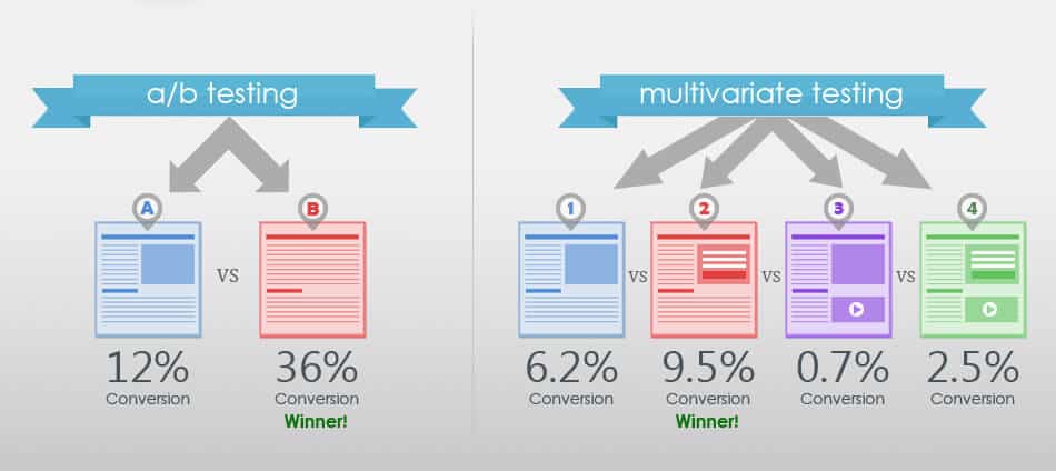
So, instead of just learning that a hero shot with a smiling woman outperforms a shot of a grumpy man, you can also see if a grumpy woman image drives more results than the grumpy man pic or if a happy man outshines them all.
Or, you can try multiple combinations, like a new headline or CTA in combination with either the smiling woman or the grumpy man.
Running all of these tests simultaneously will allow you to optimize your page or site much more quickly than you could with a long series of A/B tests.
Plus, running a test with multiple variants will greatly improve the odds that a single test will deliver at least one positive result, allowing you to start getting more from your website sooner.
Multiple Variant Testing is More Reliable
Another problem with successive A/B tests stems from the fact that the world changes over time.
For example, if you are in ecommerce and run your first A/B test during October and your second test during November, how do you know if your results aren’t being skewed by Black Friday?
Even if your business isn’t seasonal, things like differences in your competitors marketing strategies, political change or a variety of other variables can make it difficult to directly compare the results of A/B tests.
As a result, sometimes it can be hard to know if a particular A/B testing variant succeeded (or failed) because of factors outside of your control or even knowledge. The more tests you run, the murkier your results may become.
However, with a multiple variant test, you are testing all of your variants under the same conditions. That makes it easy to compare apples-to-apples and draw valid, reliable conclusions from your tests.
What Does Testing Multiple Variants Look Like in Real Life?
To show you just how testing multiple variants can improve your marketing results, let me share an experience we had with one of our clients.
The client wanted to get site traffic to their “Find Your Local Chapter” page, so we decided to add a “Find Your Local Chapter” link to the client’s footer. That way, the link would be seen by as many people as possible.
Makes sense, right?
So, we put together something that looked like this:

At first, we figured we would just put the link in the footer and run a test to see if the link made a difference.
But then, we started wondering if there was a way to make the link even more noticeable. After all, getting traffic to this page was a big deal to the client, so it made sense to emphasize the link.
With that in mind, we added color to the link:

Now, this idea seemed logical, but at Disruptive, we believe in testing, not gut instinct, so we figured, “Hey, we’ve got enough traffic to test 3 variants, let’s take this even further!”
The problem was, the client’s site was a designer’s dream—modern and seamlessly designed. To be honest, we had a bit of trouble selling them on the idea that creating a page element that interrupted their seamless flow was worth testing.
But, eventually, we convinced them to try the following:

It was very different from anything the client had tried on the page before, but we decided to run with the idea and include it in our test.
A few weeks and 110,000 visitors later, we had our winner:
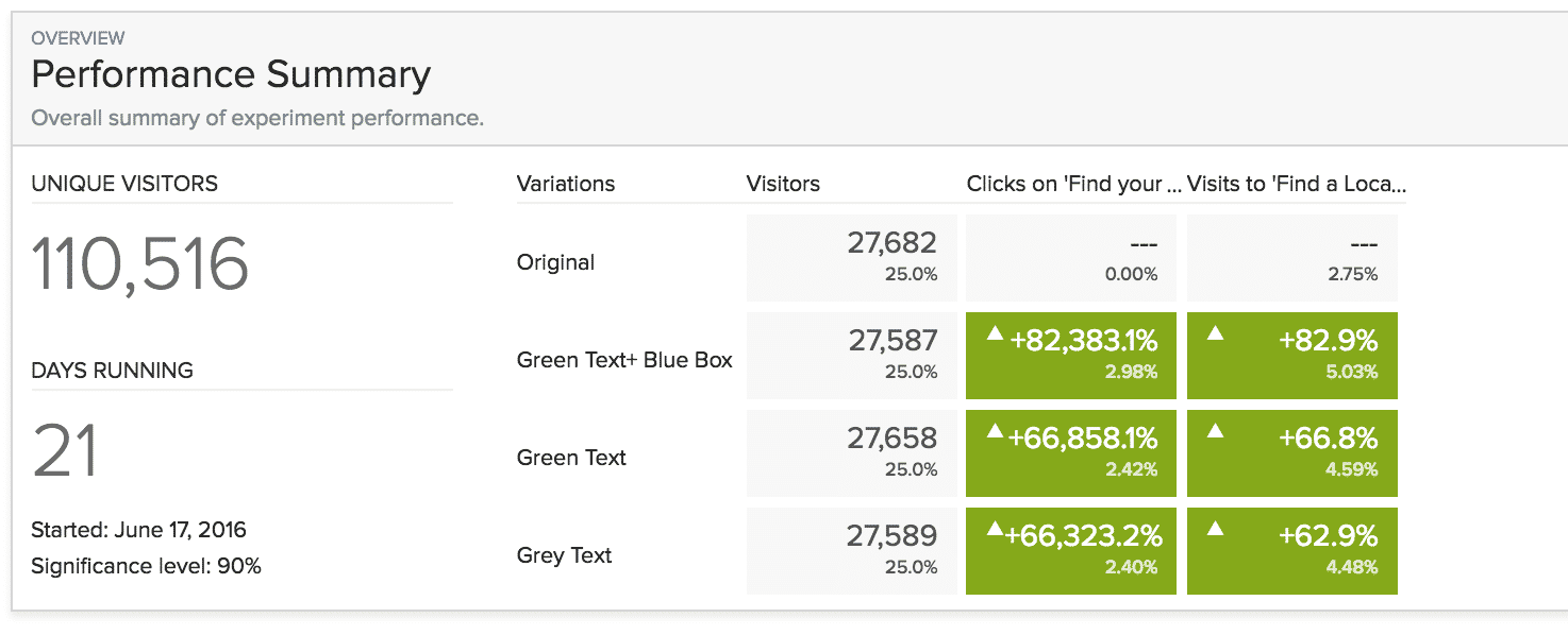
But here’s the thing. With our original, strict A/B test, we would only have discovered that adding the link increased traffic by 63%.
On the other hand, by including a couple of extra variants, we were able with the same test to discover that—contrary to the client’s belief—the more our link “interrupted” the site experience, the more traffic it drove to the chapter page.
Sure, we might have reached the same conclusion with several more tests, but we achieved these results much more quickly and reliably than we would have with an A/B testing series.
Should You Test Multiple Variants?
As great as multiple variant testing is, it does have one big limitation: if you don’t have enough traffic, a test could take months or years to complete.
In fact, in true multivariate testing—where you test to see how a large number of subtle changes interact to generate your conversion rate—you want at least 100,000 unique visitors per month (for more information on multivariate testing, check out this great article).
On the other hand, you need far less traffic to simultaneously test multiple page variants.
To see how long a multiple variant test will take on your site, try out this VWO has a free sample size and test duration calculator from VWO. If the time frame makes sense for your business, go for it!
Conclusion
And that’s A/B testing. Or, at least, that’s enough about A/B testing to get you started.
A/B testing is a process, so you can expect to learn a lot as you begin testing your site. It will take time, ingenuity and patience, but you’ll soon be getting much better results from your marketing campaigns.
The best part about A/B testing is that it makes every aspect of your marketing better. You learn more about your audience, which helps your advertising. You discover what your customer really want, which makes it easier to create content that they’ll respond to. Most important of all, your site produces better results, which lifts every aspect of your marketing.
If you’re feeling a little overwhelmed, don’t worry, we’re here to help. You can either reach out to us here for a free consultation or you can check out the dozens of articles we’ve written about A/B testing and CRO here on the Disruptive blog.
Have you tried A/B testing? How did it go? What tips or tricks would you add to this article? Leave your thoughts in the comments below.


