Landing Page Psychology 101: Trust Me, It’s All Your Parents’ Fault
by Manny Lopez • October 27, 2016
When it comes to designing landing pages, there are a lot of things to consider. The UX design industry is full of recommendations, but in addition to the usual best practices, there is another major key to creating a high converting landing page.
That major element is general psychology or an understanding of basic human tendencies and behavior.
As you plan out your campaigns, ads and eventually landing page design you need to carefully consider using specific colors, images and copy to ensure that you are creating the best experience for your target audience.
Here are some basic principles of “web psychology” that can help you boost your pages conversion rates:
The Psychology of Me
When people are shopping online for a specific product or service they are usually thinking about themselves. They are considering how this will give them pleasure or how this product or service is going to relieve their problem and bring them happiness.
People usually want to avoid conflict or pain when shopping online. With this in mind, its best to include elements in your design that will reinforce their desire for happiness/pleasure.
How? Well, you can start by using happy people in your imagery.
When you choose your photos it’s always a good ideas to show people enjoying the product in the real-world. Showing your product in action gives the user the ability to imagine themselves using your product.

If your are in the service industry the same principals to imagery can apply. Using photos of people happy/safe instead of in crisis can be a very effective strategy for most service based business.
As much as we all want to be an individual and stand on our own we find ourselves obsessed with what other people and companies especially those that we love are doing. Not everyone is a trend setter and many look to make sure that other people have benefitted or are benefitting from your service.
In marketing, we call this social proof and often times we use companies logos, testimonials and videos to show potential customers that they are in good company.
The Psychology of Emotions
People are emotionally invested in the products and services they use on a daily business. As a result, when a new customer lands on your landing page you want them to feel some sort of emotion.
In some cases using direct or even confrontational messaging is the right strategy to get that person to convert. Some industries require you to tug on people’s emotion by comforting them with a question or concern about the issue they are having.
For example, a weight loss clinic might target a person with the consequences of being overweight. They might follow this with imagery of a person struggling and not enjoying an everyday activity.
Other industries that seem to succeed when they build off their customers emotions/anxiety are financial companies. People are often worried about their financial situation so it’s common to play off these emotions to convert a user.
Targeting these types of emotion can be very tricky to pull off successfully, though, so it is very important that you do use supporting text to show the user that your product is the solution they are looking for.
The Psychology of Colors
Different colors can bring out different emotions in people. For example, stop signs are red because red is often times associated with urgency and importance. Knowing how people react to colors is a great tool to help you use colors effectively.
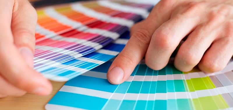
One of the most used colors on the web today is blue. People usually associate blue with trust and secure. This can be seen by 100’s of financial companies that use blue as their primary company color.
Companies such as PayPal use blue on the website and logo to help push the fact they are a trusted company. Continuing the financial company blue trend is Capital One, Bank Of America, Citi Bank and so on. Not only have financial companies subscribed to this theory but so has the world’s largest social media company: Facebook.
Green is another popular color used in today’s websites. The color green is associated with peacefulness, health and growth.
Green is a popular color for health-focused companies that want to promote clean living. Many food service business will also use green on their marketing material because it gives off the the impression of freshness and that’s exactly the emotion they want from their customer base.
Black or Monochrome is used by many luxury brands because black and its different shades give off the impression of wealth, class and strength.
There is no bigger example of a brand using monochromatic colors than Apple. Apple is known for their great minimalistic design and are often times referred to as a luxury computing company.
Overall, the color you choose for your landing page can have a huge impact on how people respond to it. With the right color choice(s), you can significantly improve your conversion rates.
The Psychology of Price
There are two basic types of people of the web: spenders and savers. Depending on who you’re marketing to, you’ll want to focus the design and messaging of your page to appeal to one or the other of these types.
So, what if you need to sell to both types? What can you do to please both the spender who is less concerned with price and the saver who is looking to get that great deal?

One effective method is using different terms to describe your price. For example, using the phrase “as low as $1 a day” might sound better to someone then $30 a month. Or, you can try using $100 off instead of 10% off. Sometimes, just presenting the numbers in a different way makes your price more palatable to some users.
Both spenders and savers love to feel like they are getting a deal and there is no better way to feed off that than to offer them a “limited time only” sale. This feeds people’s urge to feel confident about a purchase.
When people are hitting your page looking to buy a service or product, the way that you layout your pricing may be the reason a user converts or bounces.
Conclusion
Understanding landing page psychology is a powerful tool that will help you make design decisions that will improve your landing page’s conversion rate. Of course, the exact solutions will vary from business-to-business and page-to-page, but these ideas should hopefully help you get better results from your pages.
By the way, if you’d like me to do a little landing page psychotherapy on your pages, let me know here or in the comments below. I’d love to help!
Have you tried using any of these landing page psychology tricks before? How did it work out?


