15 Ways to Boost Your Ecommerce Conversion Rate in 2019
by Cydney Hatch • January 7, 2019
The ecommerce industry has experienced amazing growth over the past few years and is predicted to hit a global revenue count of $4.88 trillion by 2021!
But before we get ahead of ourselves, it is now 2019 and you’re going to have to start thinking about ways you can improve ecommerce conversion rates if you want to have a competitive edge in the years to come.
The reality is, you cannot wait for conversions to happen: you need to optimize for them. It is not just about driving more traffic, it’s about getting more sales from your traffic.
In an increasingly digital world, there are definitely some things you can do to inspire customers to take action and engage with your business. So, whether you are just starting up your business selling quirky greeting cards or you’re a marketing director of an established business, you need to be well-versed in the latest ecommerce trends.
In this post we will go through 15 ways to boost your ecommerce conversion rate for 2019 and beyond!
Let’s set you up for success!
Wait, What are Conversion Rates?
Now, for those of you who are just starting and wondering what the heck I am talking about, let’s do a quick overview of conversion rates and how they apply to your ecommerce site.
To put it simply, your conversion rate is the % of visitors to your website or landing page that convert (aka, do what you want them to do). Depending on your business goals, a “conversion” could be a lot of things, but here are a few common types of conversions:
- Making a purchase (the biggest conversion metric for ecommerce businesses)
- Sliding into your DMs
- Adding an item to a wishlist
- Starting an online chat
- Signing up for a subscription
- Downloading content
- Participate in a poll and or survey
- Upgrading services or products
- Leaving comments
- Sharing content
- Using a sale code
- Any KPI your company finds valuable
There are plenty of ways potential customers can engage and convert on your site! Generally, a conversion is a measurable action that shows that a potential customer is progressing towards making a purchase.
How Do I Calculate My Conversion Rate?
Calculating conversion is not a brain twister, I promise.
All you have to do is divide the number of conversions you get during a certain time frame by the total number of people who visited your site or landing page and multiply it by 100.
(Conversions / Total Visitors) X 100% = Conversion Rate %
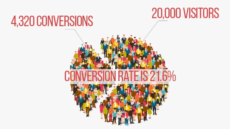
For example, if you had 20,000 visitors to your site in one month and it had 4,320 conversions, your conversion rate is 21.6%.
Easy enough, right?
Another great thing about your ecommerce conversion rate is that you can be as specific or as broad with your conversion rate as you want to be. Conversion rate optimization (CRO) can also be conducted on landing pages, category pages or any other customer touchpoint. Here are a few different types of conversion rates you can use and ways you can use this data to examine performance:
- Overall conversion rate (How well does your website convert traffic from multiple sources?)
- Marketing channel conversion rate (is Google Ads or Instagram Ads more likely to convert?)
- Page-level conversion rate (Which page performs the best?)
- Campaign conversion rate (Did my campaign convert people effectively?)
- Individual ad conversion rate (Is my content and ad copy efficient?)
- Keyword conversion rate (Which keywords bring the best traffic?)
Generally speaking, your ecommerce conversion rate is a great metric for evaluating the performance of almost any aspect of your online marketing. Driving clicks is great, but if those clicks don’t end up doing something that is beneficial for your business, what is the point of you advertising?
15 Ways To Boost Your Ecommerce Conversion Rate in 2019
To help you make the most out of your online marketing and website, let’s take a look at ways you can boost your online conversions!
1. Help People Get Stuff Done
Believe it or not, although this is a “simple” thing to start with on any website, many businesses struggle to have clear calls to action (CTAs) on their homepage and beyond.
Whether it is not having a call to action to having too many CTAs, the wrong CTA approach can cause confusion for your potential customers. If your site visitors have to use their brains to figure out what you do, what you sell, who you are and what they need to do, it may result in missed sales opportunities.
For example, one of my most recent clients, who does freelance iOS app development, came to me on how they could improve their website. Their original site is below (personal information blocked):
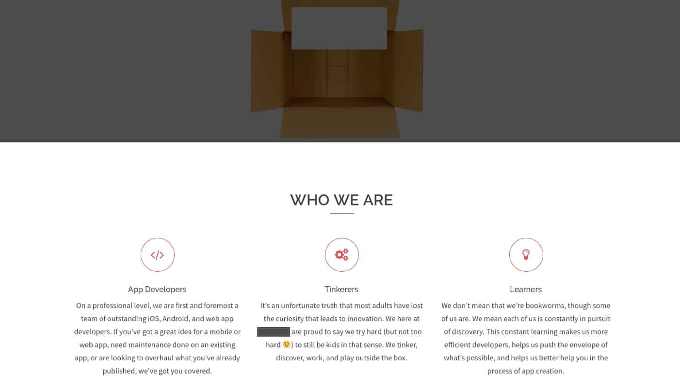
At first glance this site needs to:
- Have a clear CTA that people can find within 3 seconds. People have short attention spans and when it comes to websites, you have an even shorter time to grab their attention and for them to take action. Right now, looking at the site I don’t know what I’m supposed to do and for others looking at the site, they probably feel lost as well. So, to fix that, they will need to create some kind of action to clear up:
- What they do
- Benefits of their product
- Call to Action (Learn More, Sign Up, etc)
- Give a value proposition. It takes a lot of reading to find out why I would want to work with them and they never address any pain points their services relieve or address. On their main page they need to make it so their audience can identify 2-3 reasons why they should work with them (the 3 icon sections right now are more informational than persuasive).
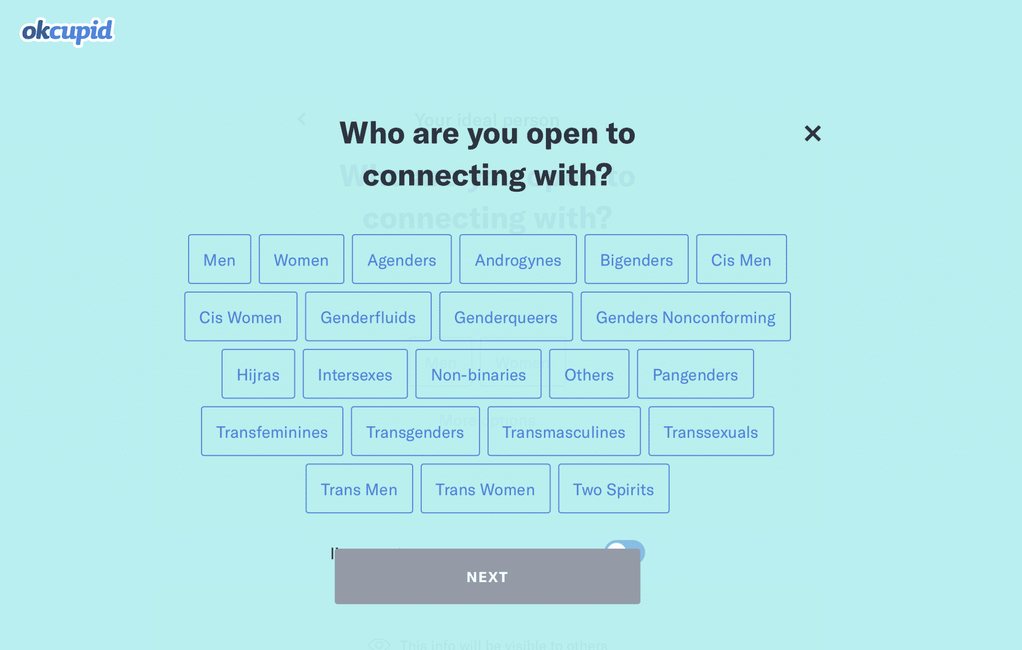
A better example of simple but effective CTAs is dating site OKCupid:
OKCupid’s CTA doesn’t seem that impressive at first glance, but like many things in life, simple is better!
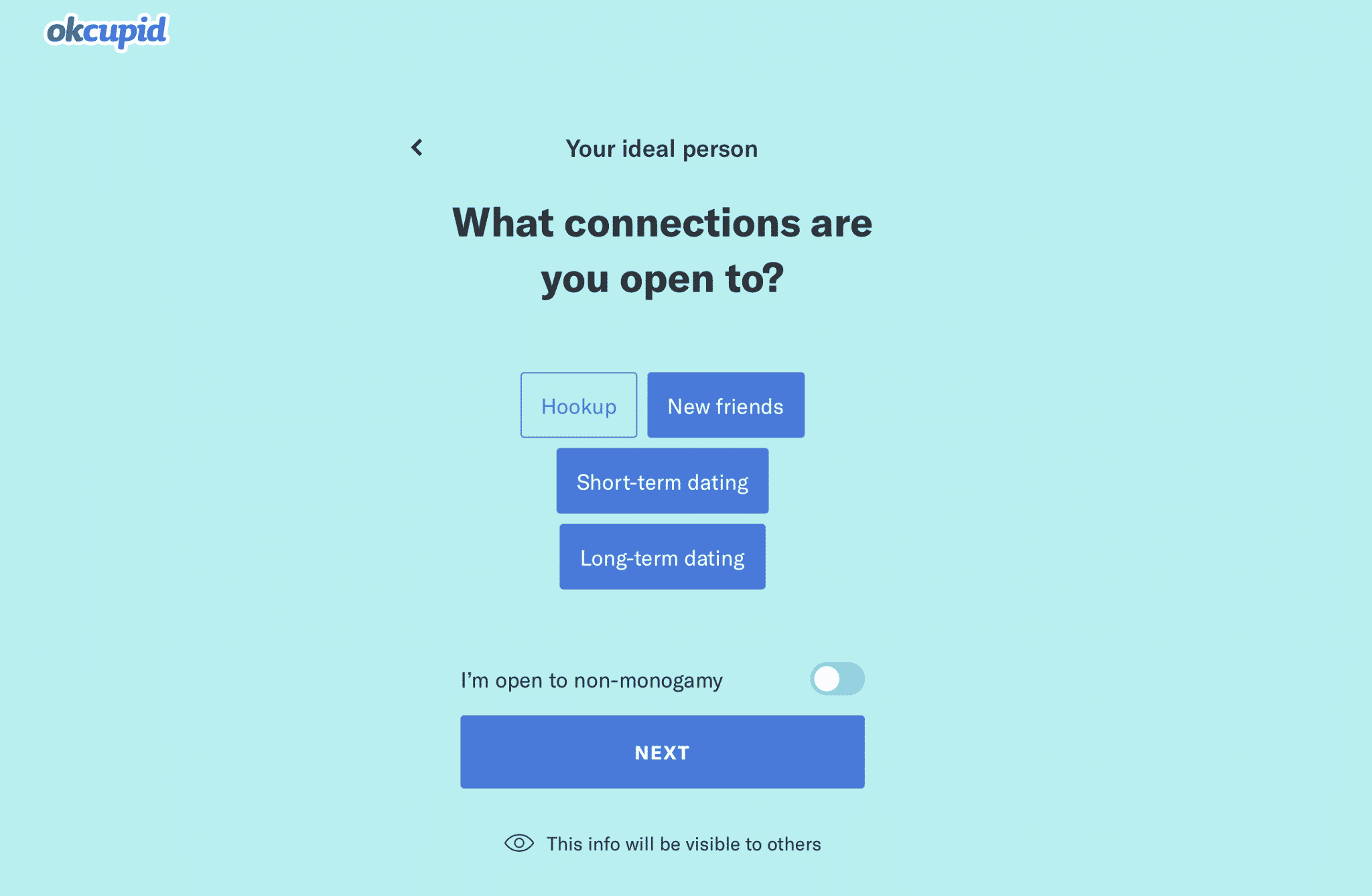
The call-to-action button “Next”, which is a deeper blue, stands out well on a light blue background which makes action options easy to find.
The simplicity of this gives users a feeling that this signup process will be personable, short and casual. OKCupid makes a signup feel more like playing a fun game than filling out a boring form and it’s all due to the copy!
As you can see from these two examples, CTAs are a must! Typically, for ecommerce, there should be one type of CTA per page, often taking the form of:
- Add to shopping cart
- Checkout now
- Buy now
- Access/Redeem coupon code
Depending on the website, just 4% of site visitors convert on first visit—the other 96% may return to purchase at some point in the future or never at all. So you need to make it as clear and easy as possible for those 4% of sales-ready visitors to check out on their first try.
Within the first three seconds of landing on a page, a user will decide if he or she has found what was originally sought. Your CTAs should enhance product pages to maximize conversion potential within this three-second window!
2. Use Ecommerce Conversion Rate Optimization Tools
Believe it or not, the internet has a lot to offer when it comes to ecommerce as it has amazing tools you can use to help analyze your current conversion rates.
The following are some my favorites to dabble with and if you can use some of these to help optimize your site, hooray!
- Google Analytics: The most basic choice, but it can give you a holistic view of your analytics.
- HotJar: An excellent tool for understanding how your users interact with you website using a heat-mapping tool (you get the functionality of click, cursor movement, and scroll-depth mapping).
- CrazyEgg: A tool that offers heat maps, click maps, scroll maps, A/B testing, user recordings and more to offer you a visual glimpse at how your users are navigating your site.
- Quantcast Measure: A tag-based analytics tool that fills a niche between Google Analytics and Facebook Analytics that measures users’ site usage and provides advanced demographic data on a per-click basis.
- Mixpanel: A powerful product analytics tool that works well for financial services, consumer tech, SaaS, media and entertainment.
- Clicky: A ecommerce tool that gives you real-time web analytics for your site or blog.
- Decibel Insight: This enterprise tool helps businesses quantify and improve the customer experience.
- Google PageSpeed Insights: With Google Developers PageSpeed Insights you’ll find out why your website is loading slow and what kind of errors you’ve got on the site.
- Gtmetrix: A powerful speed reporting tool. Submit your link and you’ll get back a huge report of what’s slow on your site and what exactly you can fix to help speed it up.
- Jaco Session Recording: A replay tool lets you see every visitor interaction including CSS animations and dynamic content.
- Formisimo: THE form analytics tool. You’ll get in-depth insights into your forms, from what fields people are dropping off at to the time it takes for people to fill in certain fields.
- Typeform: Want to create beautiful surveys to send to your customers or website visitors? That’s what Typeform is for.
- Google Forms: Need cheap surveys, quickly? Google Forms are easy to create and free!
- LeadChat: This 24/7 live chat team will power your live chat service. No need to hire your own customer support person or team.
- Usertesting: A tool that gets user testers to go through your website, mobile app, or prototype.
- Five Second Test: A simple way to get first impressions from visitors.
- Moqups: An online, collaboration-based mockup tool. Create your designs within the platform and you can get feedback within the tool from colleagues, clients, and anyone else on your team.
- Optimizely: the leading A/B testing tool.
- Hello Bar: A simple tool that lets you easily create lead capture bars, modals, sliders, and full screen popups.
These are just some of the many options you can use so be sure to do your research and see which tool fits into your business needs and model!
3. Get People Talking
Social proof is the name of the game these days so if you are going to be successful on your ecommerce website, you need to include social proof somewhere!
It should come as no surprise that 63% of customers are more likely to make a purchase from a site with user reviews.
Why? Because social proof demonstrates that you and your offer are trustworthy. When you do it right, social proof can make a huge difference to your business. Hands down, testimonials and reviews are the simplest way to add social proof to your ecommerce store. According to Reevo, customer reviews increase sales by 18%.


So, as a business owner, you should include user rating, commentary, photo shares on your product pages like above but you should also include customer testimonials on your page elsewhere.to further mobilize visitors toward a purchase.
Once visitors see that your product is well-regarded by other buyers, you are golden! When people see the seal of approval they immediately feel more at ease, more confident and more likely open up their wallets.
4. Simple Forms Make For Happy Customers
One of the biggest mistakes online brands make is creating pages that are simply too confusing and obtrusive. There’s either too much going on or there’s not enough to actually entice a site visitor to move further down the funnel (toward an eventual purchase).
If a visitor navigates through your site to a product page (or lands on one via organic search), he or she has arrived there with clear purchase intent—that’s why these pages exist. But if the form fill he or she is prompted to populate creates a conversion obstacle, you’ve broken a cardinal user-experience rule.
Pages should be frictionless—so easy to digest and maneuver that they can even lead to upsell opportunities or, at a minimum, a pleasant, memorable interaction.
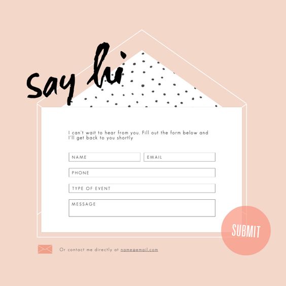
Unclear forms that have too many fields of entry can deter purchases, especially if users’ browsers aren’t set up with auto-saved personal information. Ask yourself if every single row of entry on a form is actually necessary and then cut out the “stuff!”
You should also validate entry errors in real time, not AFTER the entire form is filled out. (There is nothing worse than having to re-fill out forms!)
5. Check Out Your Checkouts
All right, you got your potential customer through the shopping experience and they are ready to finalize and buy your products/services! The payment process is the final step and as a business, you do not want to flop at the finish line!
If the experience of checkout is less than ideal and isn’t effortless and smooth, you could still end up losing the potential customer! Yikes!
According to the Baymard Institute, almost 70% of shoppers abandon their carts. The same report found that 28% of cart abandonment occurs because of a long or complicated checkout process.
So, what do you need to do? Simplify the checkout process and even offer one-click-purchasing! It’s your job to get them to check out fast and for existing customers who are already logged in, set up one-click-buying!
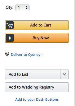
You already know that Amazon are the kings of one-click buying. You’ve probably fallen for it (I mean…used it) already. The system remembers all your details, so you can order without going through the messy checkout process.
Like this example, look for ways you can simplify your checkout process to encourage purchases to be convenient. Convenient equals conversions!
6. Create Omni-Channel Coolness
People are all about personalization these days. From Ubereats, customizing products and colors to even payment options people want choices!
In 2019 you as a business need to provide a cohesive brand experience by personalizing your interactions for each customer across their shopping experience and your platforms.
However, there is still a huge challenge when it comes to offering a seamless personalized experience across all channels:
- Only 27% of marketers in the study are syncing half or more of their channels.
- 46% have managed to connect only a few channels.
- And 27% don’t have any of their channels connected.
So, since many people are not taking advantage of this perk, you can have huge opportunities over competition by personalizing customer experiences across all channels. Predictive targeting can help you identify a visitor and then match the right experience for them.
7. Offer Free Shipping
Well, Amazon has ruined it for the rest of us, online shoppers now have come to expect a certain standard that they have grown accustomed: free shipping, typically next day!
If your store does not offer free shipping, customers are going to look elsewhere, period. In today’s market, free shipping is an absolute must! Also, look for options to get quicker deliveries!
8. Love Yourself Some Discount Codes
Everyone loves coupon codes and when you browse most ecommerce businesses, there is always some type of promo happening, so do not miss out on some sales by saving discounts for the obvious times like holidays!
Ecommerce businesses that use discount codes benefit because they:
- Boost customer happiness and shopper loyalty
- Support new customer acquisition
- Promote newly-launched products and less successful selling products
- Offload excess inventory
So, whether it is the holidays, a new product launch or just for the heck of it, promos are a must! The easiest way to make discount codes successful is by offering limited time discounts that drive urgency and make shoppers more likely go through with the purchase and not get distracted.
Some codes you can consider can be:
- Cash for credit
- Free offers
- Referral programs
- Instant discounts at checkout
- Gifts with purchases (freebies)
- Buy one get one free
- Post purchase discounts
A great use and example is Laced Up Laces who offer visitors 20% off to first time visitors and buyers! Like them, you can easily see opportunities where discount codes can help sell your products!

Ecommerce businesses who do this effectively can strategically acquire new buyers, build better relationships with existing customers and increase total sales with offers shoppers cannot refuse.
9. Stop Abandoned Carts
If you are getting a lot of abandoned carts you are probably really frustrated and wondering how you can improve your failed conversions.
Lucky for you, there is software options to help you figure out a plan!
Abandoned cart software works with users that have added items to their shopping cart, entered their email and details and then left your store. Some ecommerce platforms offer this software, like BigCommerce, free as part of the store functionality.
Their software, like others, allows you to create follow-up emails that will send the user an email with their cart contents as well as allow you to give them a coupon code to get a discount as an incentive to complete their order.
Decreasing abandonment rate should be a high priority for online store owners and software like this can help you make plans to improve this part of your ecommerce conversion!
10. Chat Away With Customers
Potential customers these days expect instant gratification and setting up chat bots and other AI that can help answer questions immediately can increase your conversions just by being helpful and attentive!
Chatting with customers can increase conversions, but if you are using live chat software be sure to immediately respond to customers who request chats! To help responsiveness, be sure to add service hours that customers can expect to hear responses from. If you are not in, the service hours reassure customers with an instant message telling them you will respond in 24 hours!
Using chat bots, whether its you directly or a chat bot system, can help your customers quickly get answers to their questions. This will can reduce the overhead needed to staff up live chat!
11. Let Customers Check Out as Guests
Along with what was discussed above about simplifying the checkout process, another important factor to consider is allowing customers to checkout without signing up for an account.
Now, before you doubt this think about your own personal experiences. How many of us dread having to fill out names, addresses, credit card information just to get spammed with emails you do not want.
Forcing the user to register is just giving them another reason to leave your store so give people the option to buy and run! If you make things easy, people will most likely remember what a breeze it was to work with you and that will inspire them to come back!
12. Give People Chill Pills
I am not sure about you, but in my lifetime I have bought things online that ended up being doozies!
With a growing number of people selling stuff online it does not neccesarily guarantee quality assurance across the board. Most people are skeptical about buying something online because of this inconsistency, so it’s your job as a business to make people informed and comfortable enough to click “buy.”
The perceived value of your products and the trustworthiness of your brand is often judged on the quality of your visual content. That means having high-quality, beautiful product photography can go a long way towards driving sales for your business.
Think about the last time you were shopping online and came across a bad product photo.

Maybe the image was dark or out of focus. Maybe you couldn’t figure out how large the product actually was or you weren’t sure what color it would actually be. Maybe there was so much going on the photo that you didn’t know what item was actually for sale.
Odds are, you didn’t buy that item.
Unlike shopping in a boutique or a department store, when you browse online, you can’t pick up the product. You can’t touch it, hold it in your hands or feel the texture with your fingers. All you have is the photographs to base your buying decisions on.
As a shopper this can be scary, so as an ecommerce business be sure to have the following on all of your product pages:
- Detailed product descriptions
- Quality product photography and videos
- Flexible return policies
By including those three things you take away the feeling of risk and therefore allows for people buy from you confidently!
13. Don’t Distract People
Your website has just one single goal: to sell products, but unfortunately, we often let design and other elements get in the way of this simple goal.
The key to great conversion is to limit the friction you make for your potential customers. By friction, I am not meaning rubbing balloons on your head for static, but distractions or bad user experiences that make shopping or engagement difficult.
Web design is constantly evolving and changing to the likes of users, so design principles are really hard to define. However, there are simple rules you should follow like:
- An easy to understand navigation
- Proper use of animation
- Good color scheme
- Clean layout
- A visually appealing interface
- Choosing a design that is appropriate to the topic or theme
- Keeping design elements and content organized
Anything else is just a distraction. Get rid of it!
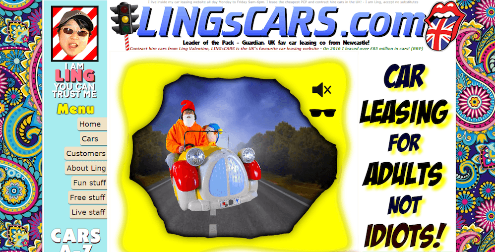
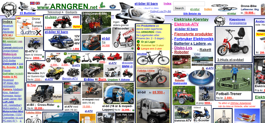
Do not be these guys, keep it simple, stupid!
One of the hardest things for any entrepreneur to do is simplify their product, business, or website. Many times, businesses marry themselves to designs because they think it is about them but they are forgetting one of the biggest marketing rules: It is not about what you want, its about what your customers wants!
Be sure to keep that in mind and make their experience easy both tactfully and visually!
14. Ensure Safety
In today’s world, there is no doubt that people are concerned about keeping their online information private. From Facebook data leaks, phone app breaches and credit card fraud becoming more frequent in our digital lives, people often feel like they are completely exposed online.
So, to help your ecommerce business look for ways and certifications that let your customers know your online store is safe. Your website needs to build trust in order for potential customers to enter their credit card information.
To help with this, one of the best ways to put people at ease is to install SSL certificates. Be sure to show major credit card images and other payment alternatives so you visually signal people that your site is customer friendly and trusted.
15. Watch Your Metrics
Finally, the biggest secret to improving your ecommerce conversion rates is to actually track and monitor them. Not every change you make to your site will improve things, so here are some metrics to keep an eye on:
- Bounce Rate: The % of people who leave after viewing a single page
- Exit Rate: The % of people who leave after viewing the page
- Click through Rate: The number of people who click a link to your website from an ad or email
- Average Session Duration The metric to see how long people are on your website
You can find these metrics in your Google Analytics account under “Audience > Overview”.
2019 Ecommerce Success, Here We Come
You run a business, you know your numbers, you understand everything in and out, but sometimes you do not know what to look for when trying to optimize your conversion rate after success.
Conversion rate optimization doesn’t just happen and reading the above tactics, you know it requires a lot of planning. Understanding CRO trends and how you can improve your site and user experience is key if you are going to sell online these days.
No matter which tactics you use above, always be sure to test and keep testing so you can best serve your intended audience. By doing so, you are actively making sure that your conversion rates are actually changing for the better!
If you want some more help on how you can improve your ecommerce site or user experience, feel free to reach out to me here. We have a wonderful team that has helped many businesses improve their ecommerce conversion rate so do not hesitate to reach out!
What do you love about ecommerce? What trends do you see in the near future and what tips have you found? Share and comment below!

