How to Get the Most Out of Your Landing Page Tool
by Jacob Baadsgaard • December 22, 2015
So, you’ve been around the online marketing universe long enough to know you need a landing page.
After doing your homework, you’ve realized that the easiest way to create, organize and test your landing pages is to use a landing page tool like Unbounce, LeadPages, Instapage, KickoffLabs, LanderApp, etc. Maybe you’ve even gone ahead and signed up with one of these landing page platforms.
The question is, now what?
Unfortunately, simply having a landing page tool doesn’t guarantee that your landing page will be a success. You might have tried a few pre-made landing page templates, created a few pages of your own or simply fiddled around with your tool only to find that creating a great landing page isn’t as simple as you thought.

Frustrated? You’re not alone.
I’ve talked to hundreds of companies who have struggled to make landing pages work for their business. That doesn’t mean that landing pages aren’t a good idea for your business—the fact is that landing page design has a steep learning curve.
It’s taken me and my landing page design team years to really master the art of landing page optimization, so don’t be too hard on yourself if your pages aren’t performing the way you’d hoped yet.
So, what does it really take to get the most out of your landing page tool? A good deal of landing page know-how.
To help you develop that know-how, I’ve designed this blog post to set you up for success. Not only does it cover the most important aspects of landing page design and optimization, it also includes a wealth of links to other articles that dive deeper into particular points.
This article serves as a great checklist—if your landing page meets all of the criteria here, you’re on your way to success!
1. Use the Right Landing Page Tool
Before we get into the specifics of landing page design, let’s make sure you’ve got the right landing page tool for your needs. At Disruptive, we’ve worked with a lot of companies and a variety of landing page tools and have discovered that not every platform is right for every company.
Here’s how the big players break down (click here for an even more in-depth assessment):
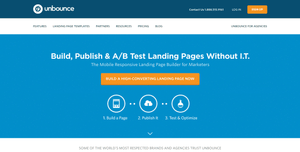
Unbounce
A personal favorite, Unbounce was one of the first landing page building and testing services that allowed marketers to create landing pages without involving the IT department. Over the years, it’s become one of the most robust landing page development and optimization options out there.
Who Should Use Unbounce
In my experience, Unbounce is a great option for most businesses that really want to get the most out of their landing pages. I’ll admit to a little personal bias here, but it really is a great platform.
Unbounce is flush with features, highly customizable and offers an easy-to-use interface for both page design and testing. Even if you are just learning to use their interface, Unbounce comes equipped with a variety of built-in templates (and you can buy more from ThemeForest), making it easy to put a decent page together and start testing.
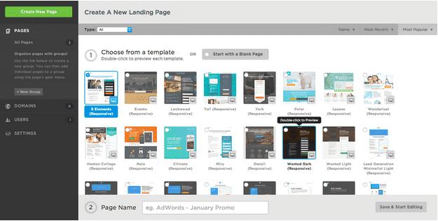
Unbounce also features a powerful mobile optimization design platform, which is becoming increasingly important in today’s mobile-centered world. Furthermore, it integrates with most customer relationship management (CRM) platforms like Salesforce (and you really should be using a CRM) as well as Google Analytics, Zoho, Campaign Monitor and 60+ other 3rd party apps, allowing you to track your landing page results and leads in a variety of ways.
Essentially, Unbounce is a great fit for intermediate-to-advanced online marketers or novice marketers who care enough about their results to put a little time into learning a new system. At Disruptive, we’ve used Unbounce for years to drive great results for our clients and it’s become one of our favorite landing page platforms.
Who Should NOT Use Unbounce
If you’re just looking for a plug-and-play, get-credit-and-forget-it landing page platform, Unbounce is probably going to be overkill. That being said, if that’s what you’re looking for, you probably don’t need a landing page platform anyways.
Save yourself the headache, ask someone to build your landing page and run with it!
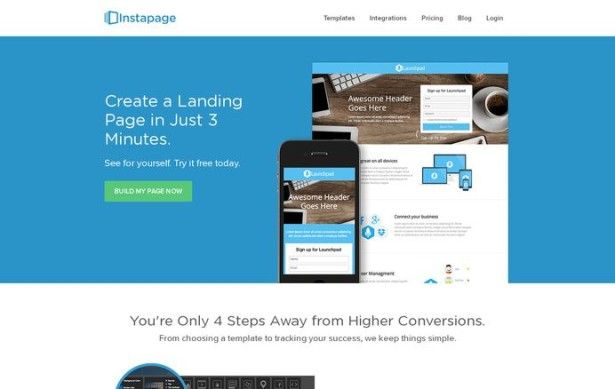
Instapage
On the other hand, if you don’t have the time to learn a robust system and can’t afford to pay someone to build a page for you, Instapage is an excellent option. The name is no misnomer, their templates are incredibly easy to use.
Who Should Use Instapage
As I mentioned, Instapage is a great fit for companies without the time or money for more involved landing page design. Going with a template means you won’t have the flexibility to really get the most out of your landing pages, but it also simplifies the design process substantially. Plus, Instapage does offer some A/B testing options, so you still have the ability to figure out which template and content works best for your audience.
Who Should NOT Use Instapage
Generally speaking, the more competitive your industry, the more effective and customized your landing page needs to be. You have to set yourself apart from the competition and a template usually won’t cut it. If you know you need a focused, conversion-optimized page to make your online marketing profitable, Instapage probably isn’t your best option.
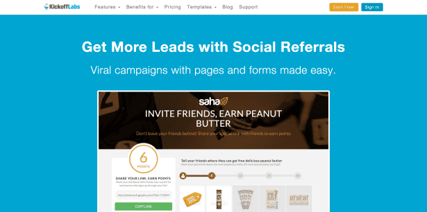
KickoffLabs
In my opinion, KickoffLabs tries to be both Unbounce and Instapage at the same time—and fails at both. It’s primarily a landing page template interface; but, it can be customized, as long as your CSS/HTML kung fu is strong. The interface is a pain and the options are very limited.
There’s no limit on visitors per month, though, so if funds are tight, traffic is high and you’re comfortable with coding, it might make a decent option. Otherwise, I wouldn’t recommend it.
LanderApp
LanderApp is basically Instapage without dynamic keyword insertion (DKI). As a result, if you’re planning on running pay-per-click campaigns, I’d stay away from LanderApp.
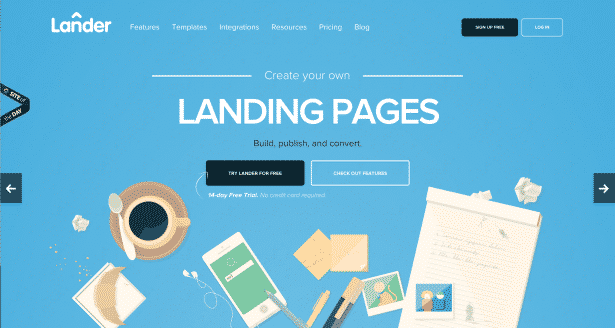
However, if you aren’t planning on doing any PPC and expect less than a 1,000 visitors per month to your landing pages, LanderApp is probably your cheapest option.
Buyer beware, though, LanderApp’s pricing scales up much more quickly than other landing page platforms as your traffic increases. For example, Unbounce charges $49.99 for 5,000 visitors/month. LanderApp charges $70 for the same 5,000 visitors/month.
Webflow
If you’re really looking to get the most out of your A/B testing, you might consider looking into Webflow. Unlike the other landing page platforms listed here, Webflow is primarily designed for building websites rather than creating landing pages.
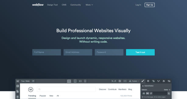
Although Webflow isn’t a classic landing page design tool, it’s included in this list because it’s easy enough to use and implement that you can readily design pages on your site for use as landing pages.
Because the pages are part of your overall site architecture, you can use robust site testing tools like Optimizely or VWO to really improve your page/site performance. Unfortunately, while most landing page tools have built-in A/B testing features, they typically lack the options and level of detail available from more dedicated site testing tools.
So, if you want to take your conversion rate optimization efforts beyond simple A/B testing, Webflow is probably worth considering.
LeadPages
Last but not least, LeadPages is probably most similar to Unbounce in terms of options and customizability. It’s got a lot of great options and a very easy-to-use interface.
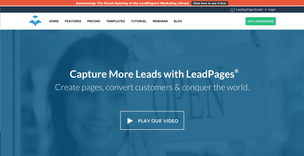
The only real downside is the fact that you have to start from a template and are limited by the original options of the template, which can be frustrating if you want elements from multiple templates simultaneously.
That being said, one of the more interesting features of LeadPages is the way they let you sort templates by conversion rate. Don’t get your expectations too high, though, conversion rates rarely translate directly from site to site or product to product. Still, it is nice to have an idea of which pages are performing best for other companies.
Overall, LeadPages is a lot like Unbounce. You can customize and test to your hearts content and the platform is fairly simple to learn and use. Can’t go wrong with that!
2. Message Match
Message match is the most important element of landing page design. In fact, it’s the reason you send traffic to a landing page instead of your website.
The reason behind this is simple. Marketing campaigns have a specific message.
Maybe you’re advertising a particular sale, or a specific item/service, or pointing out the advantages of a certain aspect of your business. Regardless of the nature of the message, you got people to click because the message of your marketing appealed to them in some way.
[clickToTweet tweet=”People click for a reason. If your landing page doesn’t match that reason, they’ll bail.” quote=”People click for a reason. If your landing page doesn’t match that reason, they’ll bail.”]

The trick to online marketing is to synchronize and optimize your marketing content and landing pages. This is part of the reason why landing page templates are a bit tricky—they can make it hard to match your messaging. The more custom the page, the better the message match.
So, if you plan on creating a lot of specific marketing material, you should expect to do a lot of landing page customization with your landing page platform.
What to Check
To make sure your marketing message is consistent with your landing page, take a look at the following (click the links for more detailed information):
- Imagery. Are the images, colors and styling consistent from your ad, social share, etc. consistent with your landing page?
- Keywords/Key Phrases. For PPC, is the keyword/key phrase that triggered your ad present in your landing page headline and copy? (DKI works great here, by the way, which is why LanderApp isn’t a great choice if you plan on doing any PPC). For other marketing channels, is the core message of the marketing material present in the landing page headline/copy?
- Products/Offer. Is the product/offer in your content immediately obvious on your landing page?
- Promotions. Does the deal in your marketing material match the offer on your landing page?
- Content. Does your content meet the expectations set by your marketing material? In other words, if your social post says “5 Ways to Save Money Today”, do you actually have 5 meaningful ways to save money listed on your landing page?
Remember, the more compelling your marketing material, the more clicks you’ll get. The more compelling your landing page, the more conversions you’ll get. If your marketing messaging matches your landing page content on each of these points, you’re well on your way to building an effective landing page!
3. Unique Selling Proposition
To create consistent messaging between your marketing material and your landing page, you need to understand exactly what you are trying to sell. At first glance, this might seem obvious—you’ve got a specific product/service you want someone to buy/sign up for.
In reality, though, the answer is much more complex.
No matter what industry you’re in, you need to sell your potential clients on what makes your company unique. If you sell computers, is your customer service better than the competition? Are your prices lower? Do you have a better warranty?
Whatever it is that sets your company apart, that needs to be the core message of your marketing and landing pages.

If you’re not sure what your unique selling proposition is (or should be), here are some things to consider:
- Needs. What needs does your product/offer actually meet? Each need is a potential USP.
- Competition. Which market needs are already well addressed by the competition? You need to be different, so marketing in the same way as your competition won’t do you much good. Find your USP niche.
- Audience. Who is interested in your niche USP? What makes them unique? (pain points, interests, etc.)
- Clarity. Is your USP clear, simple, easy to communicate and on point for your brand?
Identify what makes you and your offer unique and consistently communicate it across your marketing material and landing pages. You’ll be amazed at the results.
4. Call-to-Action
Landing pages exist for one reason—to get people to do something. You might want them to give you their email, buy a product, download something, submit their contact information or almost anything else…but you want them to do something that benefits your business.

Regardless of what your desired action is, your whole landing page should be designed to convince your visitor to do what you want them to do. To make it easy for them, you need to be very direct, which is where a good call-to-action (CTA) comes into play.
Here are some do’s and don’ts to consider when putting your CTA together:
Do’s
- Put your CTA in obvious places. Keep it above the fold and/or strategically place your CTAs throughout the landing page, just make sure your CTAs are easy to find and act on.
- Make your CTA stand out. You want your CTA to be easy to find, so make it big, use contrasting colors for your CTA—differentiate the CTA from the rest of the page in some way.
- Make your CTA an extension of your landing page content. Your CTA shouldn’t feel out of place on your page. If you design your landing page right, the CTA should be a natural part of your USP. Sell them on your product/offer and then make it easy to act.
- Make it a button. Buttons indicate action, so a button CTA is easy to find and use.
Don’ts
- Use “Submit” as a CTA. There’s no value proposition in “submit”—you might as well just say, “Give us your money.” Better options include CTAs like, “Download Now”, “Get My Free Proposal”, “Send Me My Access Code”, etc.
- Promise something you can’t deliver on. Nobody likes to be sucker punched.
- Overdo it. Too many CTAs is confusing (and a turnoff). You want enough CTAs that you don’t leave people wondering, “Now what?” but not so many that they just feel like all you really want is their money.
If you’re struggling to make your landing page produce, the first place I’d look is at your CTA. Test out a few different CTA iterations until you find one that really clicks with your target audience.
5. Attention Ratio
In addition to creating a great CTA, you also need to make sure that the clickable elements on your page don’t distract people from your CTA. This is one of the fundamental differences between a landing page and your homepage.
On your homepage, you don’t necessarily know why people are on your website or what they are looking for. Your homepage has to wear a lot of hats, so you need links to a variety of parts of your website.
A landing page, on the other hand, is created with a specific audience, USP and CTA in mind. Generally speaking, you don’t build a landing page to encourage people to visit your blog. You want them to take a specific action. So, any options on your landing page that distract people from taking that specific action undermine the effectiveness of your page.
Attention ratio is a way of measuring the number of options on a landing page that are competing with your goal action for the attention of your visitor.
For example, the average homepage has about 40 clickable options. If you are running a marketing campaign and send visitors to your homepage, you’re hoping that they manage to pick your desired action out of the 40 possible options—which means you have a 40 : 1 attention ratio.
Those aren’t very good odds.

A good landing page should have an attention ratio of 1 : 1. That means your visitor should only have two real options:
- Do what you want
- Leave the page
If you want them to buy your product, you don’t want them to click your “Like us on Facebook” option, get distracted on Facebook and never return—you want them to buy your product!
If you really want people to Like you on Facebook, run a campaign for that. Don’t confuse potential buyers by giving them extraneous options.
Now, shooting for a 1 : 1 attention doesn’t mean you can’t have multiple versions of the same CTA on your page, you just want to avoid having page elements that detract from your CTA. Landing pages are meant to be simple and focused—keep it that way.
6. Chat Pop-Ups
Chat pop-ups like Olark are a great way to increase customer engagement on your landing page. You’ve probably seen it before, it’s that friendly little chat pop-up that basically says, “[Name] is here to help!”
(in fact, if you’ve made it this far into this blog, there’s a good chance our own Olark pop-up has shown up on your screen—let us know what you think of this article!)

With the right sort of approach, adding a chat option to your landing page can substantially improve your conversion rate (we’ve seen increases of up to 37%).
The trick here is to foster conversation. Most people convert for emotional reasons. Build a relationship—even a fleeting one—with a potential customer and you stand a much better chance of convincing them to convert.
This is why saying, “Ask me, I’m here to help” isn’t a very good way to use chat pop-ups. Instead, use probing questions (for example, we ask “How are your AdWords campaigns performing?” or “What are your goals for 2016?”) to try and get the person talking.
Responses to this type of question are a great way to start conversations that both build a relationship and are relevant to the content of the page.
7. Page Length
Determining the optimum page length for your landing page can be a bit of a challenge. Generally speaking, as Neil Patel puts it, “The bigger the ask, the longer the page.”
The reason for this is fairly simple. The more you ask a potential client to give you, the more you have to convince them that what they’ll get is worth what they are giving up.
Unfortunately, people spend 80% of their time reading what’s above the fold. So, if you have explain a lot of things to make people comfortable with your ask, many people won’t read enough of your explanation to ever feel truly comfortable converting.

Fortunately, there are a few ways to handle this:
- Reduce your ask. If you only really need their name, an email and their phone number so your sales team can contact them, don’t ask for extra stuff. Get the lead and then get the other information.
- Improve your offer. The more compelling your offer is, the better they will feel about giving you their information (just tell them you’re an African prince looking to share your inheritance…)
- Use pictures. In marketing, the right picture really is worth a thousand words. Pictures take virtually no time to process and they trigger an emotional response. If you can, reduce your word count and use a couple of great pictures instead.
- Break up your landing page. Multi-step landing pages are a great way to coax more out of visitors. It reduces the amount of information they have absorb at a time and increases their feeling of investment in the whole process.
All that being said, sometimes a longer page simply converts better. A lot simply depends on what your audience responds to, which is why it’s worth your while to test a variety of content and page lengths.
8. Form Length
Just like page length, longer forms tend to decrease conversion rates. Do you really need their name, gender, height, weight, full mailing address, social security number and credit card number?

On the other hand, if you’re using a landing page for lead gen and seem to get a lot of low-quality leads, a longer form can be a great way to filter for the kind of leads you really want.
Ideally, the information you’re asking for should make sense to your visitor, especially in connection with what you are offering. No one will balk at giving out their credit card number to make a purchase. A lead gen form, though? Good luck!
Make filling out your form easy, comfortable and self-explanatory and you’ve got a recipe for success.
9. Social Proof/Testimonials
People instinctively distrust marketing. After all, you make your living telling people your product is great.
On the other hand…an actual customer? They’ll tell it like it really is.

That’s why 63% of customers are more likely to make a purchase from a site with user reviews and security seals can increase sales by 42%!
So, if people like your company, let your potential customers know! Here are a few ways to use social proof effectively:
- Cite high-authority sources. Leaders (business, industry, etc)—especially well-known leaders—have a halo effect. Take advantage of it. If you can get a testimonial/endorsement from a well-recognized leader in your market, make that a key part of your landing page.
- Details, details, details! The more details you include (business, location, case studies statistics, etc), the better.
- Include pictures/videos. Seeing is believing, so pictures or videos of your customers are great, especially if you can get one where they are actually using your product.
- More is better. The goal here is to create the impression that lots of people love your business—which means your potential client probably will too!
Featuring high-quality social proof on your landing page can dramatically improve your conversion rate. Make it happen!
10. Mobile Optimization
Unfortunately, it’s not enough to simply put together a great landing page. You also need to make sure your page provides a great mobile experience.
In 2014, mobile Internet usage passed desktop usage, so there’s a good chance that many (if not most) of your landing page visitors will be seeing your site on their mobile device.
To make sure your page measures up on mobile, check the following:
- Layout. It might have been great on desktop, but does your layout make sense on mobile? Are there elements you can eliminate to streamline the experience? Page and form length are even more important on mobile than on desktop, so boil your page down to the most important elements.
- Give them what they’re looking for. A lot of mobile searchers are looking for a location. Give it to them. For many people, it’s easier to call than fill out a form. Add a click-to-call number. Remember, the needs/goals of your mobile audience aren’t always the same as the needs of your desktop audience.
- Make your CTA obvious. Scrolling through a page is a pain, so put your CTA front and center (and keep it there, if possible).
- Readability. If it’s hard to read, they’ll leave.

Fortunately, landing page tools like Unbounce make it easy to take your basic desktop page and convert it into a mobile version. From there, you can remove or add elements as necessary to make sure your page is really ready for mobile.
11. Tracking/Analytics
A good landing page tool will come with built-in tracking and analytics for tracking page performance. However, you can’t afford to stop there. The traffic you send to your landing page plays a key role in the success or failure of your landing page. After all, even the best landing page won’t work if you’re sending it the wrong traffic.
The only real way to make sure that you are sending the best possible traffic to the best possible landing page is to set up tracking for your traffic. Whether you’re using social media, PPC, content marketing or some other traffic source, the better you track it, the better your results will be.
For example, we’ve done a lot of PPC audits (over 2,000) at Disruptive and have found that 61% of PPC ad spend never produces a single conversion. If you can identify where you’re wasting spend, though, you can redirect it into the traffic sources and landing pages that are really producing.
12. Landing Page Testing
Even if you nail all the previous points, you’re still only partway there. The biggest secret to landing page success is testing.
Create a page, create a variant and see which one works better! Sometimes, the results will surprise you.

It’s always in your best interest to have a testing strategy in play for your landing pages. And, the better your strategy, the better your long-term results will be.
Here are a few things to consider as you put your testing strategy together.
- Set yourself up to learn. Every test should be designed to teach you something. That way, even if your variant doesn’t perform better, you still haven’t wasted your time. In our experience, we improve conversion rates for our clients on about 60% of our tests—but we learn something important from 90% of our tests.
- Do your homework. If your page isn’t performing well, look at the traffic to your page. Make sure you understand who is coming to your page and why…and then come up with a hypothesis about what you could change to better meet your visitors’ needs.
- Be patient. It’s easy to call a test early when the results seem overwhelmingly positive or negative, but early results rarely remain consistent over time. You have to wait until your results are statistically meaningful. Otherwise, why are you even testing?
Landing page testing is the secret sauce that separates the marginally successful landing pages from the game changers. Most landing page tools have a built-in A/B testing tool—use it!
Conclusion
Creating a successful landing page isn’t quite as simple as picking a landing page tool and adding a bit of content. If you’re really looking to get the most out of your landing pages, you need to think through every aspect of your page and design it to succeed. Even then, you’ll still want to track and test everything!
By the way, if you’re looking for some feedback on your landing pages or would like us to simply put together some high-quality landing pages for you, let us know here or in the comments! We love to help our clients create the kinds of landing pages that make their businesses grow.
You’ve heard my two cents, now I want to hear yours. Do you have a favorite landing page platform? Are there any key landing page parts you’d add to this list?


