
Be Irreclickable: A Guide for an Irresistible Call to Action
by Cydney Hatch • September 17, 2019


ATTENTION: If You Read To The End Of This Blog Post, You Will Get $1,000!

Oh, if only that were true! I mean, we all did not mix up our intentions with that call to action, right? We wanted $1,000 so we read to the end of the article to get there. It’s an irresistible offer!
So, now that I have your attention, thinking about the proper way to move someone to action, let’s talk!
Have you struggled to get your website visitors or social media followers to do what you want? Maybe you want them to sign up for a newsletter, buy something with a certain promo or download a content piece, but no matter what, they just seem to be unresponsive. If you are ready to scream because your efforts seem to be “useless,” know you are not alone. I promise people online have a pulse, you just need to get their blood pumping!
One way to do this? Creating an effective call to action!
If you are not getting the traction you need from content, maybe it’s time to take a look at the asks you are making to your audience. In this article, I am going to share some tips on how to create effective and irresistible calls to action for your marketing campaigns, landing pages and more!
Get ready to be irreclickable!
What is a Call to Action (CTA)?
Many factors determine the success or failure of your content online, yet a three-letter word seems to be pretty dang significant: C-T-As or calls to action. A call to action is an image or texts that prompt your visitors, leads, and customers to take action.
In simplicity, it’s a “call” to take an “action” towards a certain business goal. So, whether it’s making a purchase, signing up for email subscriptions or sharing social posts, as a business you need to craft calls to action to get your audience there! Some of the most popular calls to actions you might be familiar with are:
- Buy Now!
- Download Now!
- Click Here!
- Share!
Like the ones above, strong, persuasive CTAs get you higher sales, more followers, wider exposure and more. For example, The Skimm is a newsletter digest of news stories simplified for people on the go to stay up to date on the headline news of the day.

As seen above, in one of their call to action pop-ups, they craftily pressured you into signing up for their newsletter with a value proposition of “We Read, You Skim” while including “Millions of People Use Our Service”…meaning you should, too. Like them, call to action can drive a variety of different actions depending on the content’s goal!
Where to Use CTAs
So, you might be asking yourself, “This sounds great, but where can I place calls to action?”
It’s typically said that you need a strong CTA on your landing pages, but I see many businesses miss out on other places where they could be making a sale or accomplishing a business goal. Some of those places easily forgotten are:
- Repeated CTA’s Throughout a Page
- Fixed Header Bars
- Image Ads
- Ad or Social Copy
- Blog Posts
- Pop-Ups
- Above and Below the Fold of a Site
Your call to action is one of the most important components of marketing. After all, if a visitor doesn’t do something when they visit your page/post, you’ve missed an opportunity. By making sure you aren’t missing out on crucial placements, you will be well on your way to ensuring that your site and content pieces convert as many users as possible.
(By the way, if you want to learn some more best practices for your CTAs—check out this blog post! See what I did there?).
Call to actions are all about driving people towards a certain action, so think about the creative places you can add them in copy, images, videos, etc.
A No Brainer Approach: Hacks for Incredible CTAs
Now that you understand what call to actions are and where you can place them, it’s now time to deep dive into what makes for “irreclickable” call to actions! While it’s important to understand what industry-specific messaging your potential customers would respond well to, the CTA tips below are best practices and provide general value easily formatted to any business model and type:
Be a Goal Getter
The first step to perfecting your call to actions takes you down a path of introspection. What is the core of your online presence and do you have a clear understanding of your goals?
The answer to this question will determine how you use CTAs and therefore will help you craft them. Your goal and the action that you are calling for correspond to each other.
If, for example, your site and or social goals are to increase brand awareness for your nutritionist office, the action you will be promoting will be to inform people of your services, brand and value propositions! So, some of your CTAs might read something like: “Live More Healthy Today, Learn How Here” or “Schedule a Free Consultation.”
So, like that example, think about the flow of your marketing goals and how CTAS can help drive people to and through them! Without a plan, you are creating marketing fluff!
Consider AIDA (No, Not the Musical)
Marketing is known to have a lot of acronyms, there is no doubt about it. From PPC, CRO, SEO to even FOMO there is a lot to know, but for calls to action, it’s best to remember AIDA before adding any CTA to your business content.
AIDA stands for:
A: Attention
I: Interest
D: Desire
A: Action
This marketing acronym is designed around the interest of your business’s target audience, helping you see what will work best for them. To be successful, you not only need to grab your audience’s attention for an action to be taken but you need to pique their interest, create an emotional connection and direct them to take the action.
By following this formula, it helps you walk through how you can write calls to action that will truly connect with your audience through thoughtful steps! If you want to learn more about AIDA in detail see my article about that formula and effective copywriting skills here.
Keep It Simple, Sweetie
This seems to be pretty obvious but wordy CTAs really hurt performance.
So, to help the success of your call to action, brainstorm phrases that can work for the type of action you want your audience to take. Once you brainstorm those lines of text, work to simplify or make them more “snappy.” Generally speaking, you should keep your text short and sweet, meaning no more than five words!

For example, if you are a Bridal Boutique that wants people to book a ” bridal gown try on appointment” you might come up with phrases like:
- Come Try On Our New Dresses
- Come Find the Perfect Dress for Your Wedding Day
- Make Dress Shopping Easy for Your Big Day
- Say Yes to the Dress With (Boutique Name)
- Bring Your Mom and Your Dreams With You: Find the Perfect Dress
- Find the Dress of Your Dreams
- Make an Appointment With Your Future: Find Your Dream Gown
- Need a Dress? We Have Many for Your Big Day
From there you can simplify the phrases for what you want people to do like:
- Book Your Dress Appointment
- Booking Made Easy – Schedule Today!
- Try On Our Gowns
- Browse our Bridal Gowns
- Say Yes: Book an Appointment
- Say Yes With Our Dresses
See how easy that can be if you write out phrases that align with the actions you want people to take?
You can also make the most of this limited word count by using strong verbs. It’s all about being clear and concise with your CTA. You don’t have a ton of space in your ad/buttons/copy to get your point across so make it punchy! Brainstorm ideas and your life will be made easy in keeping things brief, I promise!
Use Some “FOMO” Magic
Like most things in marketing, you want people to feel you are providing value but to really drive your actions home, give value with a time clock! By creating a sense of marketing “FOMO” you are creating an emotional scarcity that typically drives a lot of conversion in a short amount of time! There are a few ways you can do this effectively:
- Use Time-Related Phrases Like: NOW, TODAY, THIS WEEK, THIS HOLIDAY, TILL (DAY), # DAYS LEFT
- Use Scarcity Phrases Like: LIMITED, RESERVE YOUR SPOT, LAST CHANCE, SALE ENDS, GET IT NOW
- Add a Countdown Feature to Emails or Other Locations to Show Offer Expiration
- Share Social Media Updates for stock and or sale timelines
By using language like the above for your call to actions, you are prompting people to do something or risk losing the opportunity.
Give Them the Feels
Piggybacking off of FOMO feelings, you want to always look for ways to connect emotion into CTAs. You want to be able to elicit a strong response from your audience in connection to your brand. If your CTA is jazzed about an offer, then your audience will be jazzed about it too.
For example, a common CTA is sharing a promo like “Buy One and Get Another 50% Off!”—this rocks because not only are you providing people with a massive benefit, but who wouldn’t be thrilled to get their order for half off?
Another example of this is using the effective exclamation point. By using them you are provoking enthusiasm and it makes your CTA pop! I mean, who doesn’t want a little pick me up in their copy?

For example, if you are selling a tour to Italy with your travel agency like above, you might want to say something along the lines of “Plan a 5 Day Trip of a Lifetime!” or something that will excite people! The button below also promotes people to start perusing through the options and inspiring the planning process.
Like this example, if you can get people to feel SOMETHING looking at your content, you will most likely drive them to action!
Stand Out Honey
To be effective, you need to make sure your CTA stands out against everything else on the page.
I mean, all the effort that you put into creating your CTAs will be useless if your site visitors are unable to spot it on your site. So, to ensure you do not get lost, look to use some of the eye-catching tactics below:
Color Matters
In simplicity, your color palette should make the CTA stand out. You can do this by choosing a color combination that calls for attention.
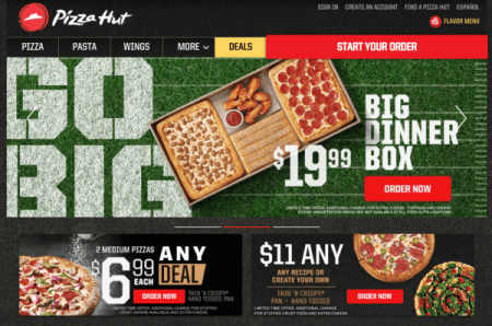
The uniqueness of the color and the contrast of it compared to the rest of your site is what really produces results. For example, Pizza Hut does a fantastic job contrasting all the CTA buttons in red to drive people to make an order. From their $6.99 deal to the Big Box Dinner every ORDER button is beautifully bright red making the decision easy: Order already!
Like them, you need to ensure you are creating eye-driving contrast to the actions on your content. If you want to know what is the best colors to use for your target audience, test it. Do not 100% believe the industry norms because your business is unique as are your customers.
If you also want a pro tip, Adobe has an amazing color wheel that can help you pick harmonious color palettes from complimentary, monochrome or compound! Check it out here!
Size Matters
In most cases this is true! The proportions of CTA buttons or texts should reflect their unique role on your site. You want to go with a size that distinctively marks the CTA as a crucial segment of the site, one that shouldn’t be overlooked.
For example, HowAboutWe’s CTA button is perfectly balanced with all of the other boxes on the page:
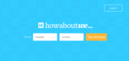
Like them, you want to make sure things are sizably balanced, easy to see and clickable.
Location Matters
Where you choose to place the CTA can have all the impact on its performance. The main rules are that CTAs should be located in popular spots; that the space surrounding them should have reasonable white space; and that they are not competing with other buttons in the area over clicks.
On top of physical location, think of where your call to actions should be placed in context of a shopper experience. Be sure you are serving up call to actions when people are educated enough to make it.
Give A Little Bit
Have you ever heard of the phrase, “Never ask someone to do something you wouldn’t do yourself?”
Well, if you have know that the same goes for marketing! If you are asking your target audience to do something for you, you better be willing to do something for them in return! That is all what interactive marketing is!
If you want CTAs to appeal, you need to make sure the value that you are offering is clear, and that it actually appeals to your group. For example, CTAs like “Start My Free Trial,” or “Download Instantly” all offer a certain incentive that allows visitors to visualize what they are getting out of this deal.
Be obvious about what value you are providing customers! Use your USP or unique selling point!
Your USP is arguably one of the most important pieces of acquiring new leads, so creating a nice USP/CTA mash-up is a great way to increase clicks. Give a little and people will give you a lot more!
Know Your Devices Like, Whoa!
In the modern world, it’s safe to say that most people are not looking at your online content straight from their computer. Most people are on the go looking at offers and content with all types of devices: mobile phones, iPads, etc.
Since that is the case, you need to ensure that your call to action can be seen clearly on tablets and mobile devices. If anything, the call to action messaging should be even more focused, as users on phones are more likely to take action and complete the sales funnel.
So, whether it’s calls to action on Facebook, Google or your website, be sure to create content optimized for all viewing!
Use Some Mind Games
It’s become very popular in the last few years, to create a mind game around calls to action beyond simple “yes” or “no.” For many brands, they are offering two choices for users to pick from to use the power of reverse psychology to push the user towards the action. There’s a great example of this trick on Ann Taylor Loft’s pop-ups, as seen below:
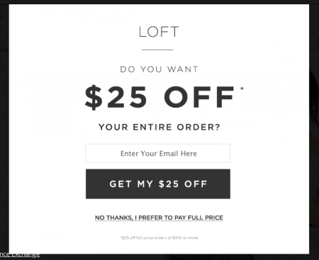
The brand simply asks: “Do you want 25% off your entire order?” with two options available: “Get my $25% off” and “No thanks, I prefer to pay full price.” Although this seems kind of funny, it works! In addition to the example above, TimothySykes.com tested a call to action that stated “don’t click here if you’re lazy”, and it performed 39% better than “click here.”
Clearly, people will never turn down a sale nor want to be viewed as LAZY so it creates an opportunity for more traffic. Reading call to actions like this causes the user to stop and think about the opportunity they’re turning down rather than simply clicking “no” to dismiss the popup.
Like them, you too can play the successful mind games in your content asks!
Push Some Buttons
There are loads of ways you can design your call to actions whether its hyperlinked texts, graphics or photos but buttons without a doubt are the most successful. In fact, conversion rate optimization experts at Crazy Egg go so far as saying: “The call to action is so important, so essential, and so overwhelmingly powerful that you should not attempt to make yours anything but a button.”
So, you might be asking, “Why are buttons such a big deal?” Well, it all goes back to psychology! The human brain is wired to expect action when a button is pressed. Buttons are also quite tempting – we really want to press them! If you don’t you are lying! HA!
So, since that is a proven tactic of the mind, you can definitely experiment with “pushing some buttons” when it comes to your call to actions. On top of just creating buttons, you can also improve your button-pushing action by including visual cues. An icon of a shopping cart on an “add to cart” button, for instance, or an arrow on a download button are both good examples.
Don’t Be Pushy
Have you ever signed up for a home service or gym membership where canceling feels like they are taking an arm and a leg? I know for me, it is one of the many reasons why I am weary of any type of ongoing offer, membership or anything that will lock me into a payment system!
I mean, no one likes interacting with an overly-aggressive salesperson—on the web or otherwise—so make sure your calls to action are not pushy! High-risk CTAs can sometimes repel visitors (internet users, as it turns out, are often wary of commitment)—these might include forced-to-comply requests, like not being able to access content without submitting an email address.
Sometimes you need gated content, so try to balance the type of CTAs you use to keep visitors returning.

A business who has completely nailed this is Netflix! Netflix uses persuasive text to guide you to their free trial. They let you know how convenient their product is with the ability to watch anywhere as well as the ability to cancel if you’re not satisfied.
Like them, consider using a CTA for a low-risk trial—like experimenting with a free 7-day trial versus committing to a full sale right away.
Giving visitors a chance to try gives them the confidence to make buy or return for more later.
Don’t Be Greedy
In simplicity, you shouldn’t be losing conversions in the war between clashing CTAs.
For example, Kiln, a co-working office space, had this on their contact page:
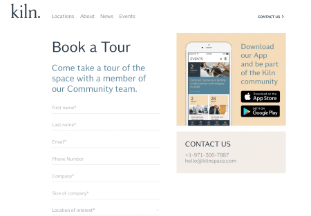
Looking at it, your eyes are trying to gather all the different asks in one place. Are you supposed to download their app? Book a tour? Contact them? Who knows?
No one likes a cluster-eff of content, so keep things minimal!
Like them, you might be taking your potential customers down a decision fatigue trap, which triggers analysis paralysis. Like many sites, you don’t want to have multiple calls to action that distract your attention and scream, “CLICK ME! NO, CLICK ME!” To keep things more effective, limit your asks and prioritize them.
In some cases, you might need to direct people to do more than one thing, like making a purchasing and liking your Facebook page. In this case, you may choose to have one CTA more prominent than the other. For example, Harry Potter’s Pottermore website has two asks but they are separated into two simple options: Sign Up or Sign In:

So, look at your current design and ask yourself if you are confused as to what the asks is. If you have more than one, look to simplify to prioritize them!
Don’t Be ClickBait Trash

I think we all think calls to action should be a lot like the clickbait articles like “Only the people with an IQ above 160 can solve these questions. Are you one of them? Click to find out…” but that is not the case!
A quality call to action is not clickbait as you are not creating a trap, you are providing value! In fact, Tony Haile, the CEO of Chartbeat, lays out and debunks online publishing myths by stating that:
“Valuing ads not simply on clicks but on the time and attention they accrue might just be the lifeline they’ve been looking for. Time is a rare scarce resource on the web and we spend more of our time with good content than with bad. Valuing advertising on time and attention means that publishers of great content can charge more for their ads than those who create linkbait.”
So, if you are playing for quality leads, you will create quality content that will inform, inspire and drive. Value provides value! Do not get caught up in vanity metrics, look to things that will provide conversions, not vanity traffic!
Don’t Cause Unnecessary Drama
This is probably the most neglected step of making a CTA, and it’s maybe the most important. Friction can be created a few different ways when it comes to landing pages and websites. Here are some of the most common problems, along with their solutions:
Too Many Form Fields
If you’re asking for a lot of information from someone, they’re going to be wary or not even want to spend time filling it out. Make whatever you’re offering worth the information you’re asking for, and cut out any fields that aren’t completely necessary.
Sketchiness
People aren’t going to give you their email if you might sell their information or spam them. Give them reasons to trust you, whether it’s through a privacy statement or trust symbols. Read more about exuding trust here.
Not Enough Information
When there is any risk involved, people will run the other way. They’re not going to spend any time or money on a product or service that they have concerns about. Address every question that they may have and give them the information they need to feel good about clicking your CTA.
Note: downloading a free ebook will require a lot less information than financing for construction equipment. The more money and time that a person is committing = the more information you need to give.
The Form/Page Doesn’t Work
This is possibly the worst one, and the thing that is going to tank your conversions. No one is going to kick down a bathroom door that is locked, and no one is going to stick around to figure out why your page is loading so slow or what your button doesn’t do anything. Test that everything works before you publish it, and make sure it’s so easy to understand that your grandma would know what to do.
So, save the drama for your momma and keep things simple for people. The less hoops they need to jump through, the more successful you will be. 32% of consumers stop doing business with a brand they love after just one bad experience, so make their experience with your brand ROCK!
Be Irreclickable, Irresistable and Actionable
The best call to actions are ones that are clear, creative, specific and urgent.
Hopefully, this article has helped you improve your mindset on how to approach call to actions but a rule to remember after creating is to ALWAYS TEST! Always remember to test!
Every business is different. By constantly measuring and analyzing, you can determine what works best for your audience and goals, leading to a CTA strategy that converts every time. To learn more about creating, designing and writing CTAs that work, read the rest of our call to action blog posts starting with “Improving Your Call to Action: A Mind Reader’s Guide.”
If you want additional help, reach out! We would love to help you create irreclickable call to actions for your business!


